Article Design Studio
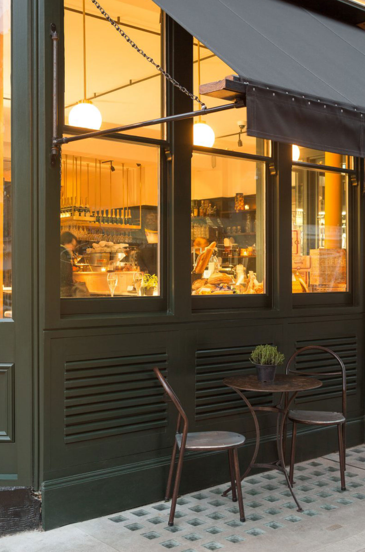
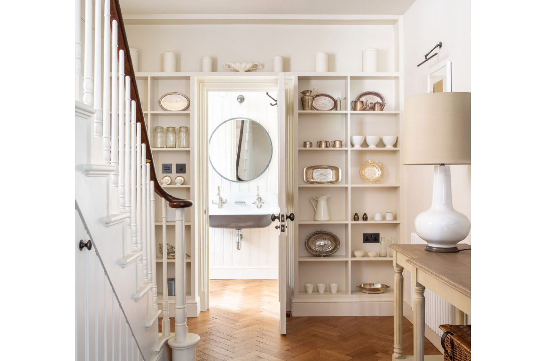
Article specialise in creating unique and imaginative spaces. Having aligned themselves with some of London’s finest hospitality establishments Article looked at refining their own aesthetic as they began to build on more residential projects. Our key objective with this rebrand was to create a visual language that was subtle, warm and simple.
Article Design Studio
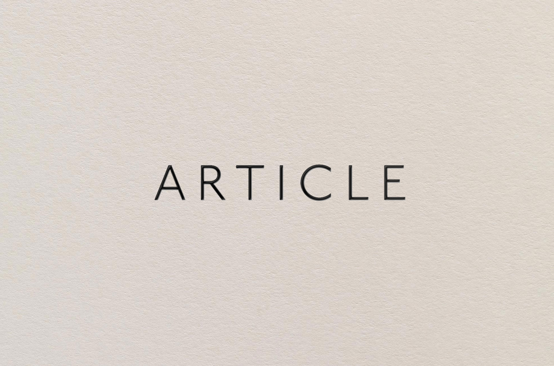
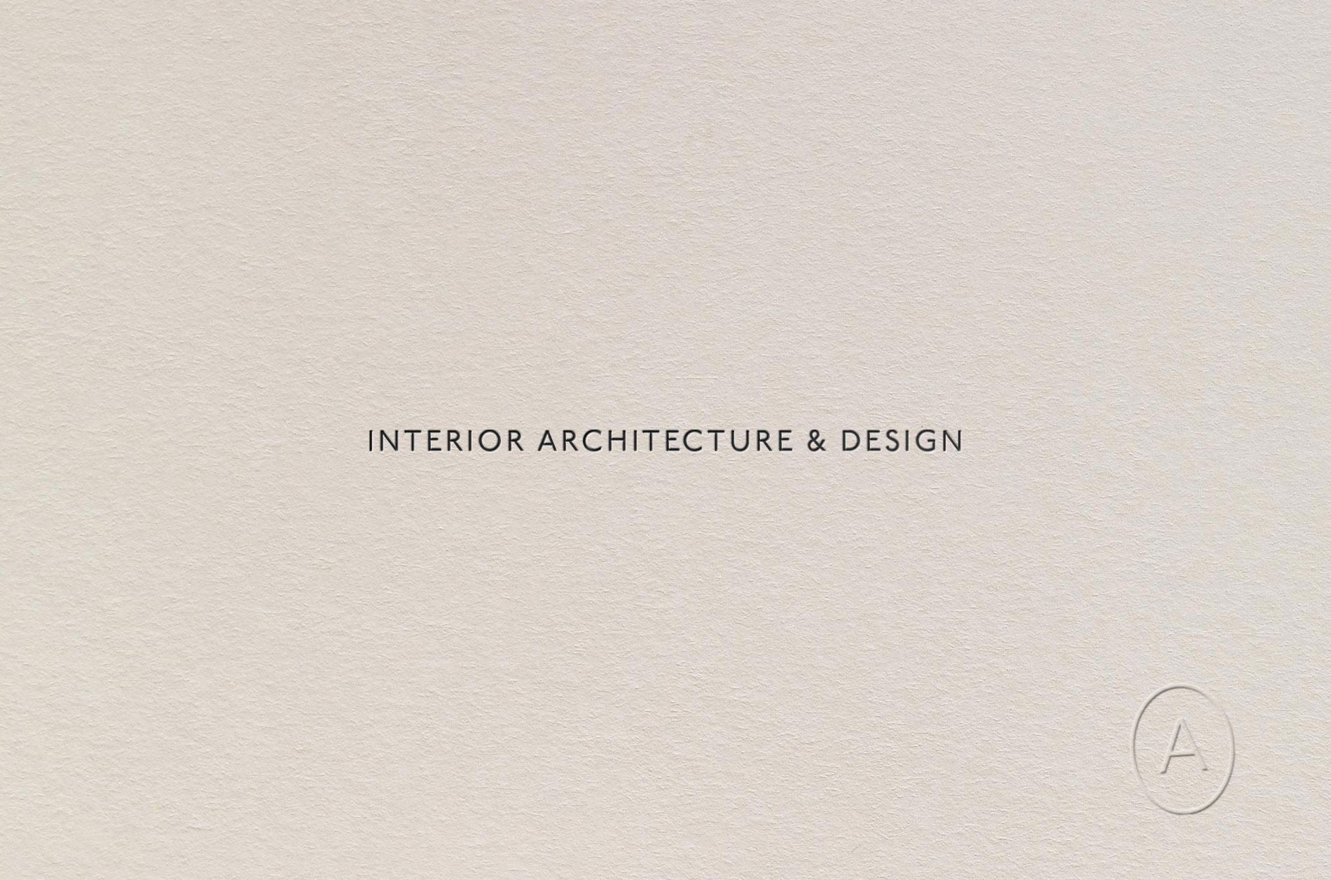
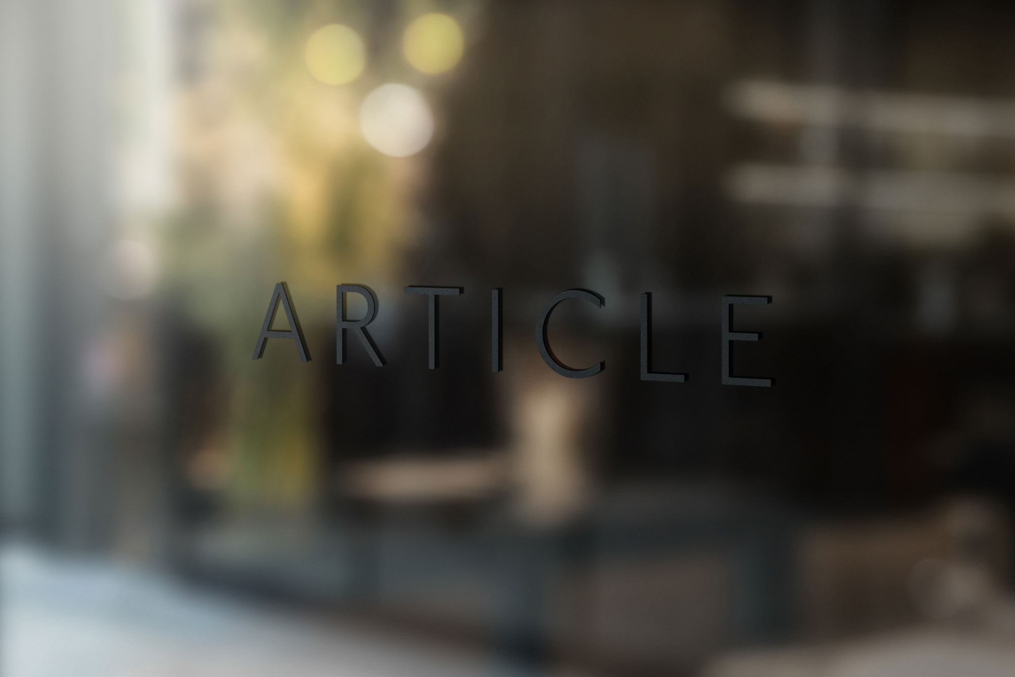
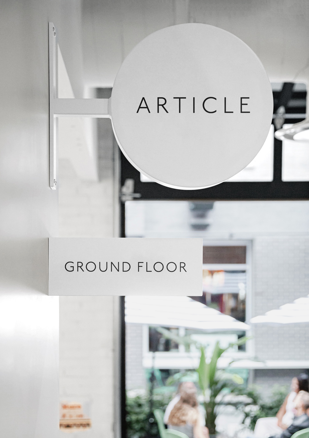
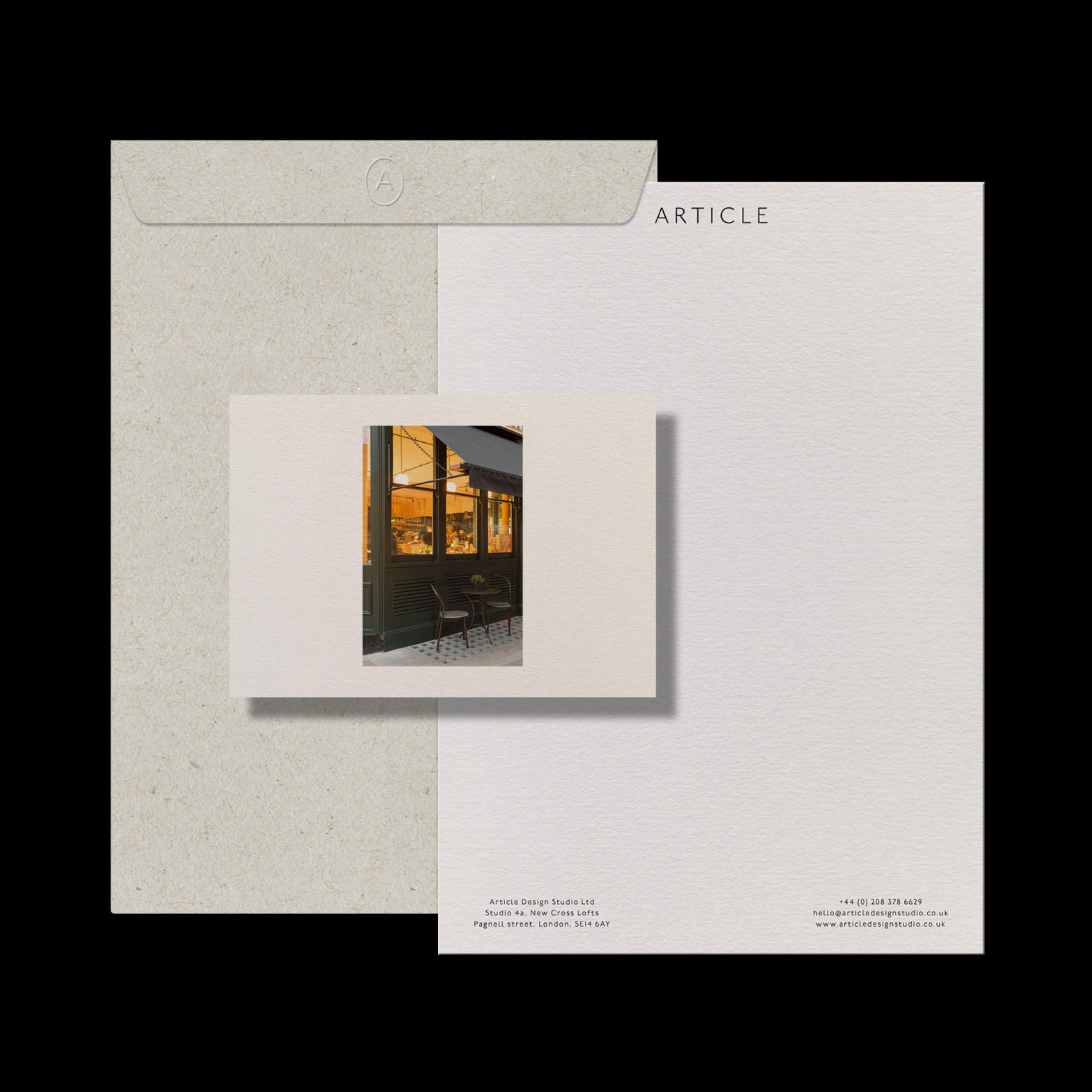
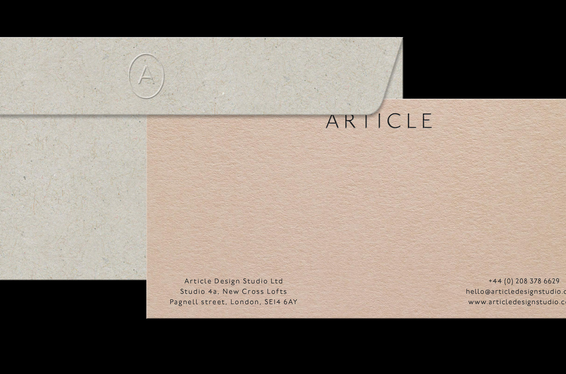
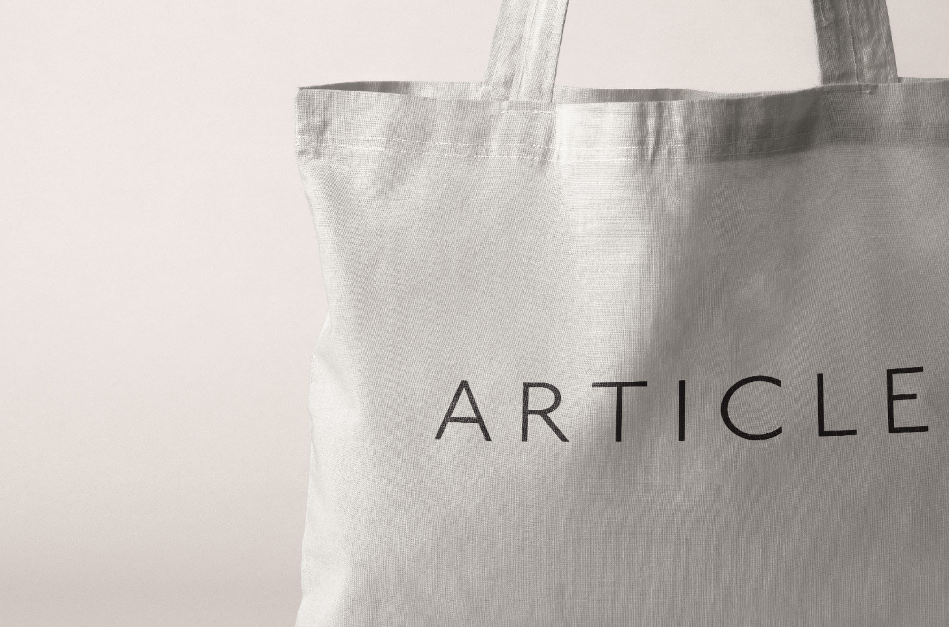
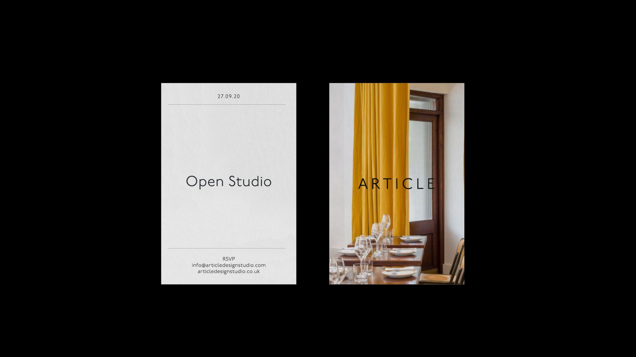
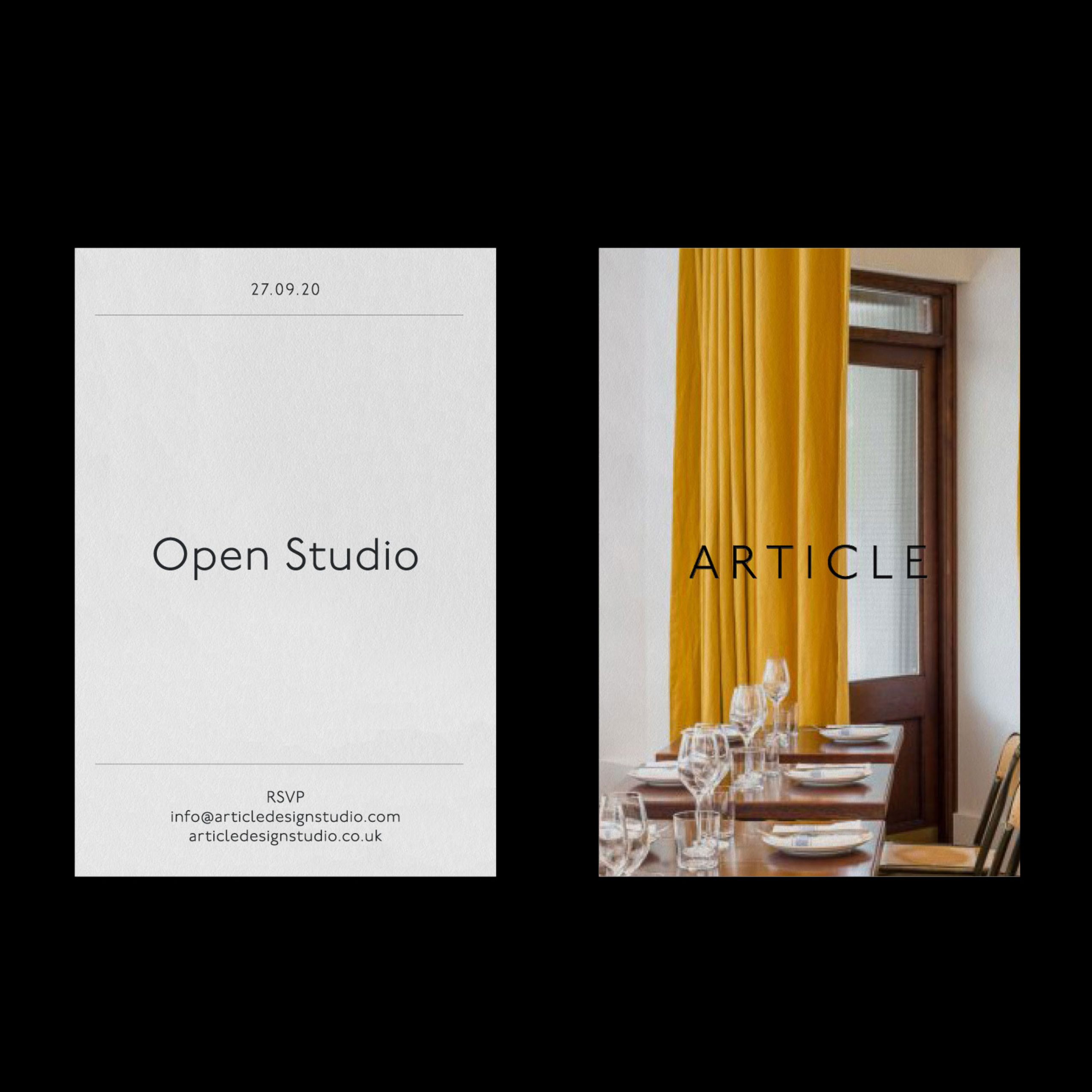
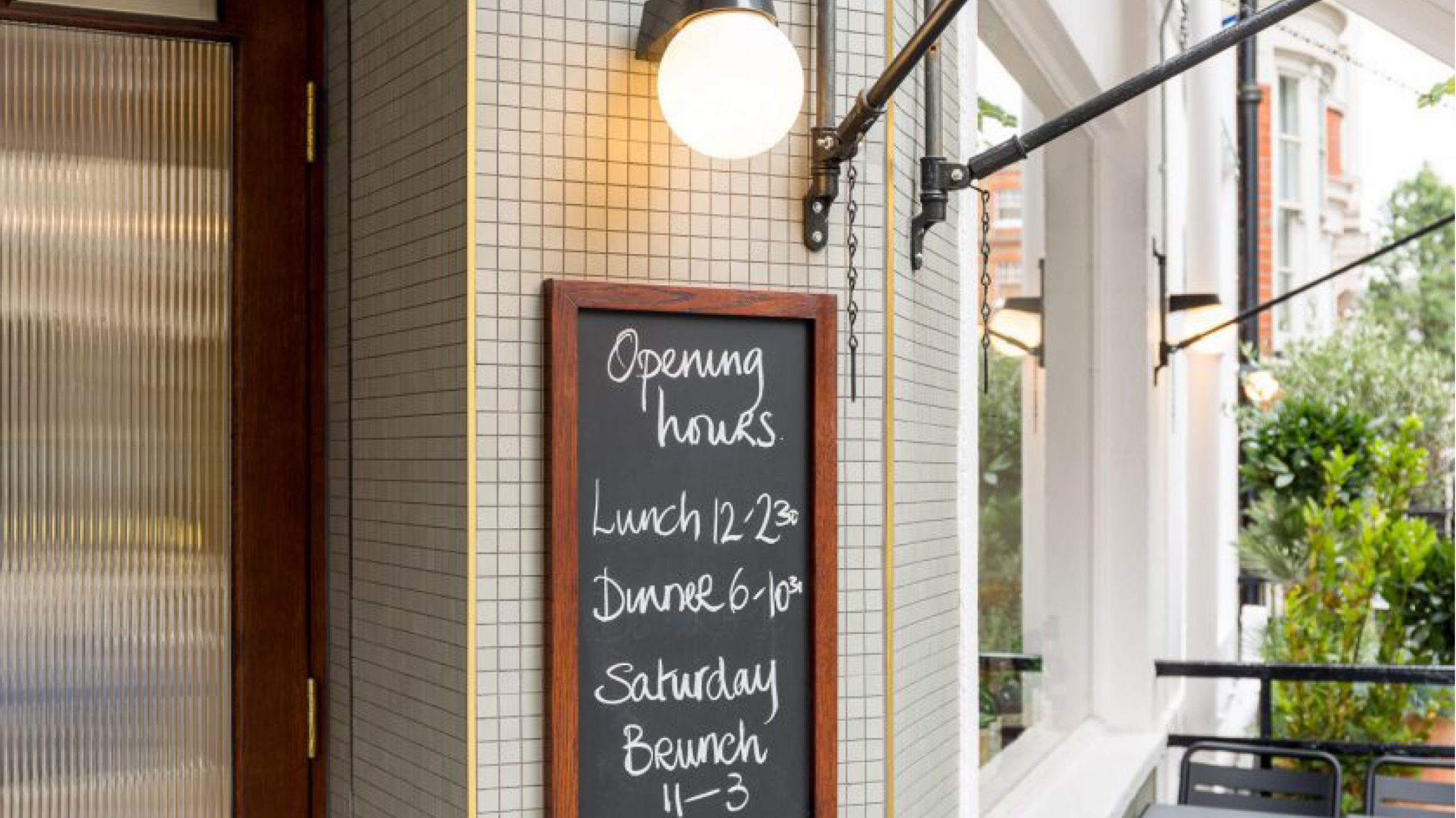
After early research, discussions and workshops we concluded that the identity needed to encompass an understated air of Britishness. We achieved this by using an adaptation of Johnston, Edward Johnston’s quintessential typeface originally designed in 1916. A contemporary approach to spacing and placement keeps the typography clear and concise.
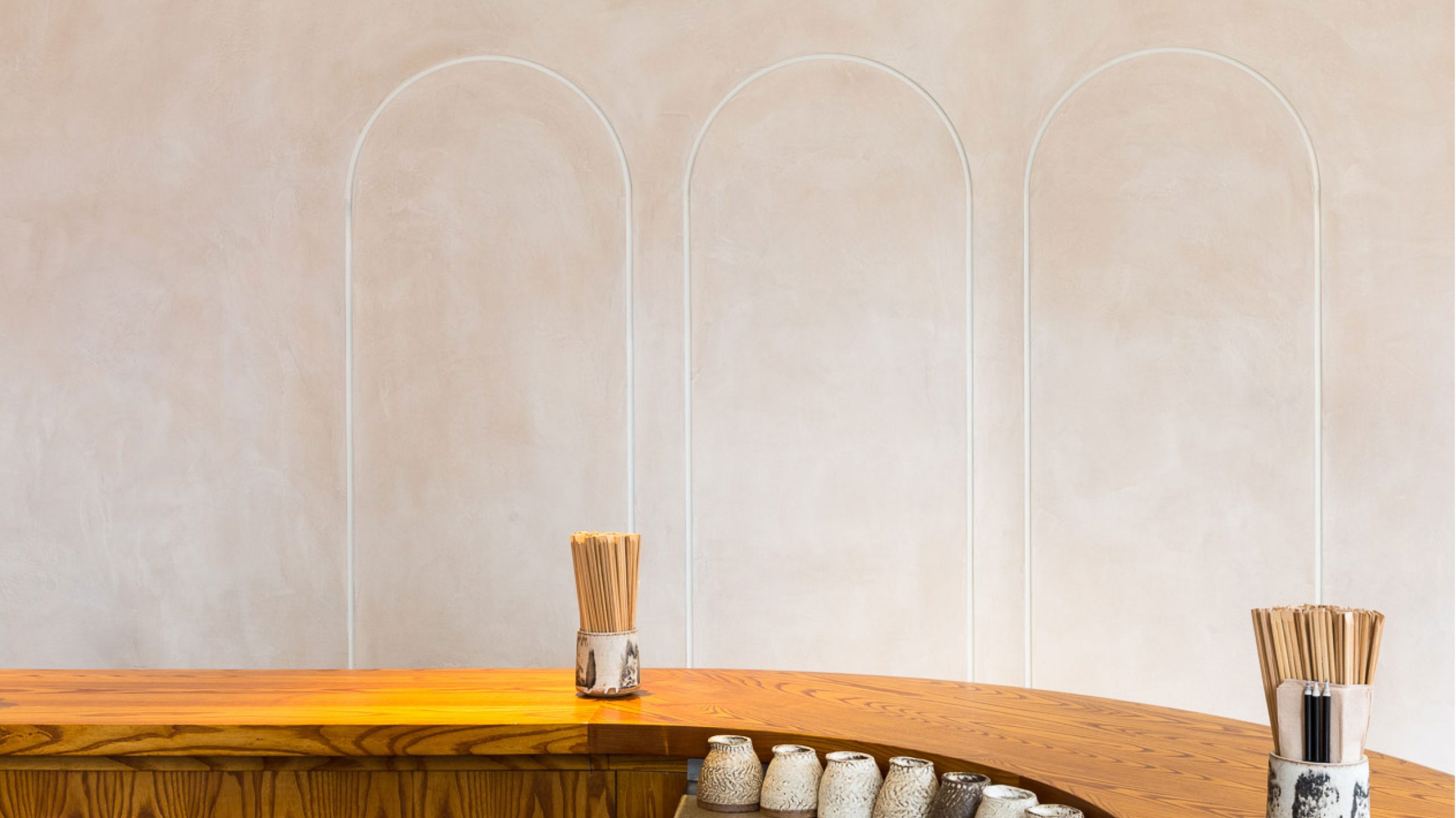

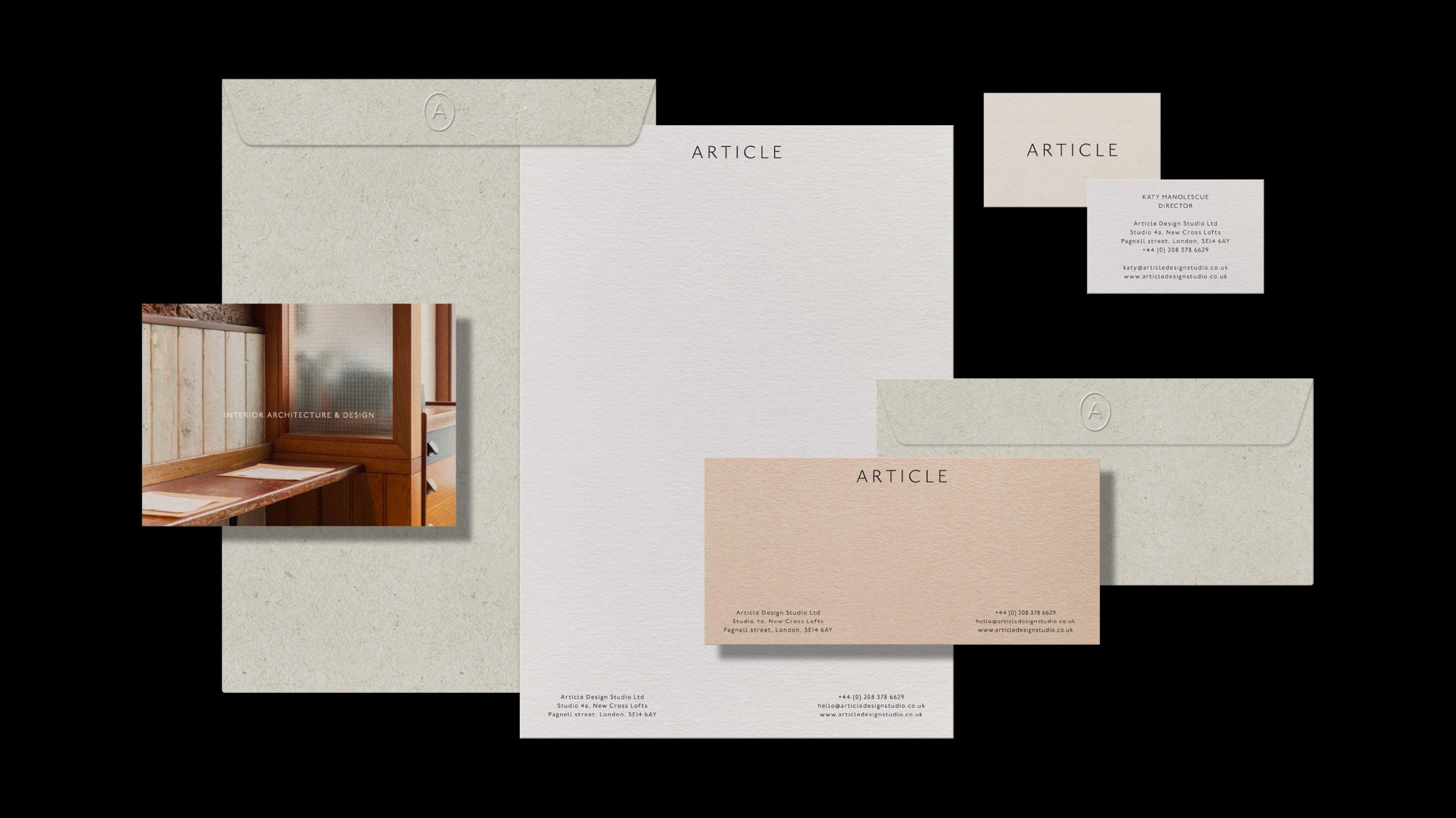
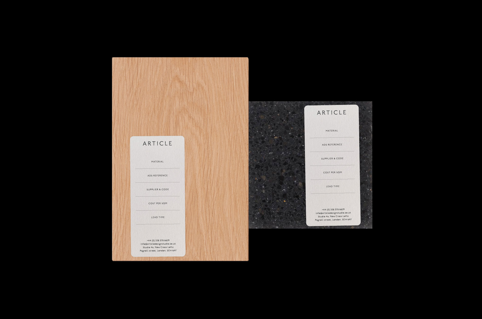
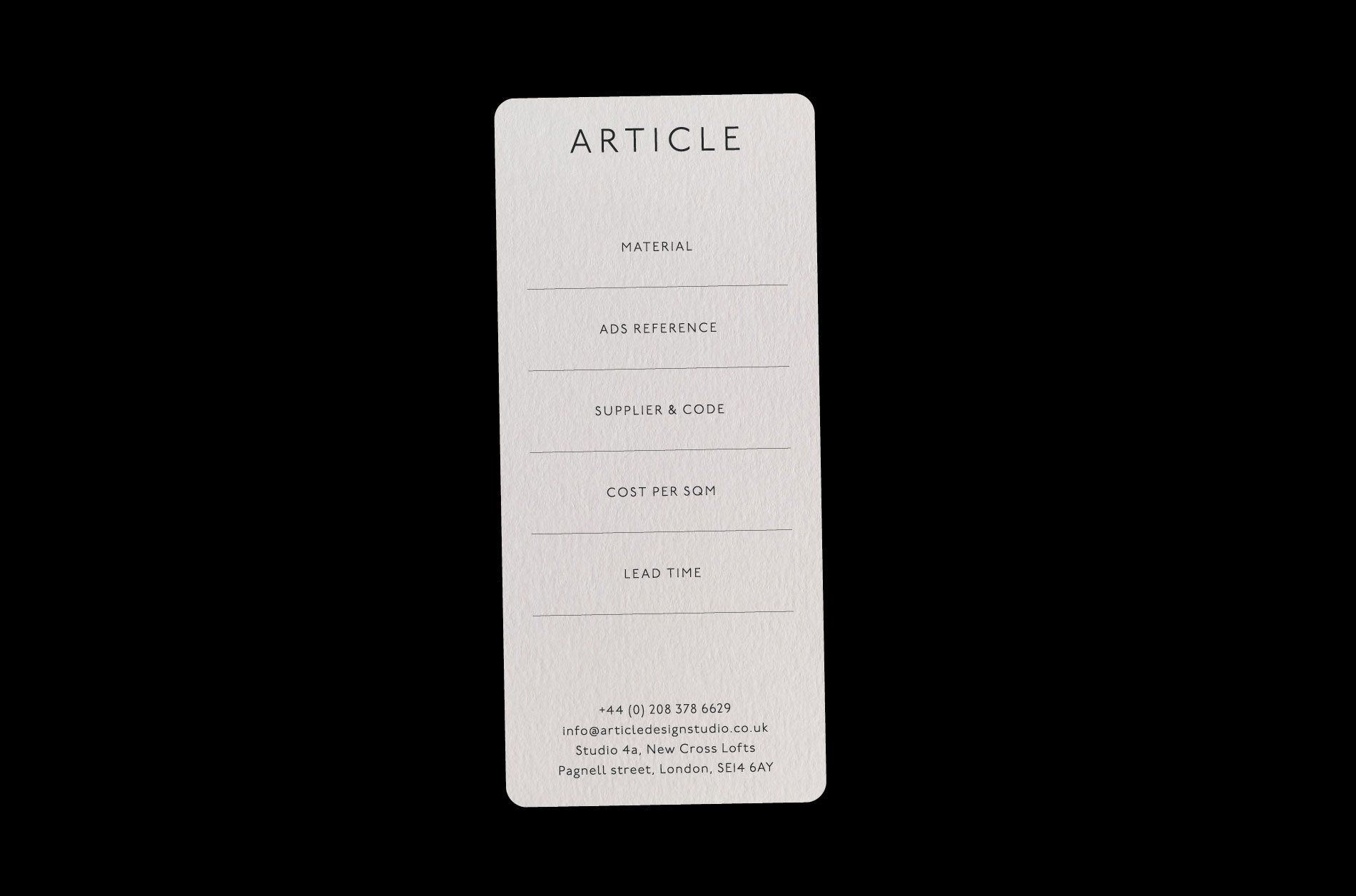
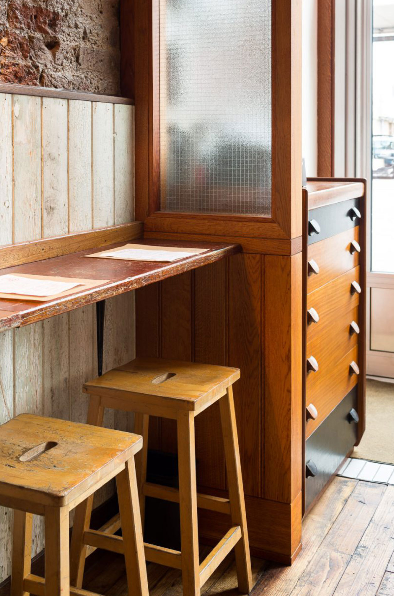
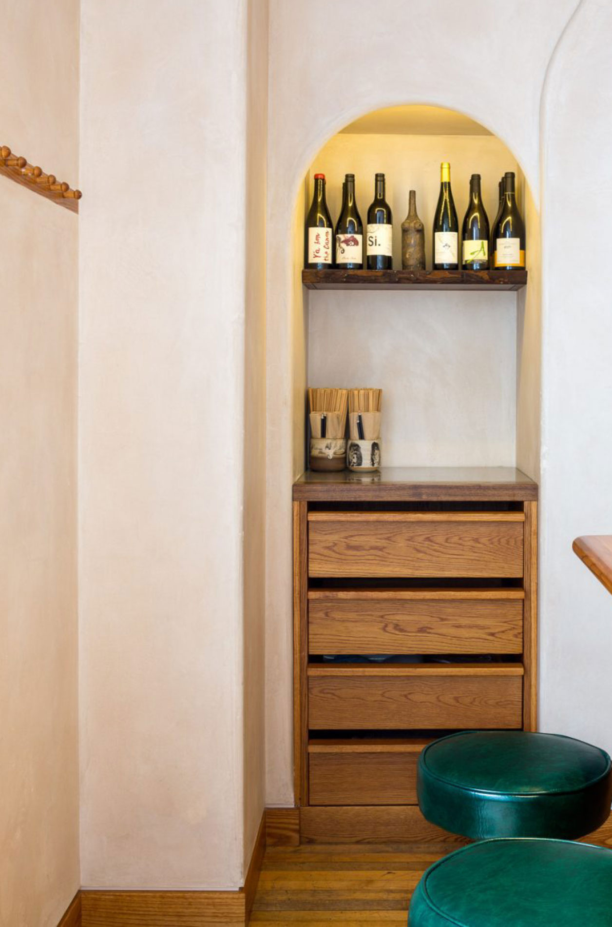
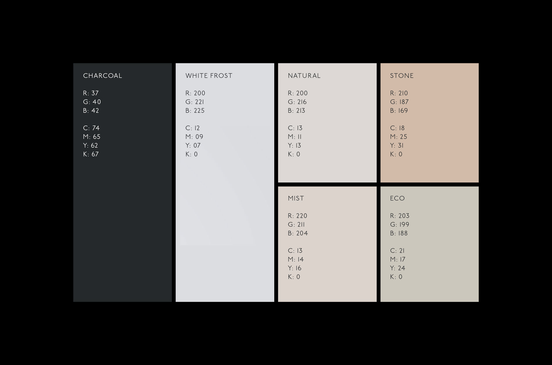
A colour palette started to emerge of warm, natural tones, that make you feel at ease. It was important for these tones to represent the work of the studio, making you feel reassured and calm. Each item within the printed collateral uses a different paper stock which helps lift the minimalist typography and build a unique texture, feel and tone of voice. We generated a brand palette based directly on the chosen stocks.
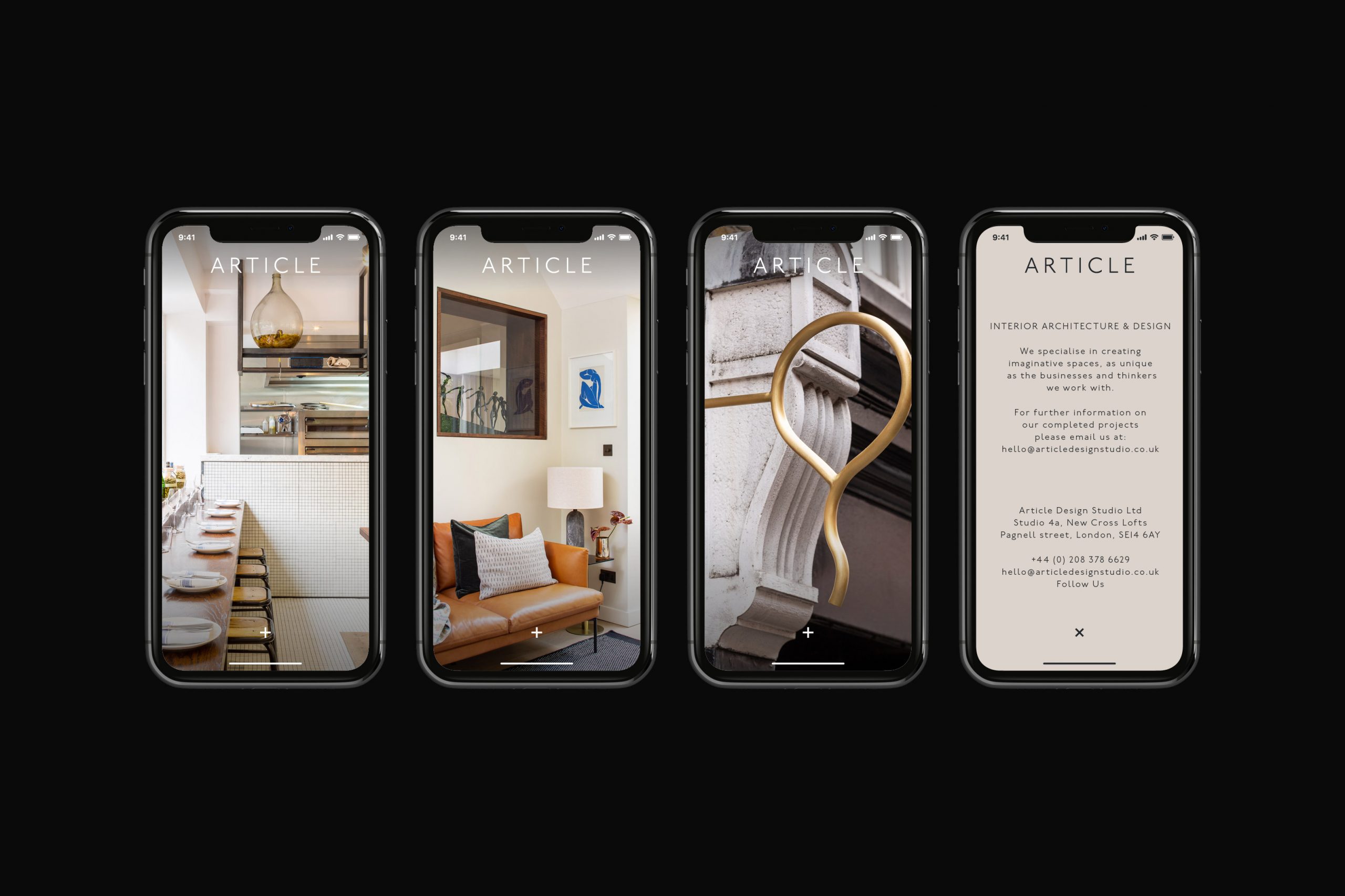
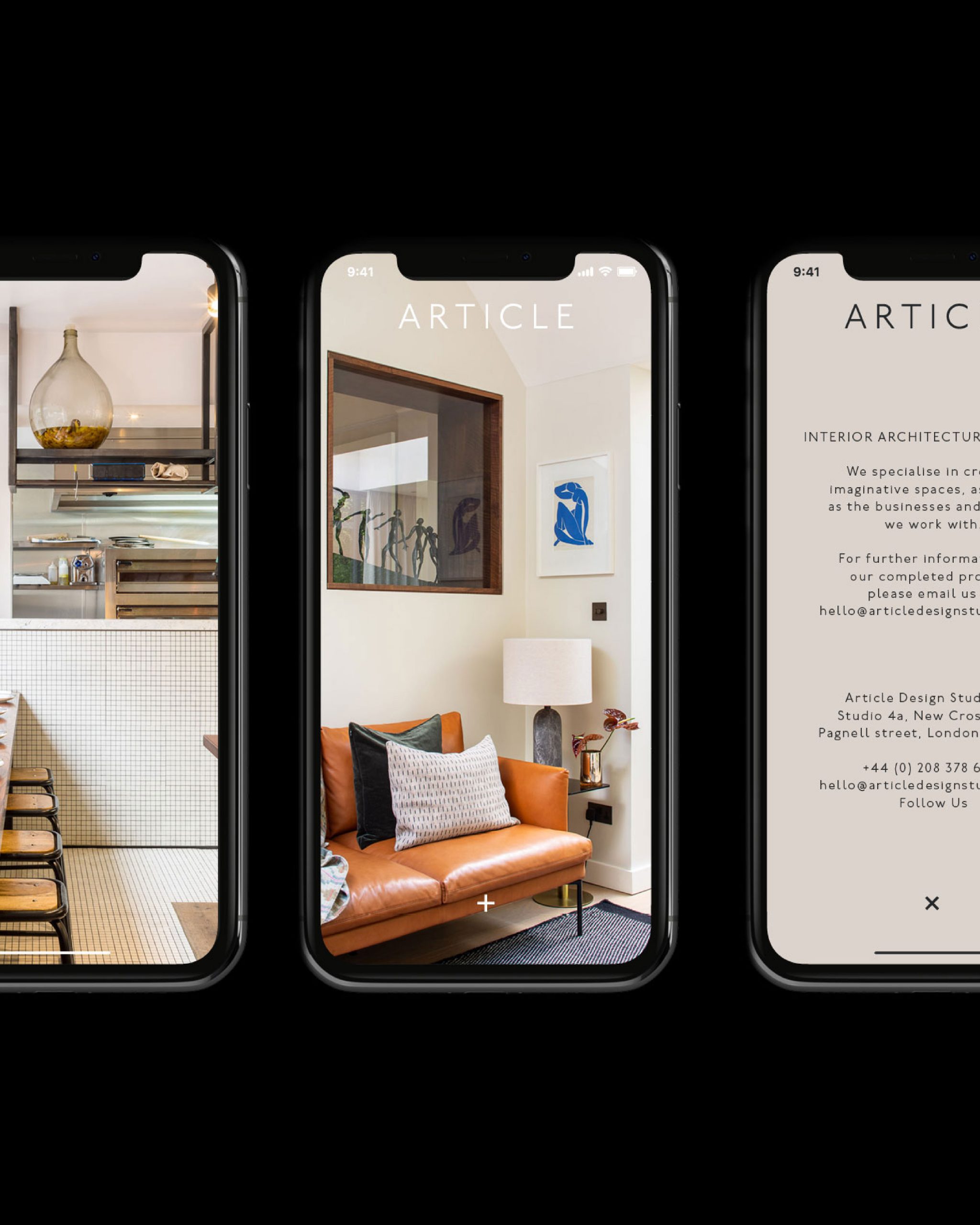
The online portfolio (for the time being) was stripped back to a few key images with links to social media and contacts, with the aim of evolving this over the following year.

“A subtle and honest reflection of our studio and its workings. Precision and simplicity, design language that is dear to our hearts and A Common Thread have captured it perfectly. We love the timeless British typeface they have utilised; it was like being reunited with an old friend when the logo was revealed to us. Seemingly quite plain and modern, yet artwork that is rooted in classic British design heritage. An acknowledgement of the past, but looking to the future with fresh eyes – we like that very much indeed”
– Article Design Studio
Gallery View
Article Design Studio
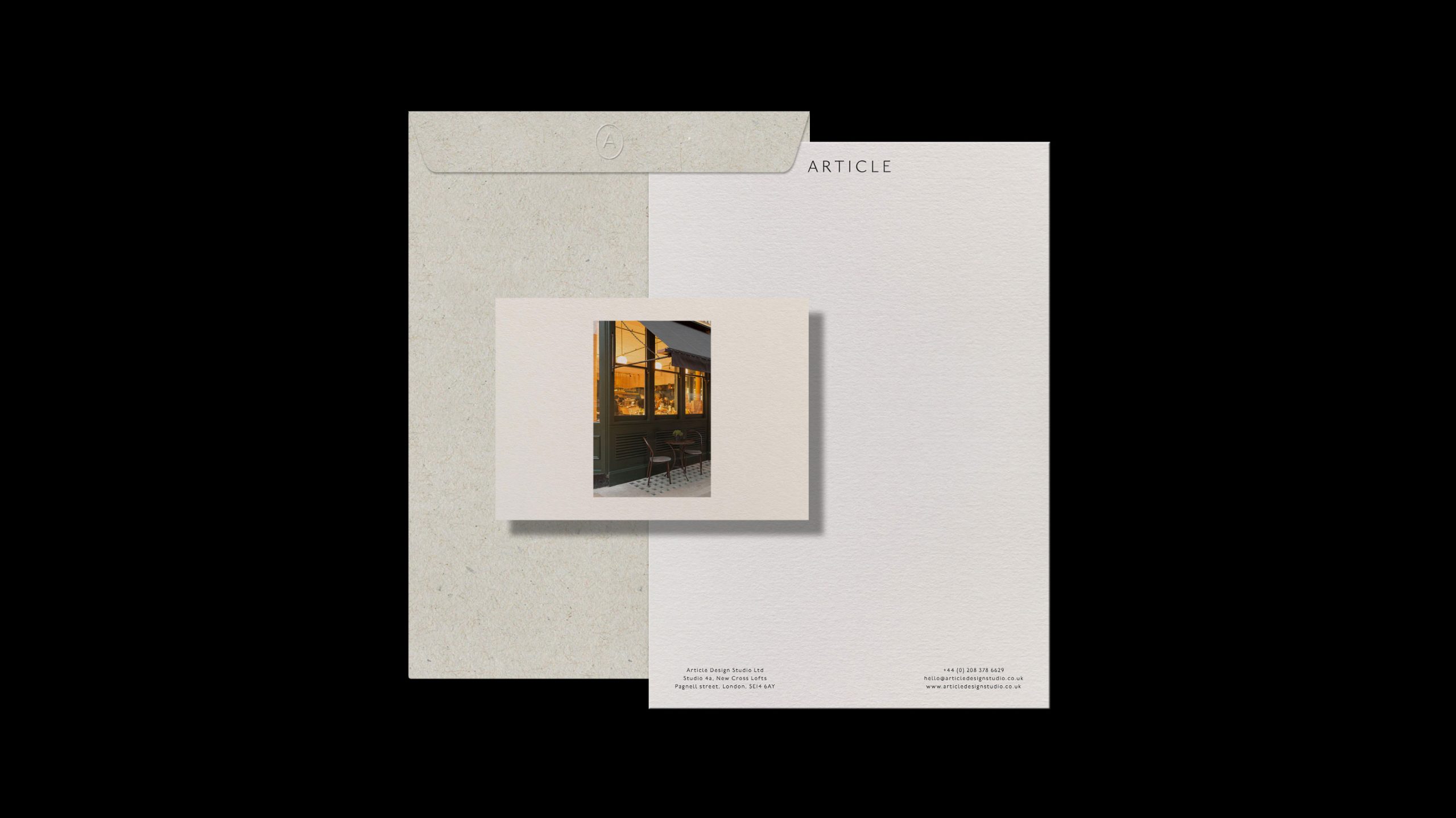
After early research, discussions and workshops we concluded that the identity needed to encompass an understated air of Britishness. We achieved this by using an adaptation of Johnston, Edward Johnston’s quintessential typeface originally designed in 1916. A contemporary approach to spacing and placement keeps the typography clear and concise.
A colour palette started to emerge of warm, natural tones, that make you feel at ease. It was important for these tones to represent the work of the studio, making you feel reassured and calm. Each item within the printed collateral uses a different paper stock which helps lift the minimalist typography and build a unique texture, feel and tone of voice. We generated a brand palette based directly on the chosen stocks.
The online portfolio (for the time being) was stripped back to a few key images with links to social media and contacts, with the aim of evolving this over the following year.
“A subtle and honest reflection of our studio and its workings. Precision and simplicity, design language that is dear to our hearts and A Common Thread have captured it perfectly. We love the timeless British typeface they have utilised; it was like being reunited with an old friend when the logo was revealed to us. Seemingly quite plain and modern, yet artwork that is rooted in classic British design heritage. An acknowledgement of the past, but looking to the future with fresh eyes – we like that very much indeed”
– Article Design Studio