Bonhams
Wayfinding and Signage for Bonhams Auction House.
Founded in 1793, Bonhams is one of the world’s largest and most renowned auctioneers of fine art and antiques, motor cars and jewellery.
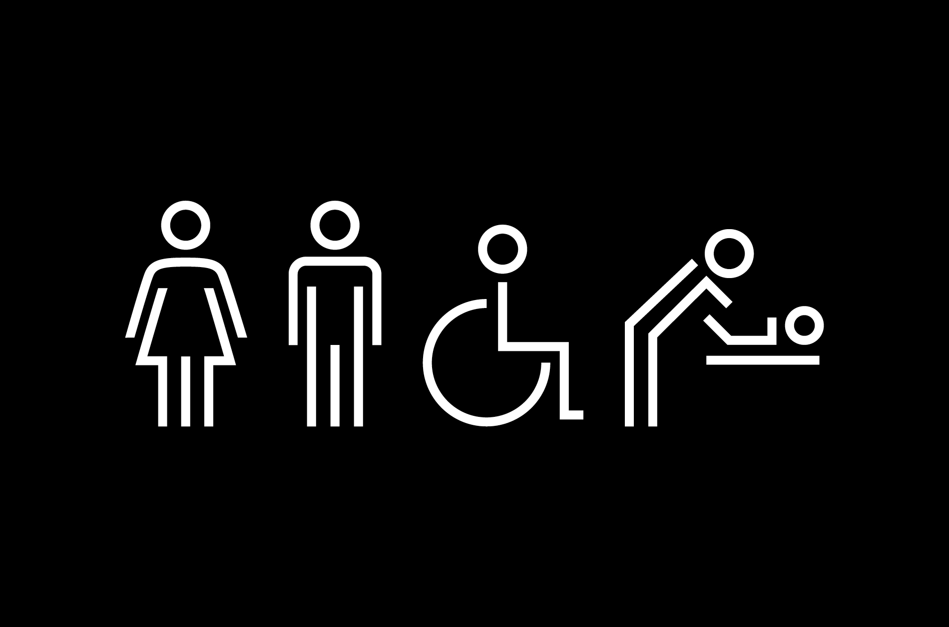
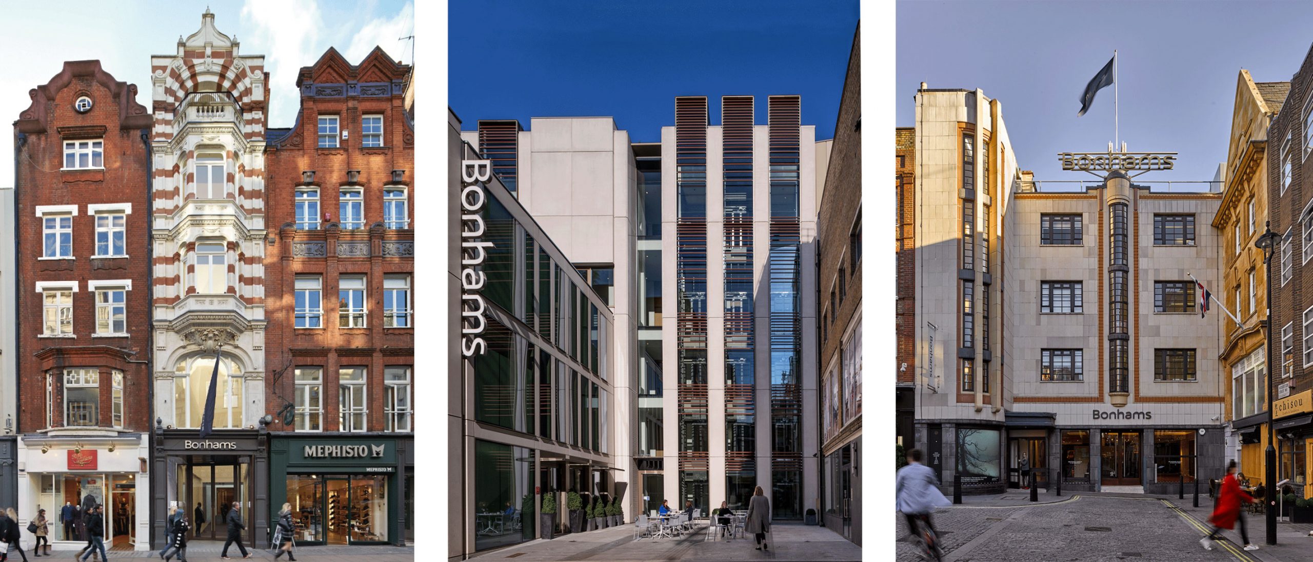
We were commissioned to create a new way-finding solution for their headquarters on New Bond St. that would serve the entire public areas of the building including its various sale rooms.
Bonhams
The project started with a consultation with key members of staff to establish key areas of focus.
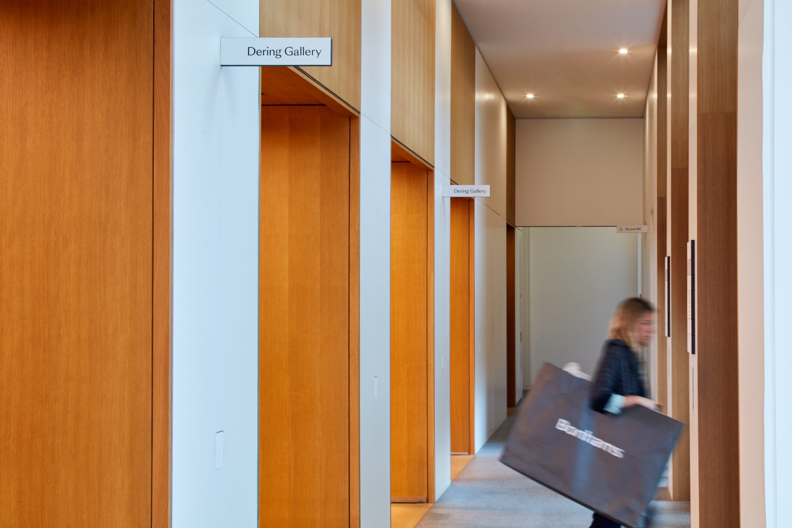
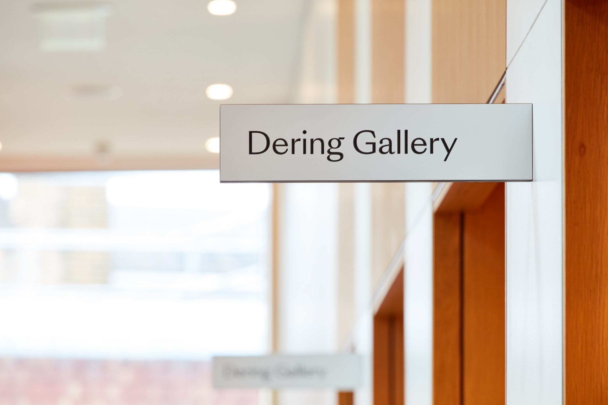
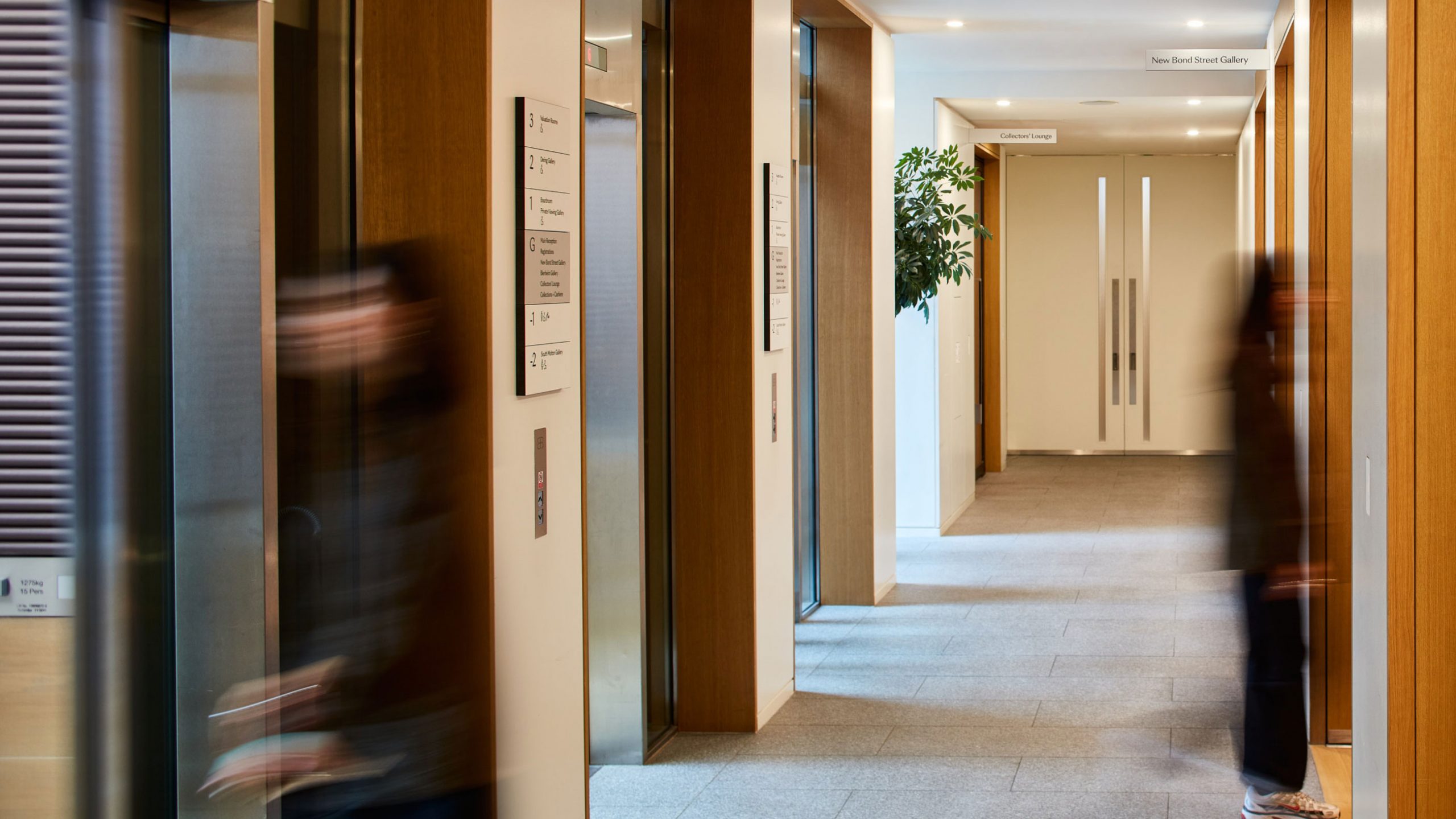
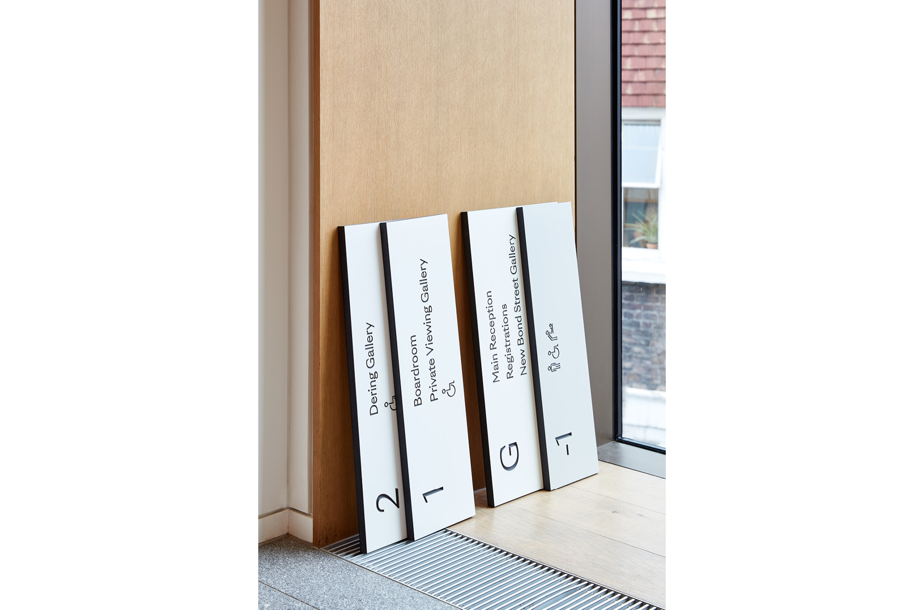
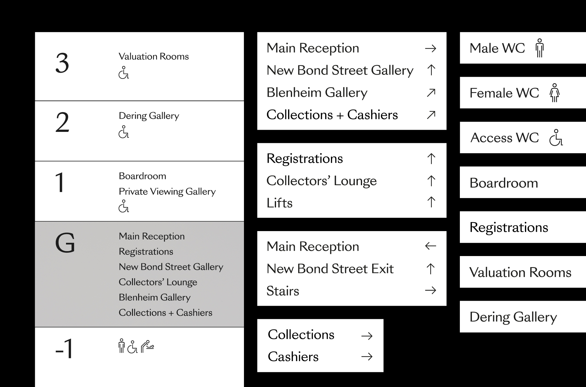
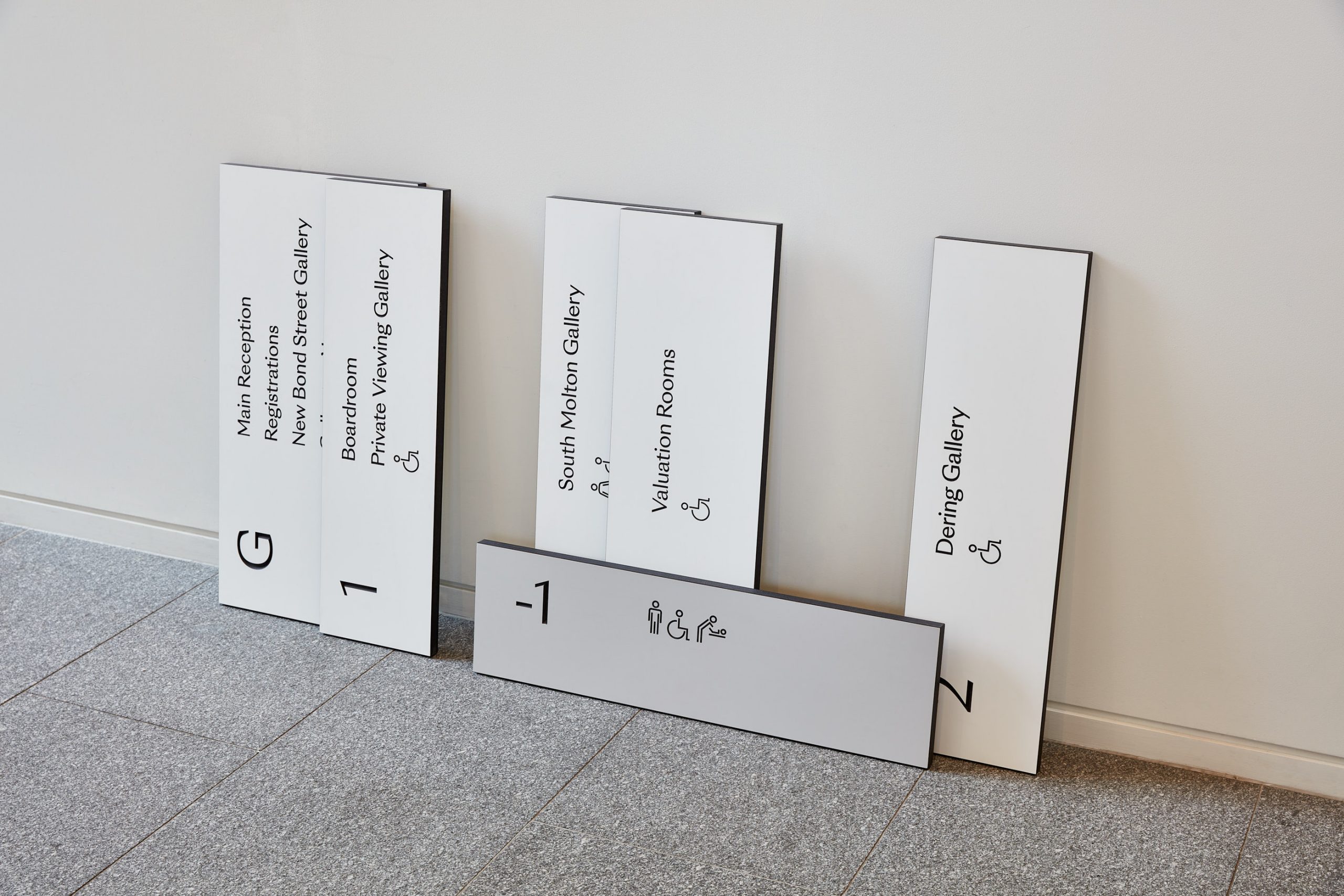
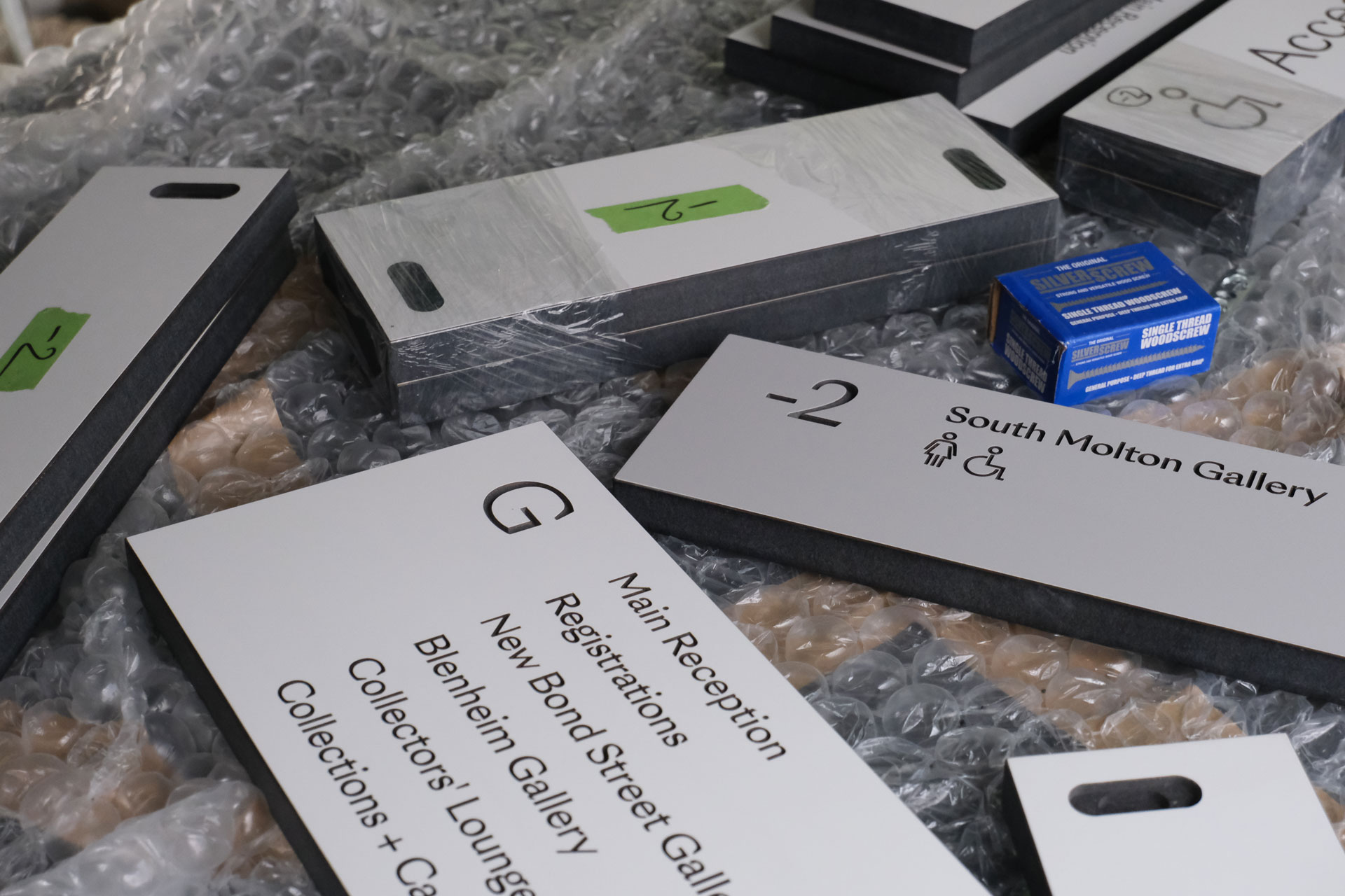
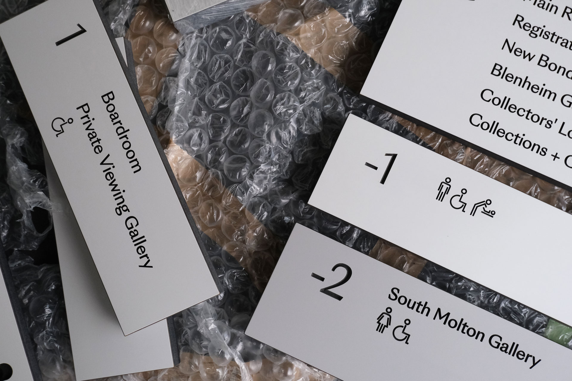
One important outcome was the naming of the three sale rooms so they would be easily identifiable from one another and have their own autonomy. Previously they had simply been numbered.
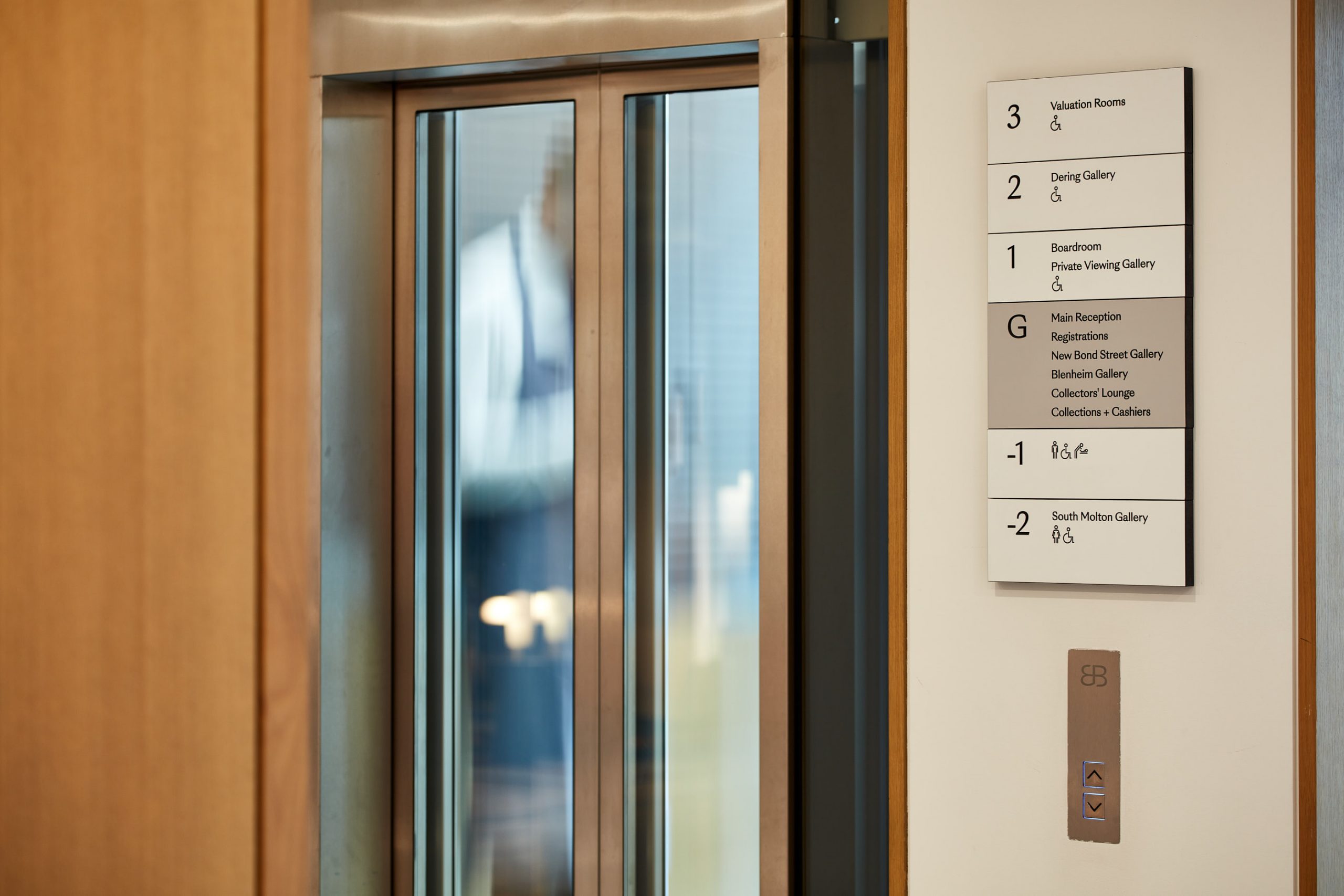
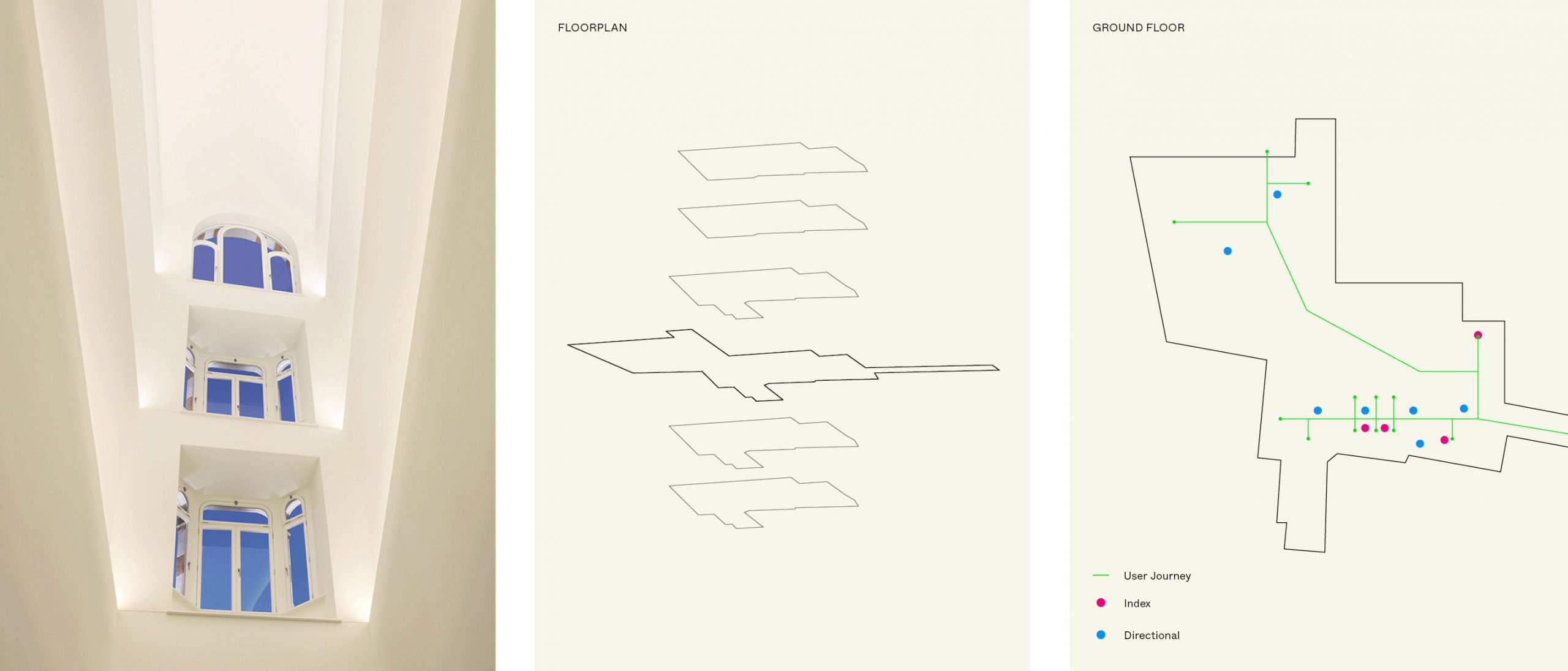
Following this, extensive user journey planning was conducted and refined so clear and intuitive routes could be created throughout the public areas allowing people to orient themselves within the physical space and easily navigate from place to place.
A particular challenge as the building itself is made up of an original Georgian town house and a 1930’s office building both brought together by a contemporary building completed in 2013.
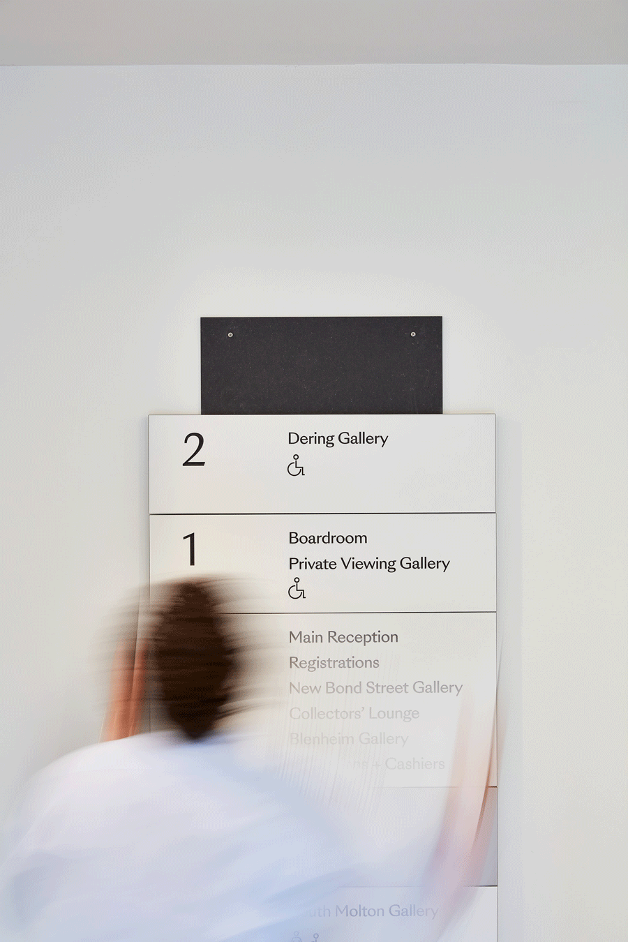
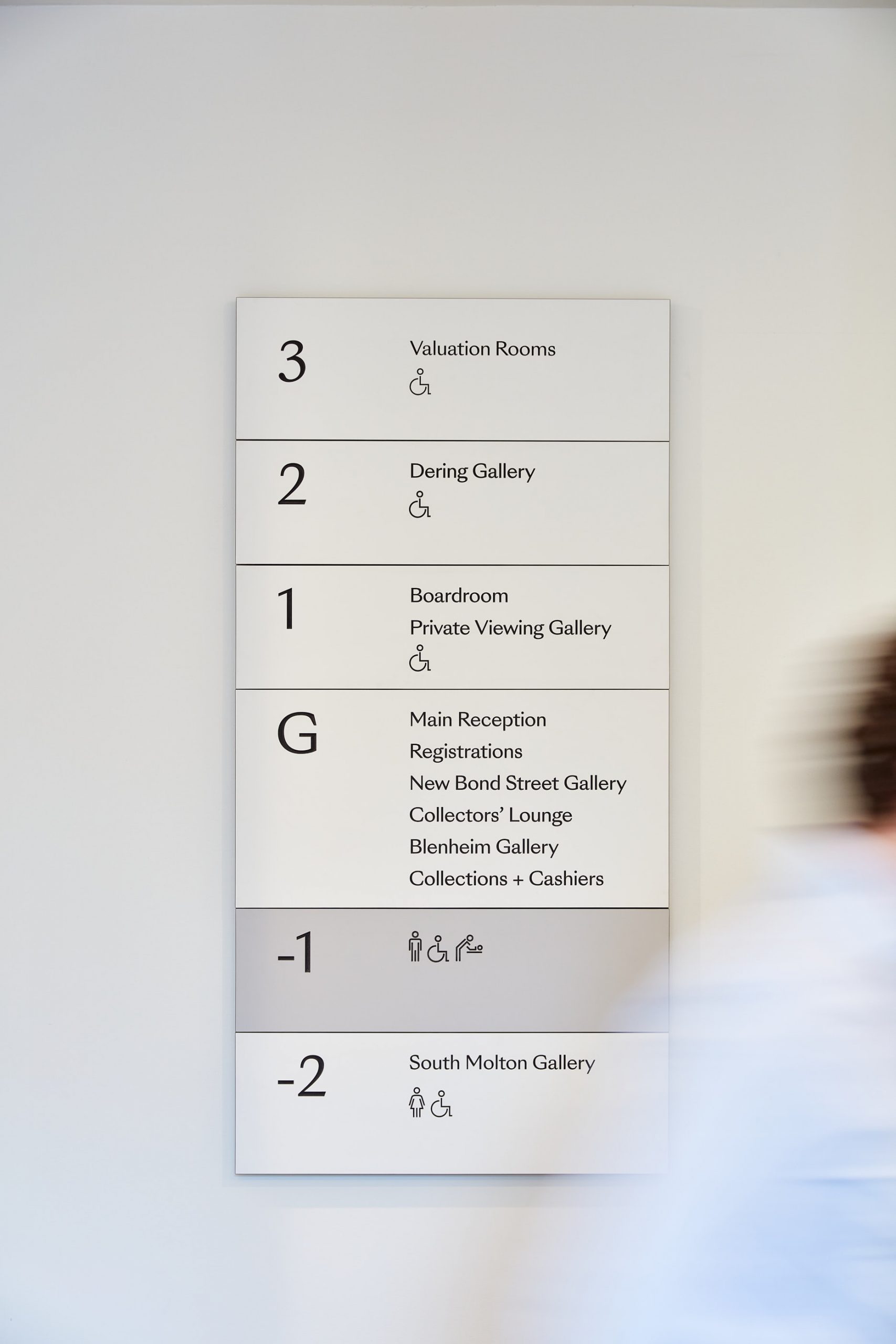
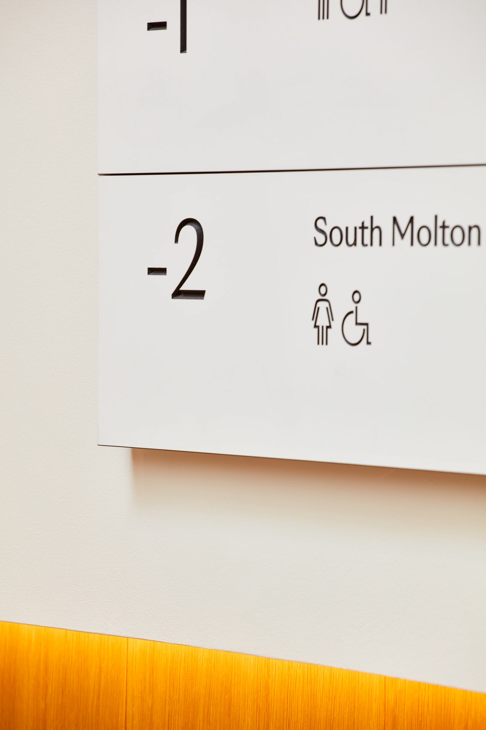
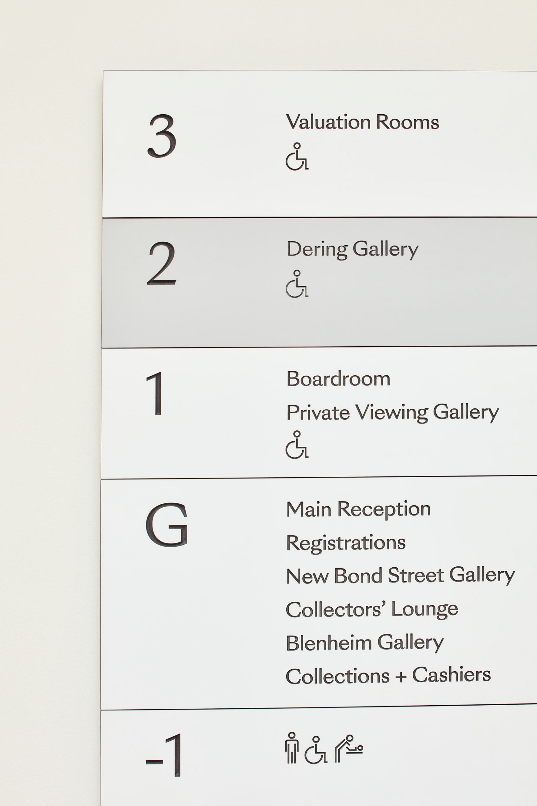
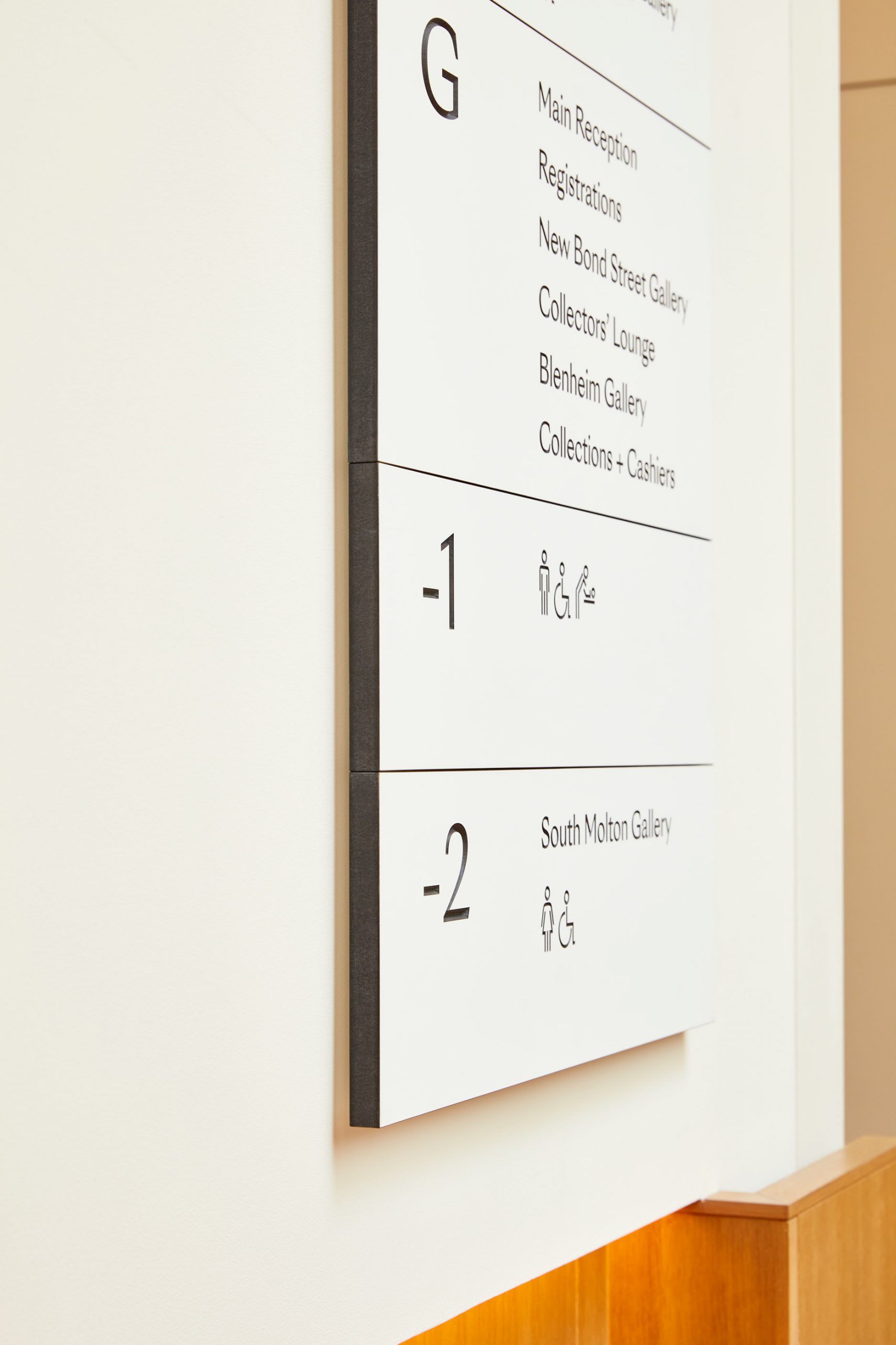
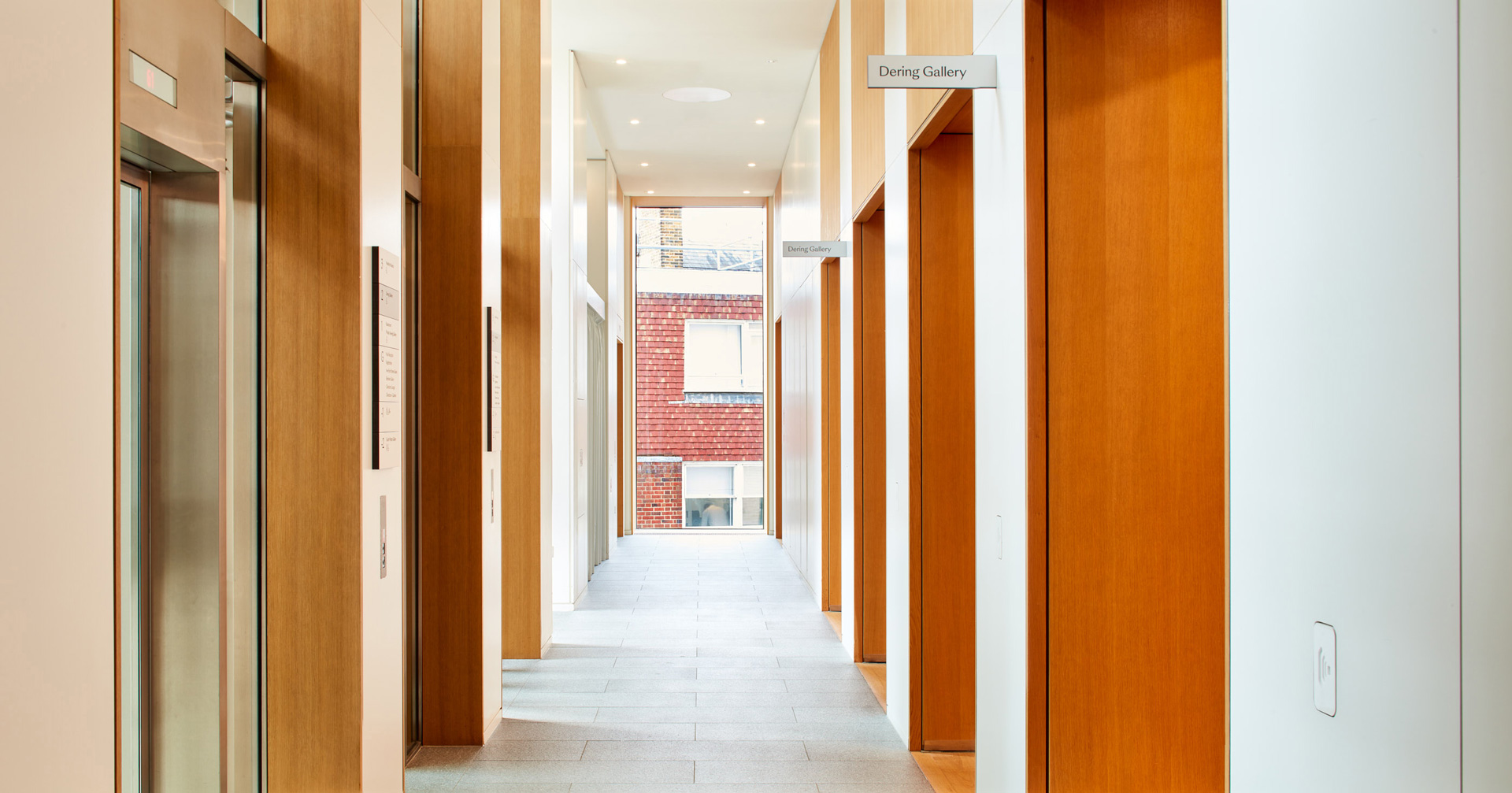
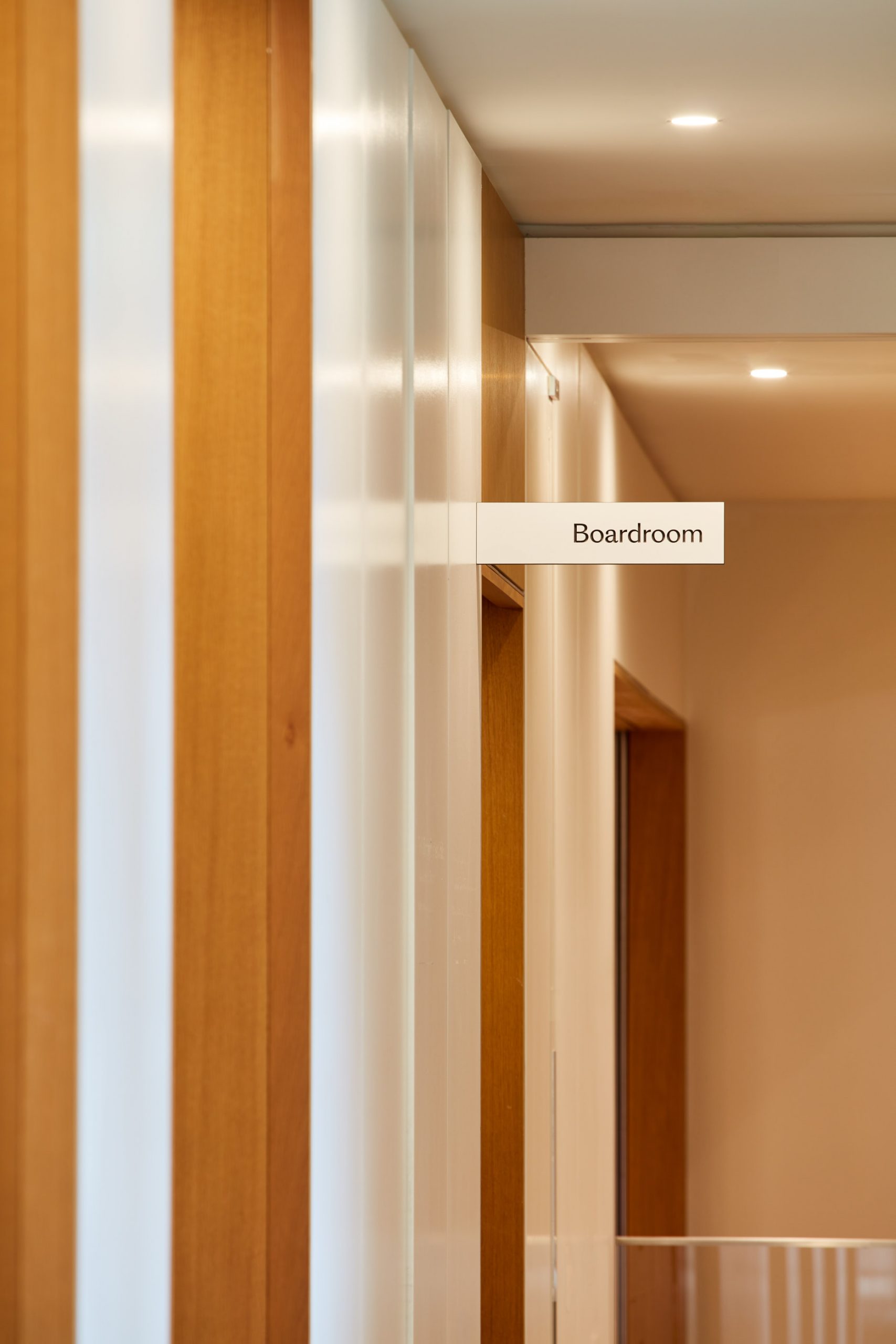
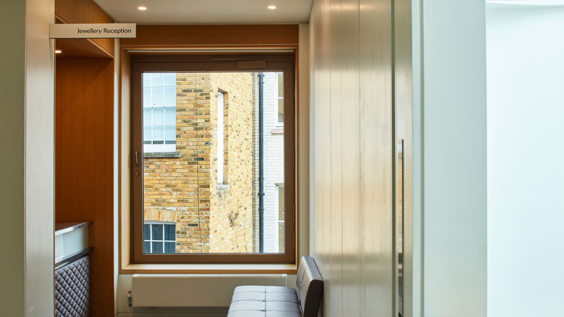
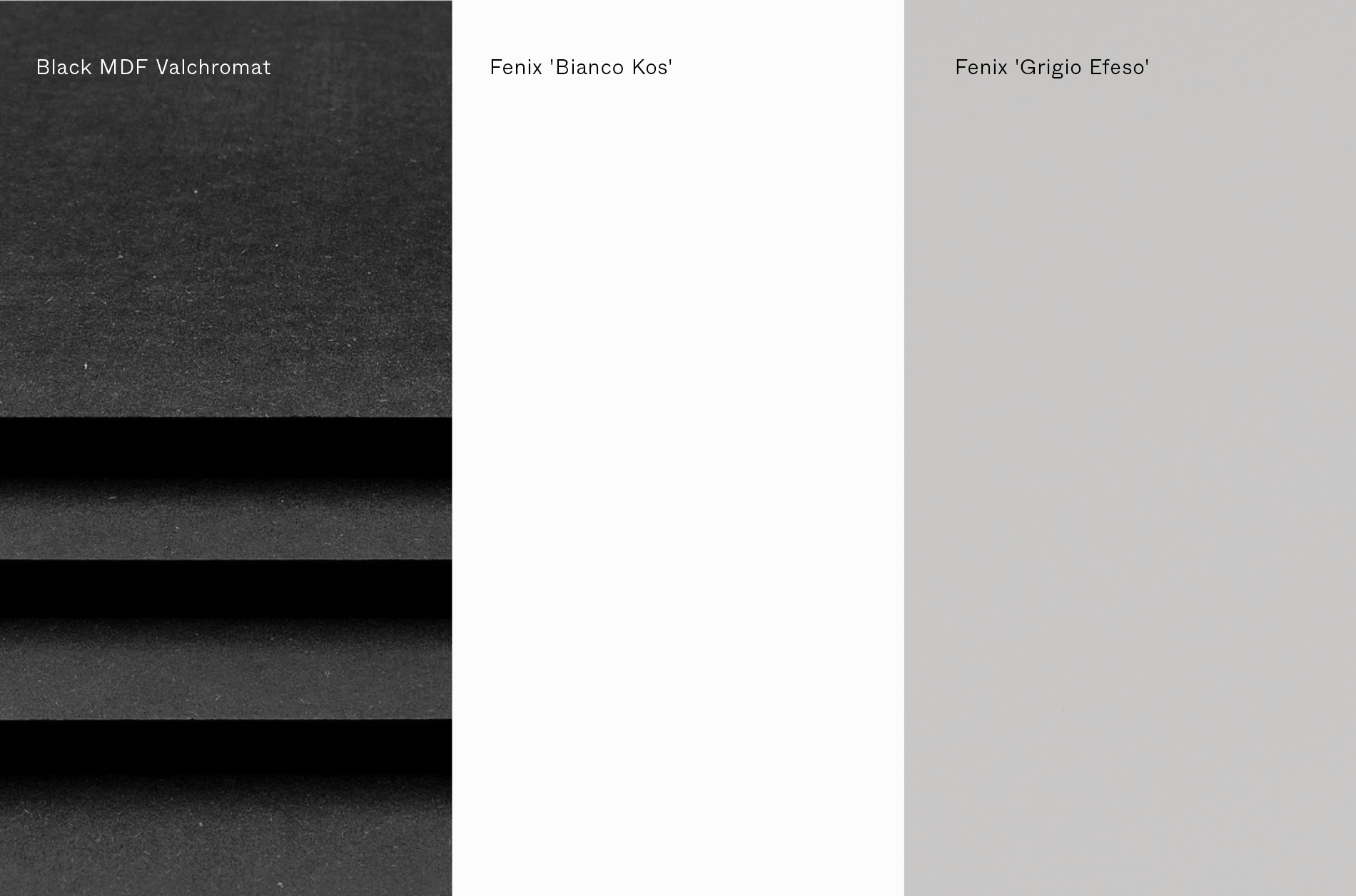
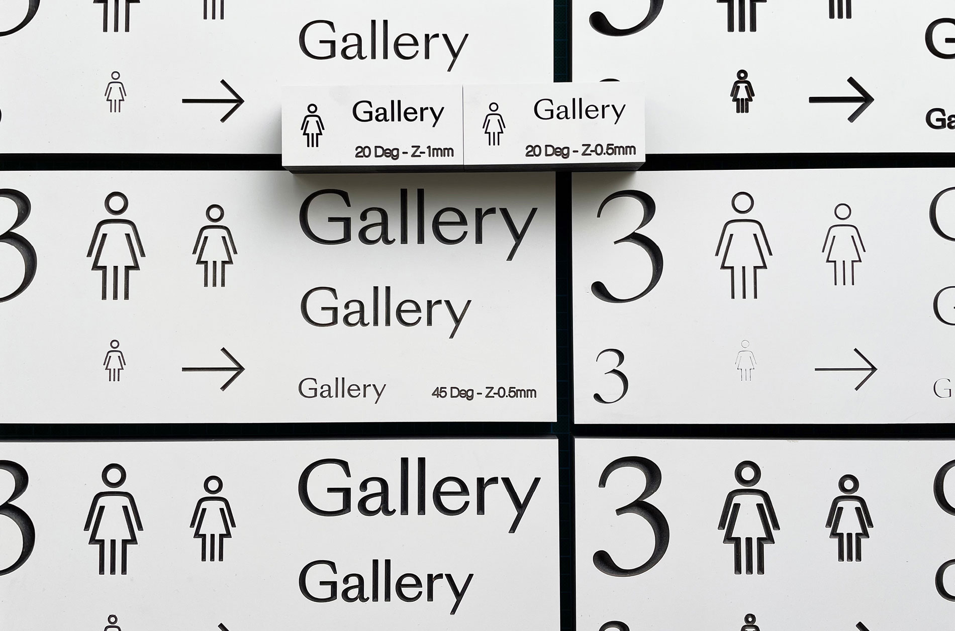
Aesthetically, the design of the physical signage reflected the various materials in use throughout the building so they felt incorporated and note a retrospective afterthought.
A non disruptive application techniques was developed that also allowed for the signs to be edited to support specific exhibitions as well as moved when large artworks were being installed.
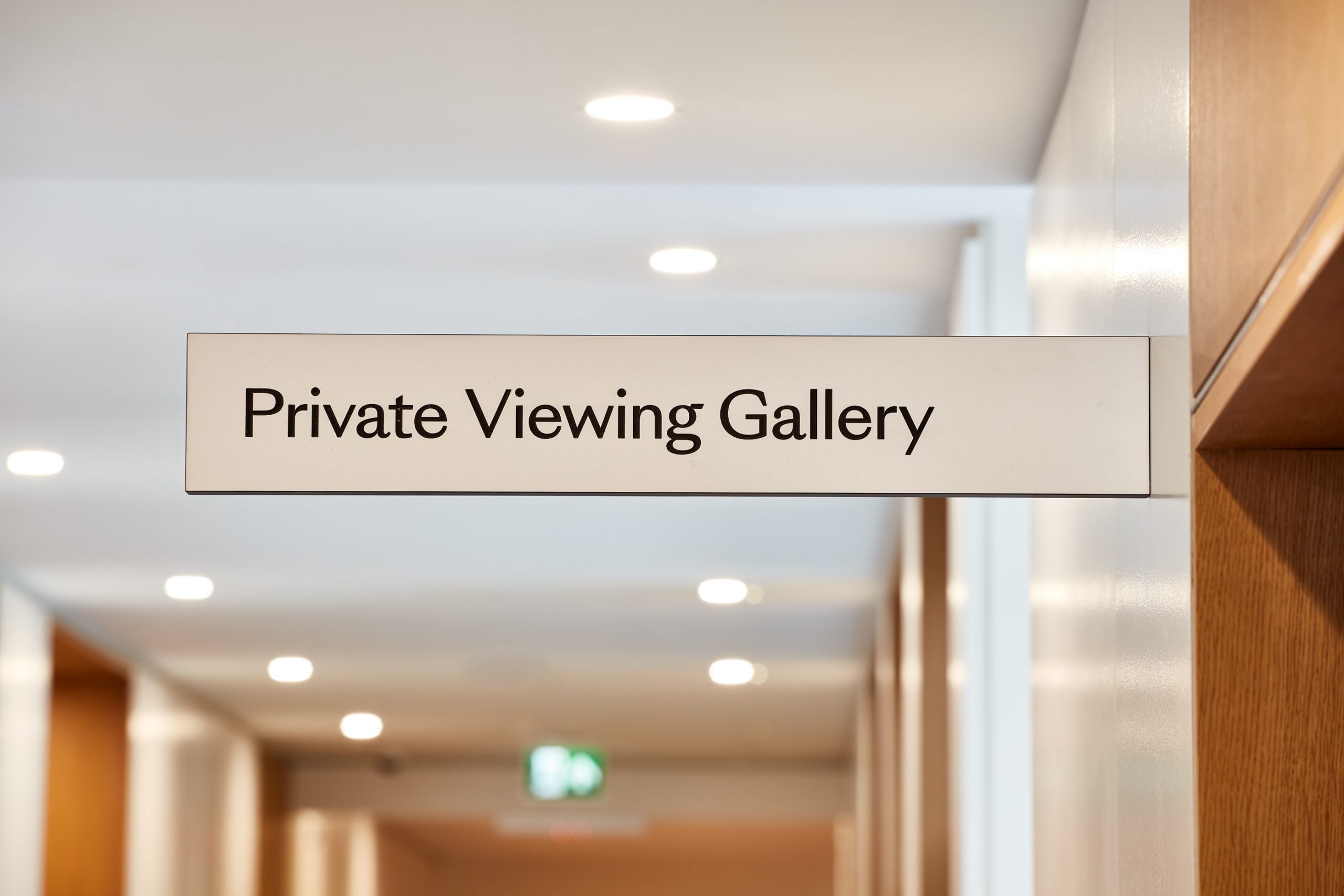
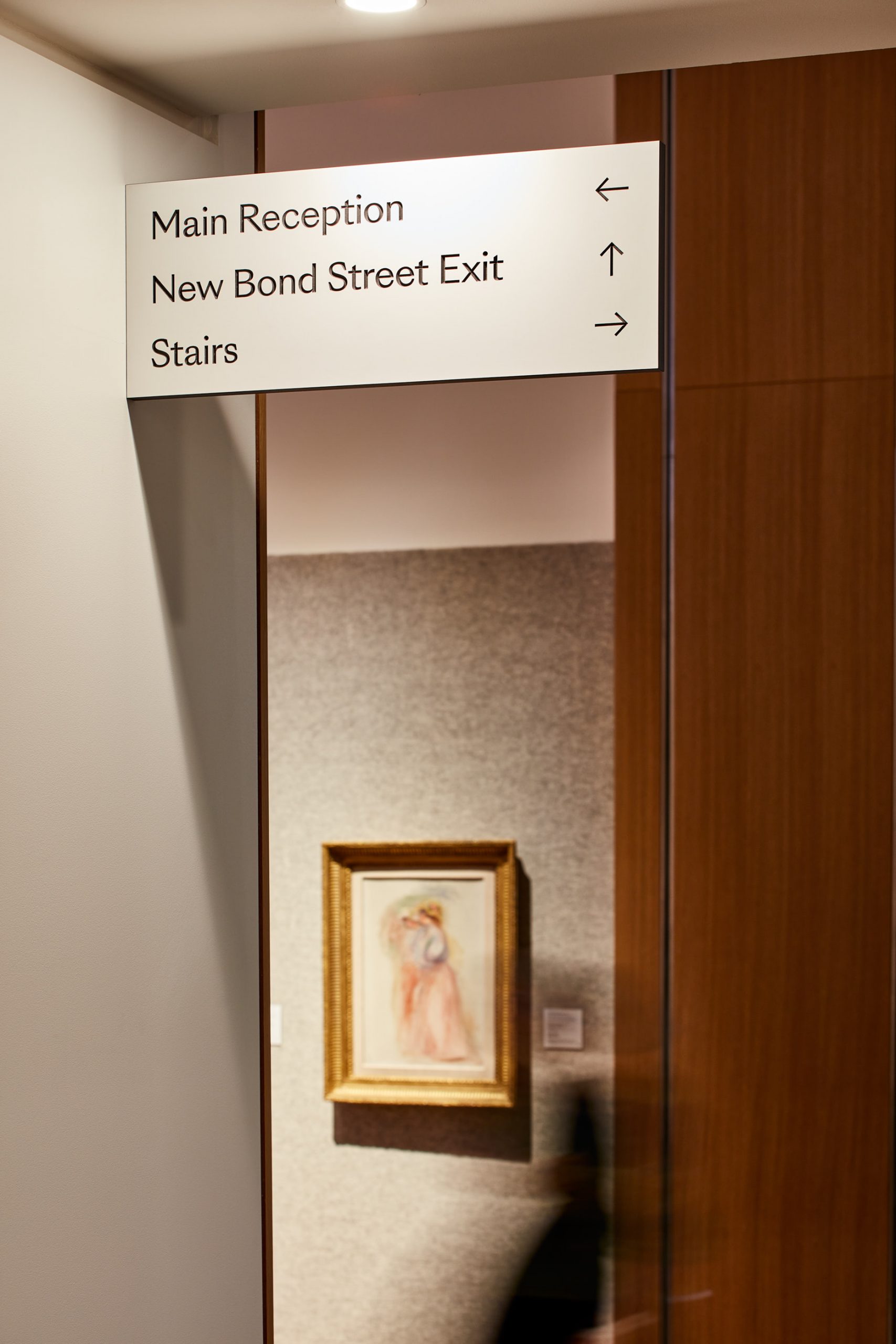
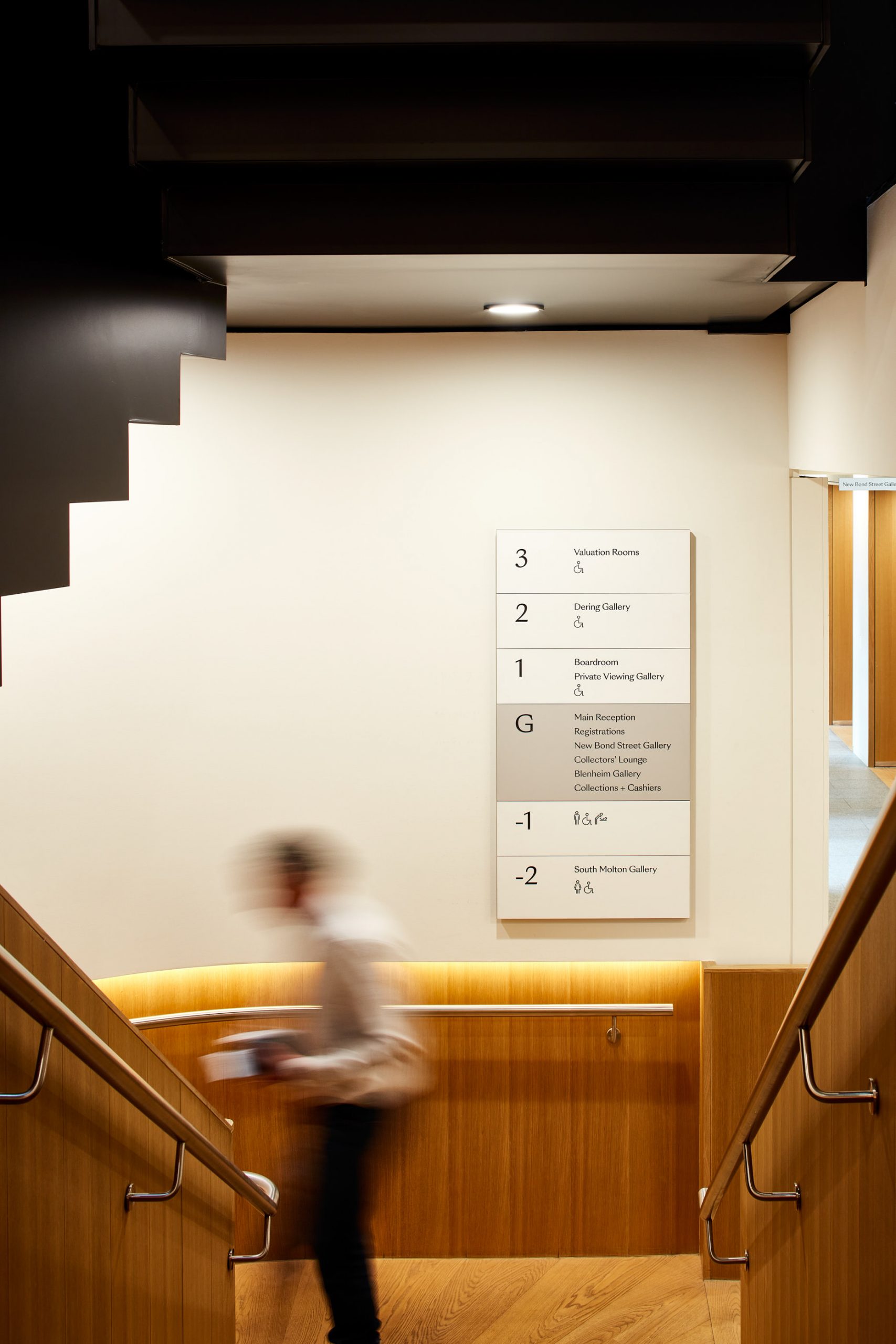
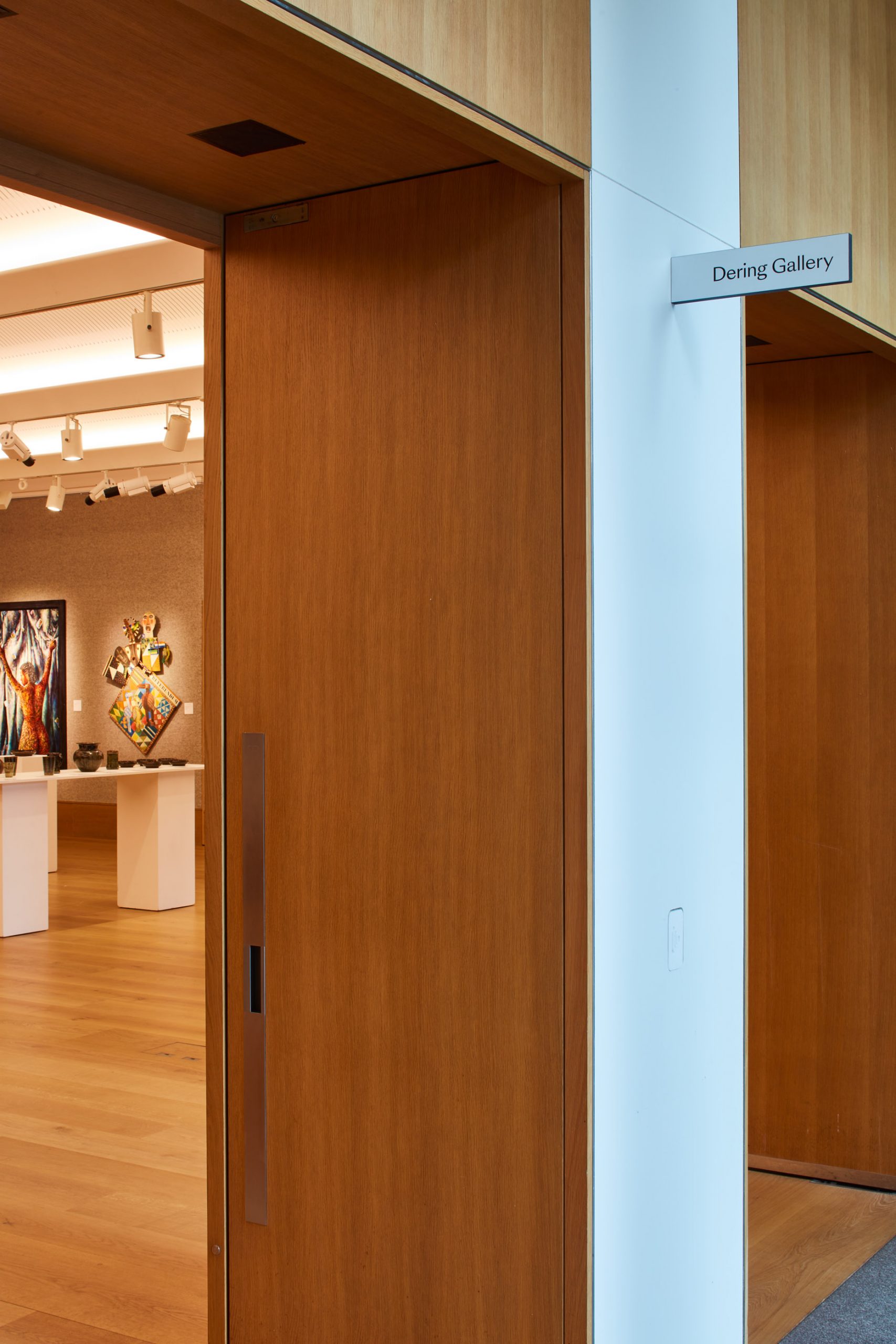
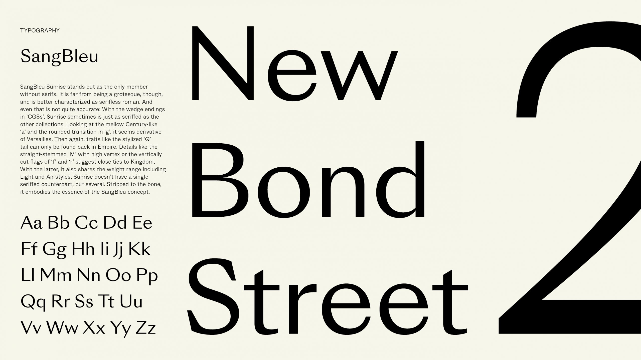
For the typography we utilised a sans-serif cut of the Bonhams brand font SangBleu by Swiss Typefaces. Our chosen cut ‘Sunrise Regular’ provided us with clarity and an aesthetic that was stylistically similar to traditional stone letter carving, bridging the gap between legibility and character. “SangBleu appropriates the best from the past and transforms it into an effective tool set for the aesthetic and technical environment of our day and age.”
The final production consisted CNC’d typography into Fenix laminated black Valchromat.
Gallery View
Bonhams
The project started with a consultation with key members of staff to establish key areas of focus.
One important outcome was the naming of the three sale rooms so they would be easily identifiable from one another and have their own autonomy. Previously they had simply been numbered.
Following this, extensive user journey planning was conducted and refined so clear and intuitive routes could be created throughout the public areas allowing people to orient themselves within the physical space and easily navigate from place to place.
A particular challenge as the building itself is made up of an original Georgian town house and a 1930’s office building both brought together by a contemporary building completed in 2013.
Aesthetically, the design of the physical signage reflected the various materials in use throughout the building so they felt incorporated and note a retrospective afterthought.
A non disruptive application techniques was developed that also allowed for the signs to be edited to support specific exhibitions as well as moved when large artworks were being installed.
For the typography we utilised a sans-serif cut of the Bonhams brand font SangBleu by Swiss Typefaces. Our chosen cut ‘Sunrise Regular’ provided us with clarity and an aesthetic that was stylistically similar to traditional stone letter carving, bridging the gap between legibility and character. “SangBleu appropriates the best from the past and transforms it into an effective tool set for the aesthetic and technical environment of our day and age.”
The final production consisted CNC’d typography into Fenix laminated black Valchromat.