Hayhurst & Co Architects
Re-brand and website design for Hayhurst & Co, a RIBA award winning architectural practice based in London.
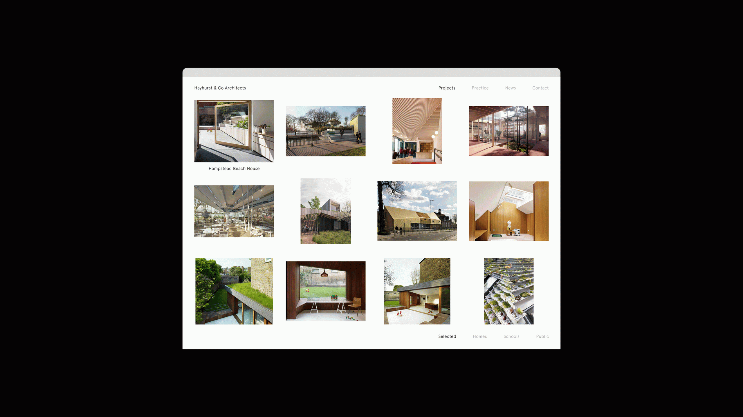
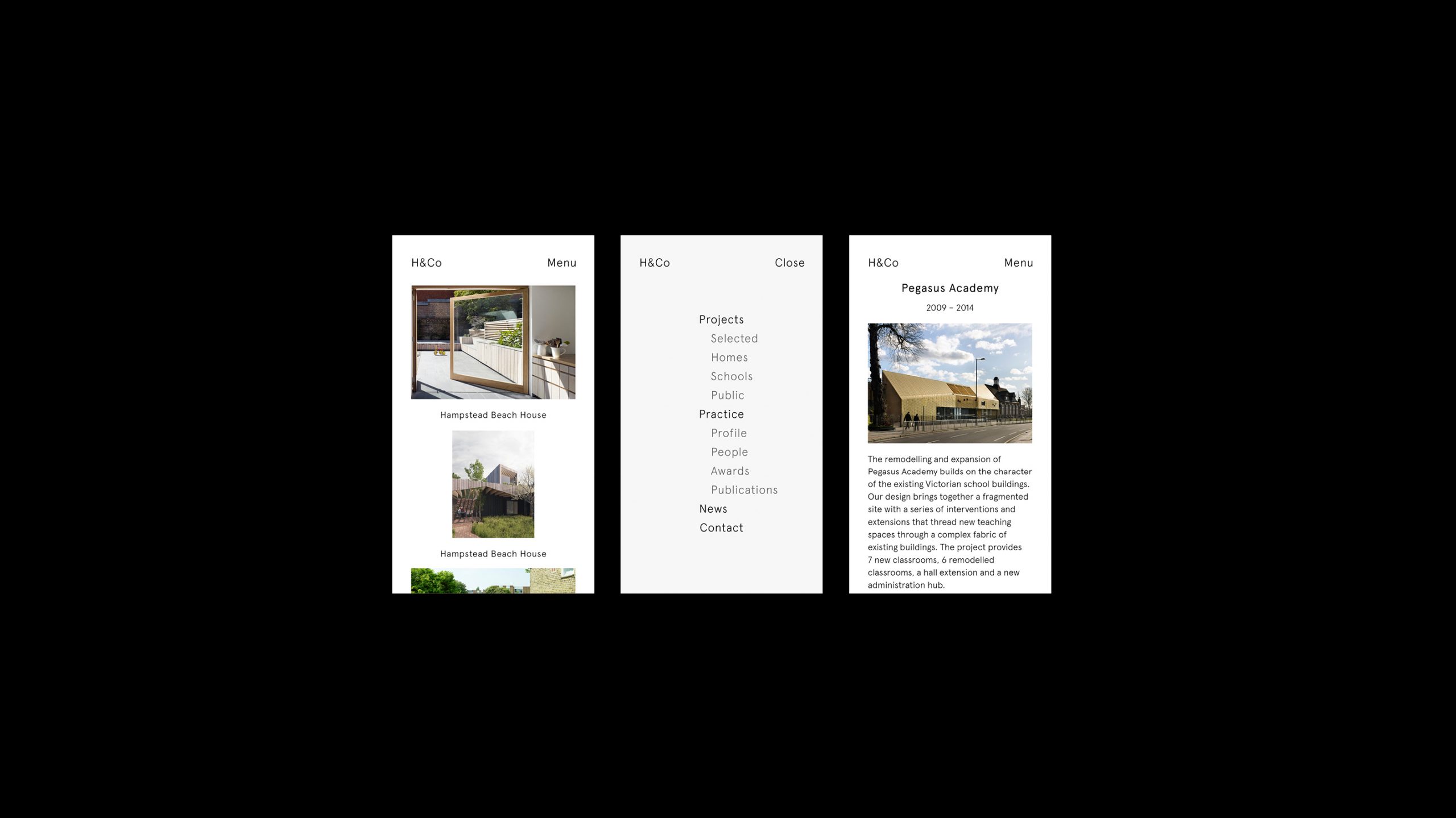
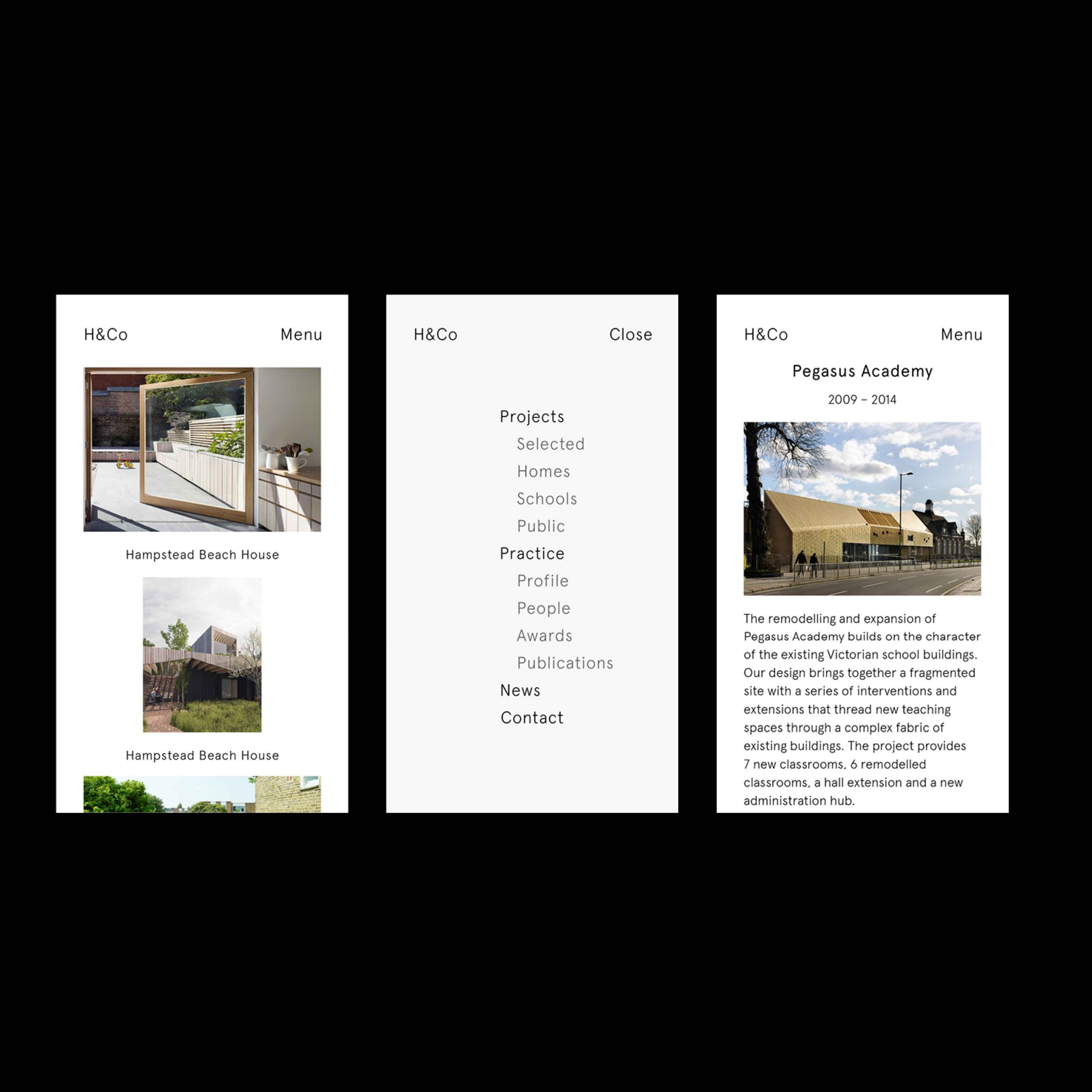
The task was to build a website that showcased a diverse and extensive portfolio in a refined and concise manner. The modular concept for the individual project pages means each project can hold a unique, editorial appearance.
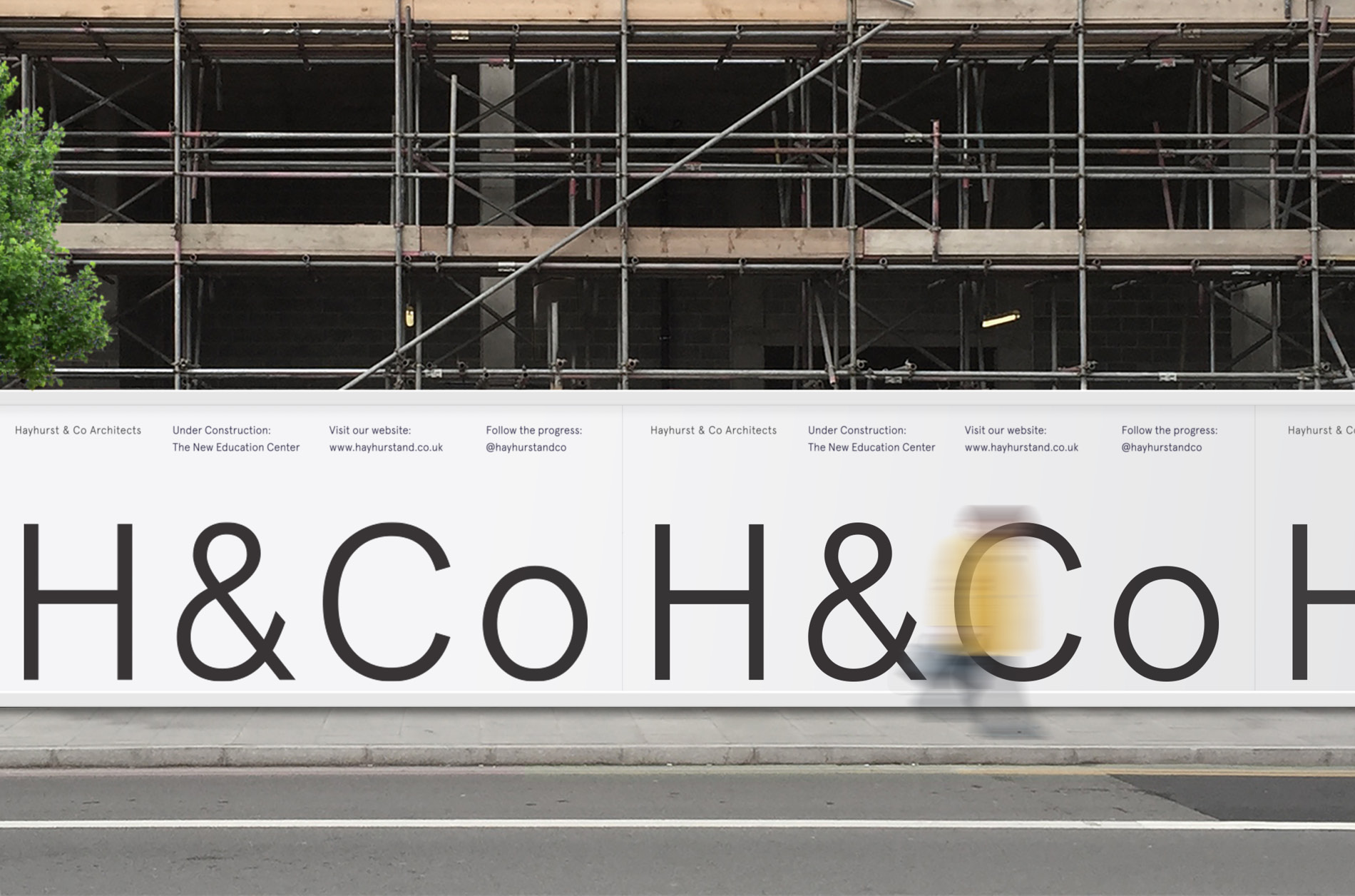
The logotype and monogram aimed to achieve a refined sense of clarity and were a direct result of the ‘form follows function’ approach. It was imperative that the visual language let the diverse portfolio shine and didn’t imply an overbearing aesthetic. This understated tone of voice was carried over to printed material such as stationary, materials, presentation documents and brochures.
‘Through our diverse portfolio, we have established a reputation for designing environments that are sensitive and sustainable, innovative and humane, and refined and delightful. We are interested in designing environments that enable and support communities, and spaces that respond inventively and pragmatically to patterns of life and physical contexts. There isn’t a ‘look’ to our projects: each design is unique and tailored to respond to the people our projects are for, the site the space will sit in and the budget available.’
Hayhurst & Co Architects


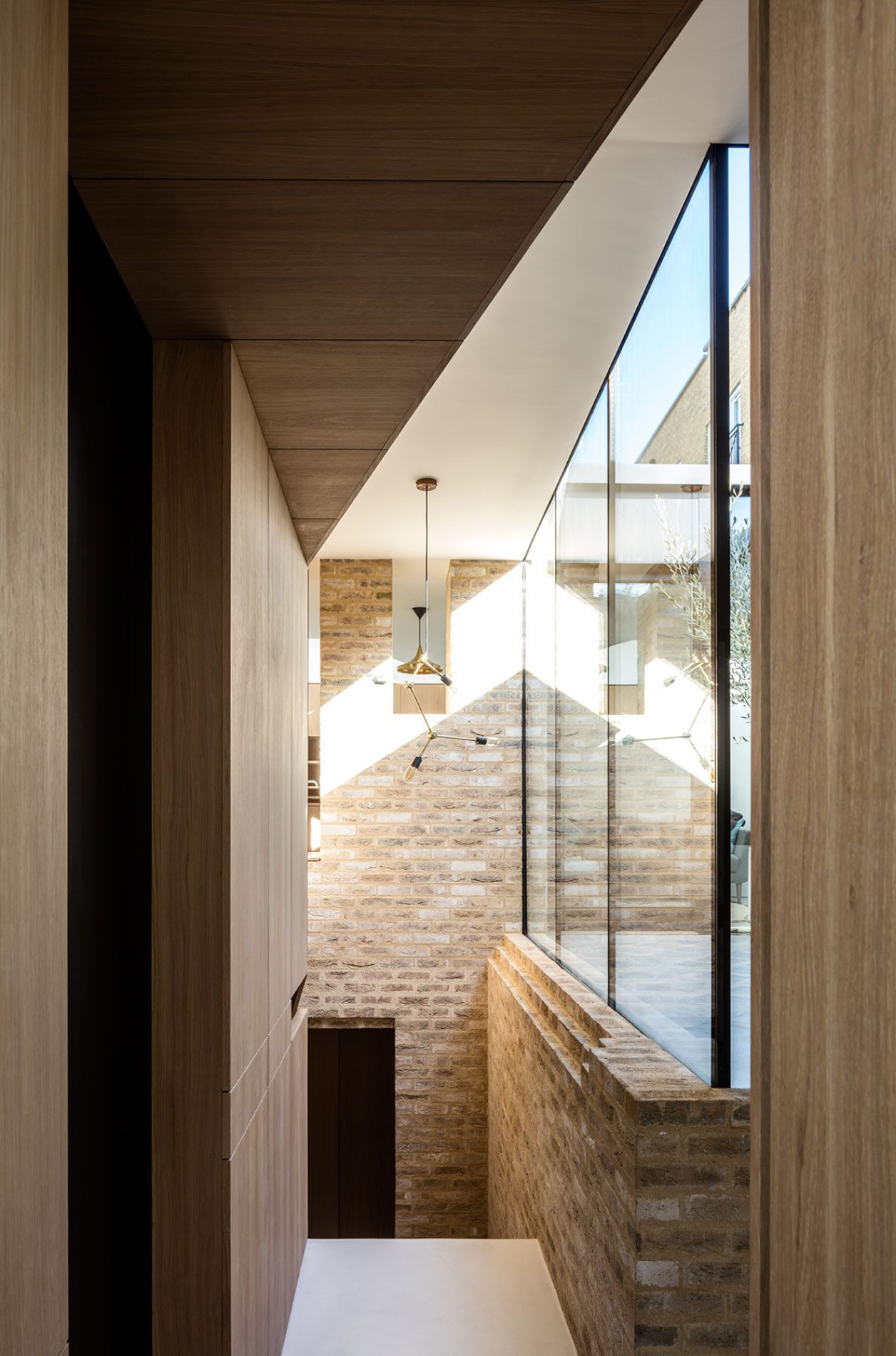
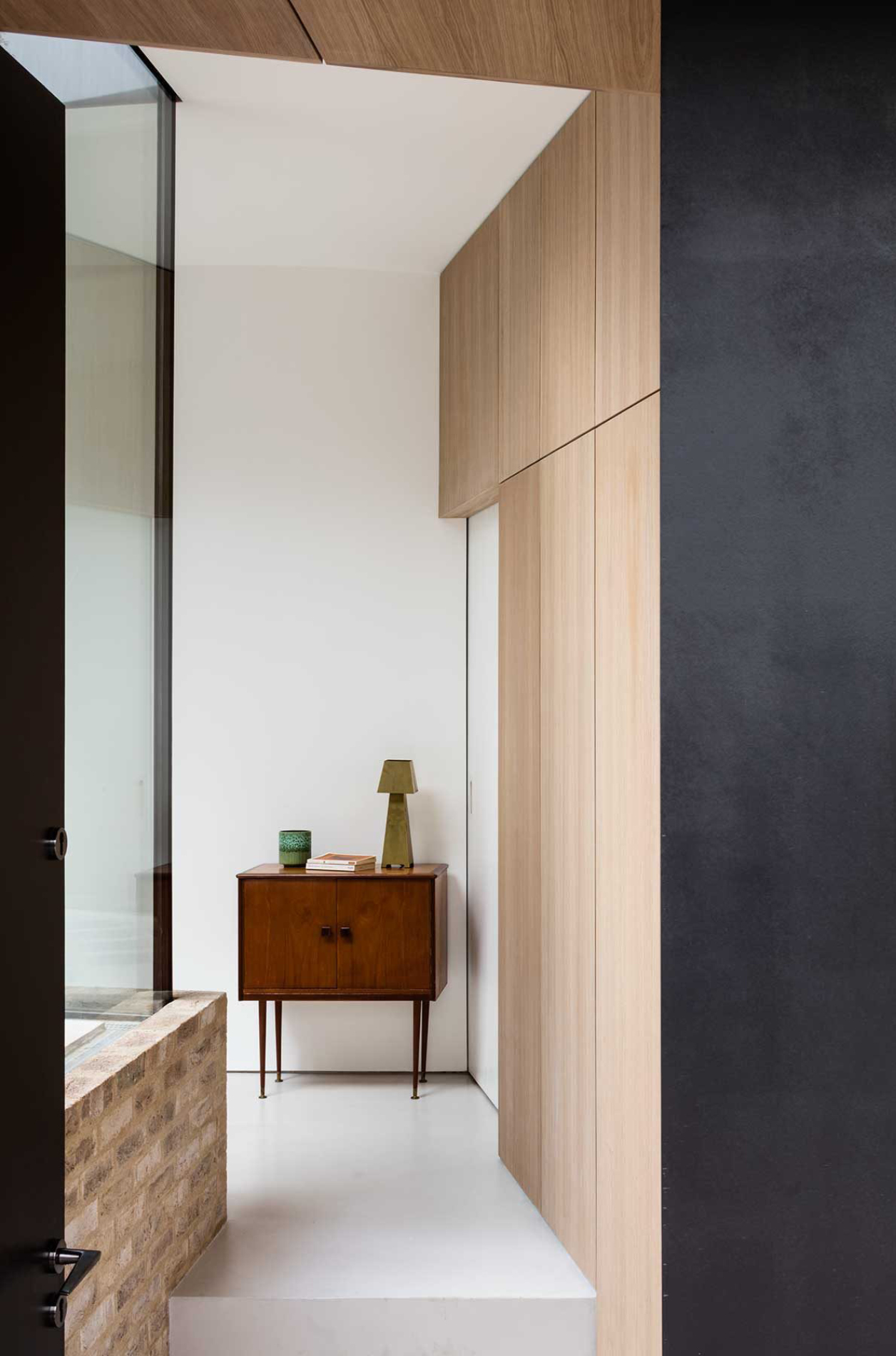
White space is a prominent tool applied throughout all of the digital and physical assets. We wanted to reflect the practices approach to architecture and emulate a sense of space and natural light.


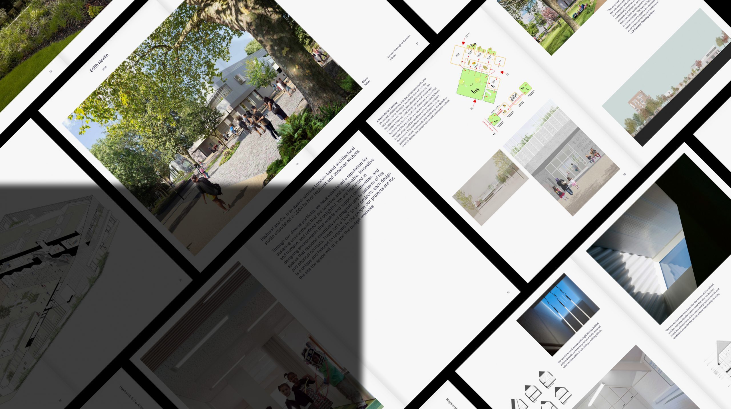


We used a subtle selection of embossed paper surfaces inspired by construction materials to give all printed assets a feel of extra consideration and differentiation.


Gallery View
Hayhurst & Co Architects
White space is a prominent tool applied throughout all of the digital and physical assets. We wanted to reflect the practices approach to architecture and emulate a sense of space and natural light.
We used a subtle selection of embossed paper surfaces inspired by construction materials to give all printed assets a feel of extra consideration and differentiation.