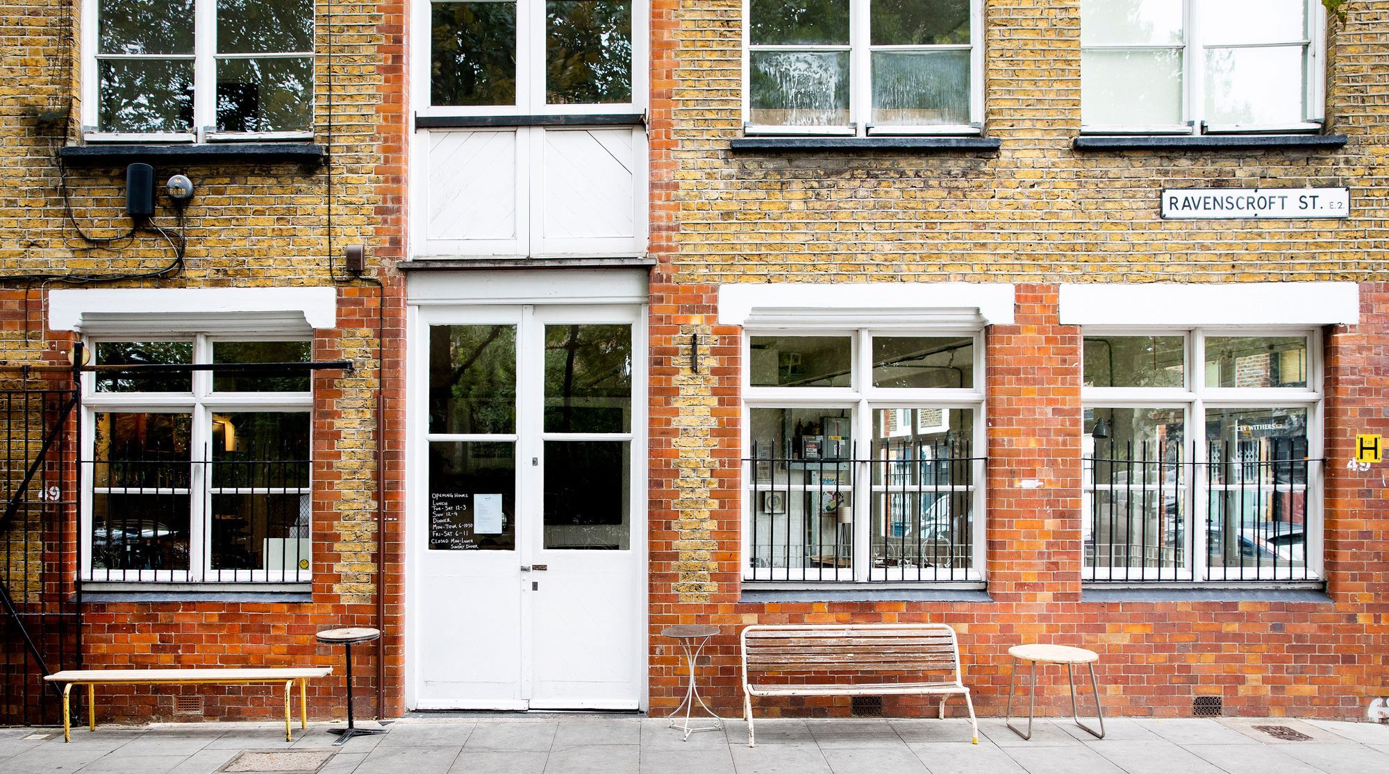
Brawn
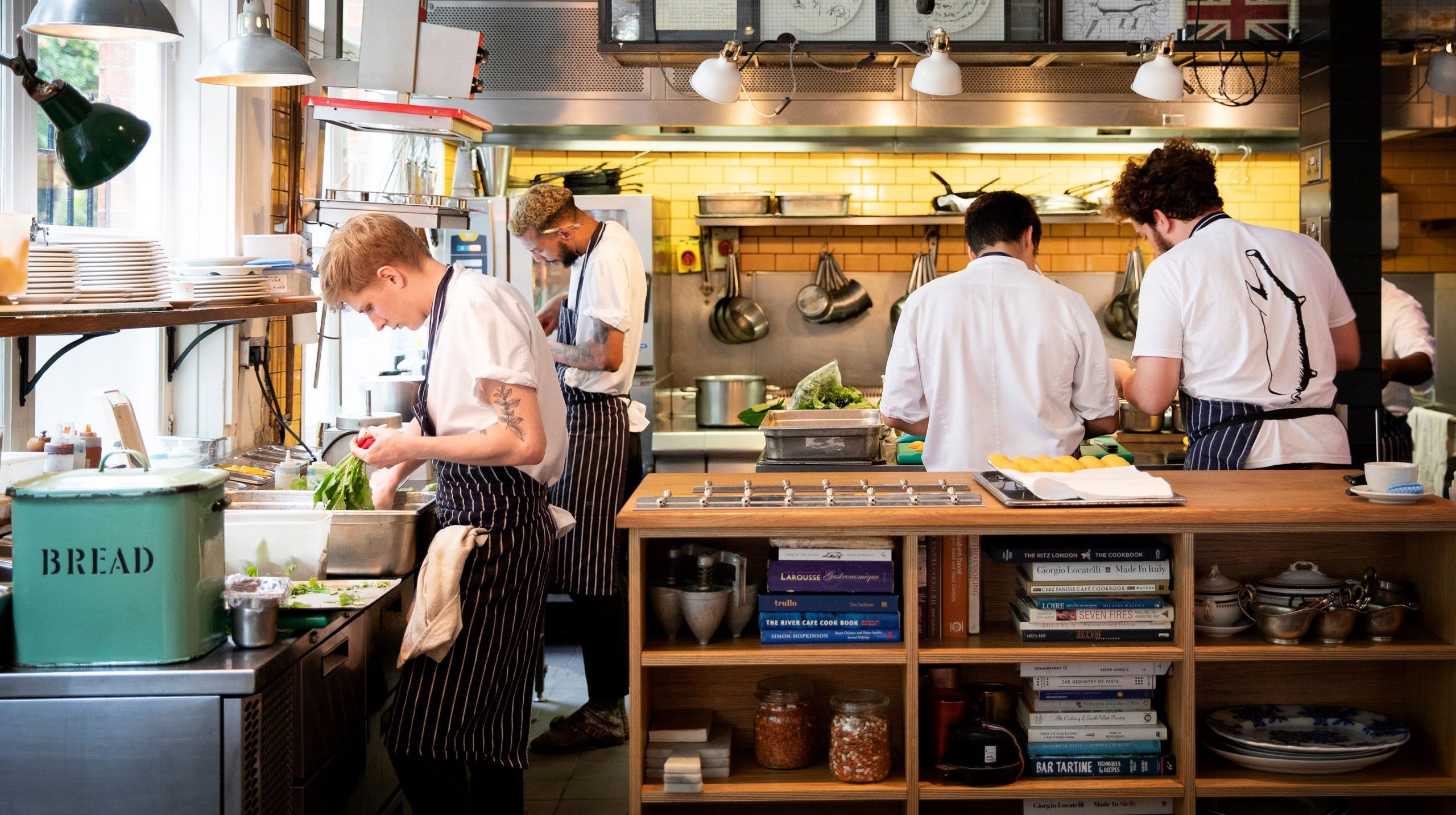
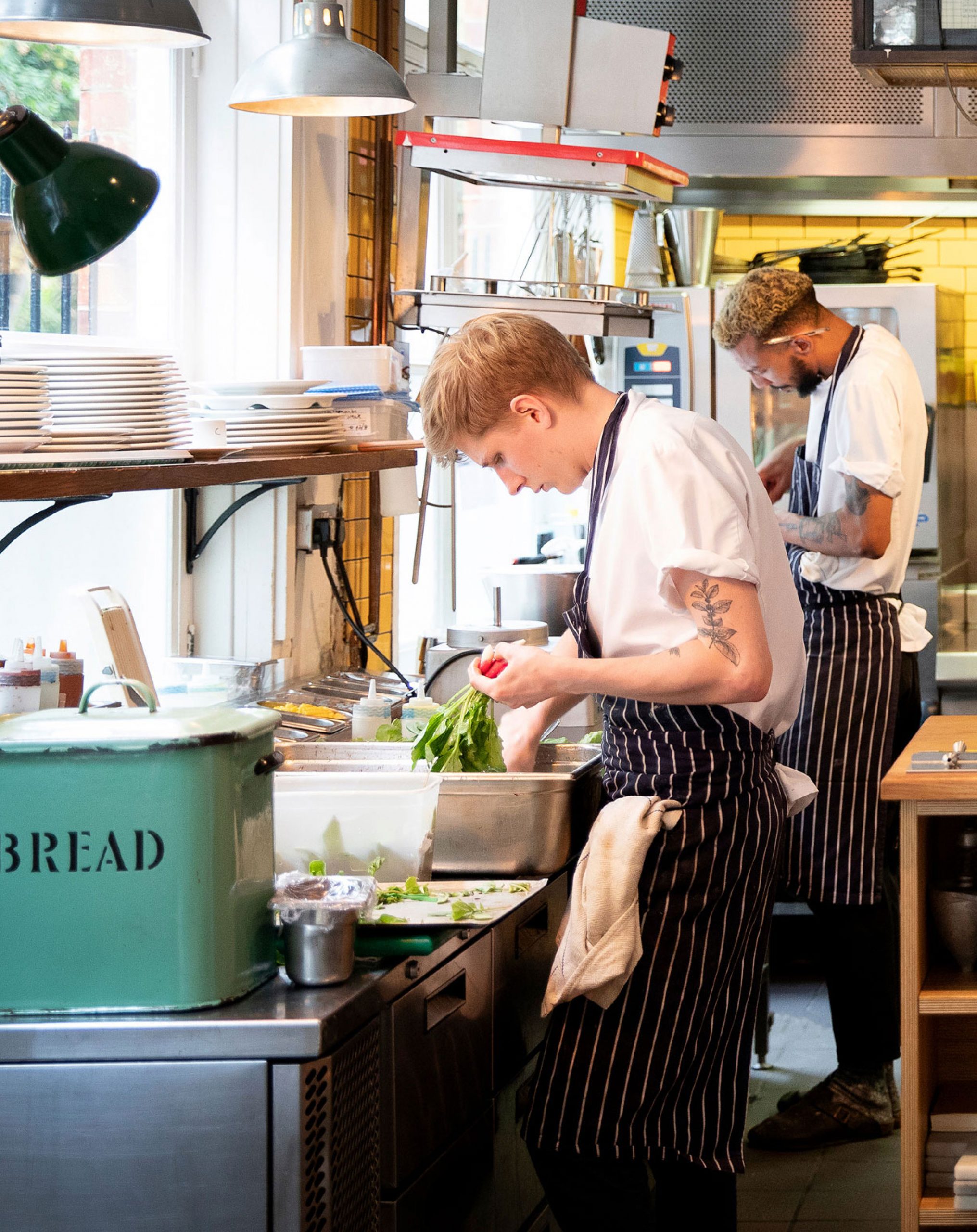
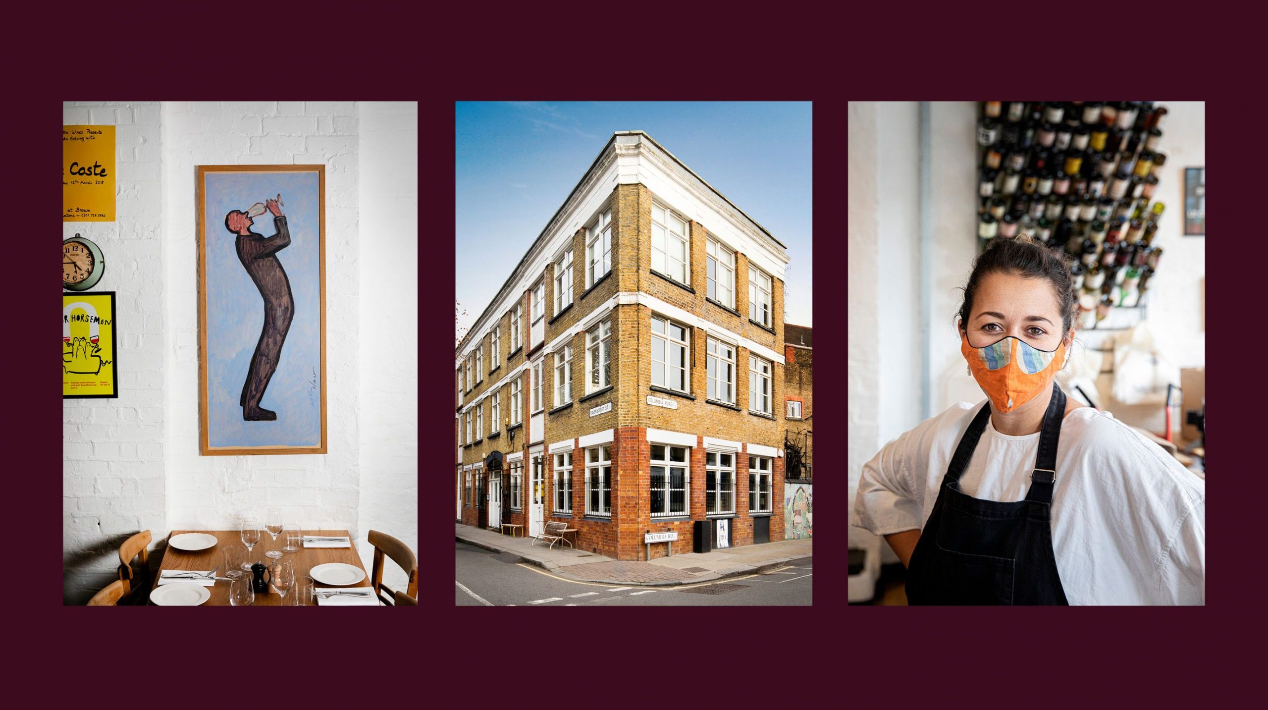
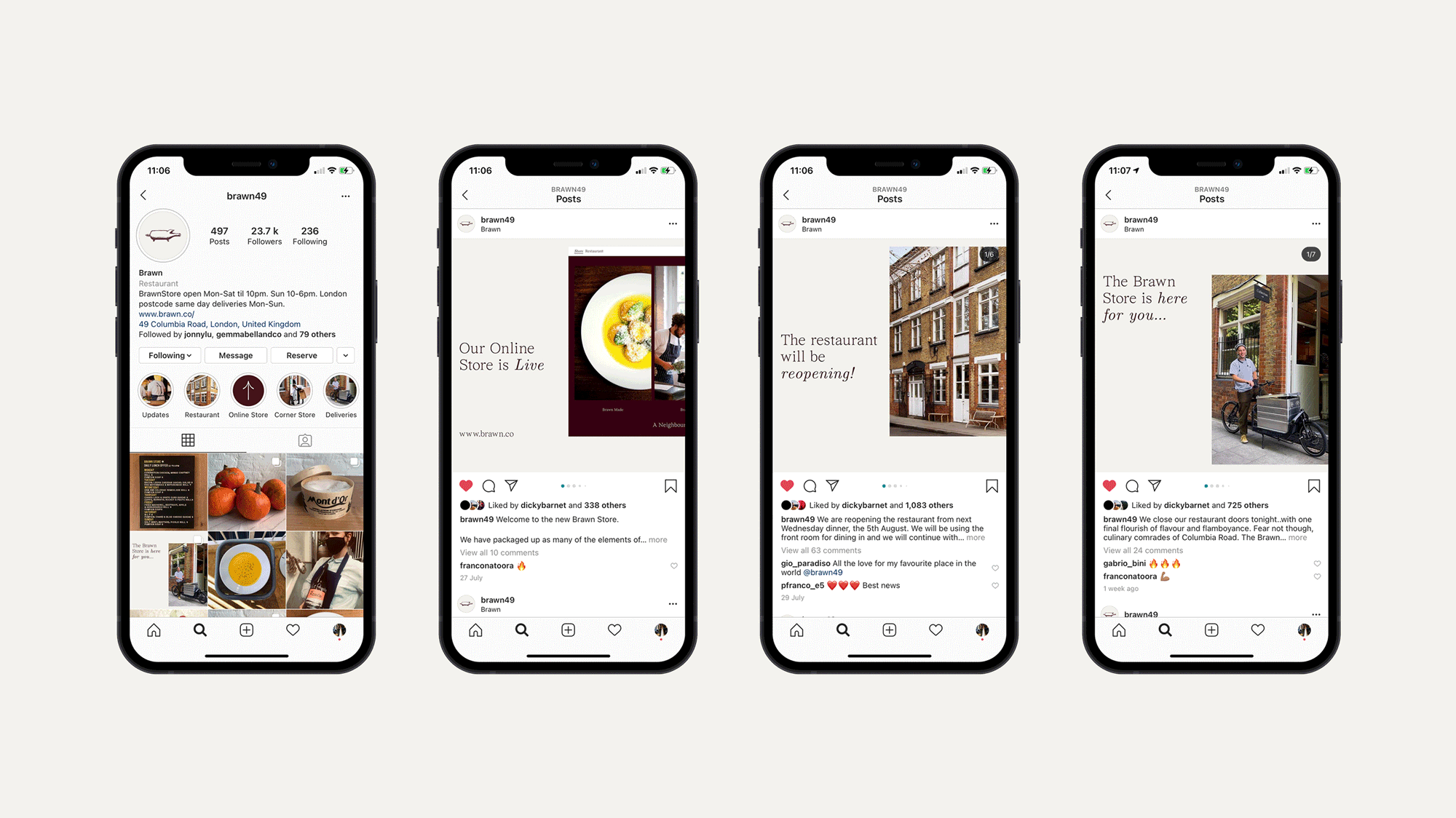
We were asked to help Brawn evolve and expand their offerings from a neighbourhood restaurant to an e-commerce platform, corner store and delivery service. During the transformation we developed a new extensive visual language that was applied across a range of touch points including website, packaging design, wayfinding and digital marketing.
Brawn

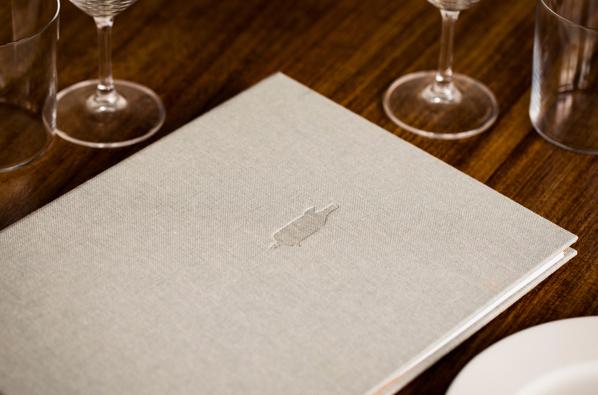
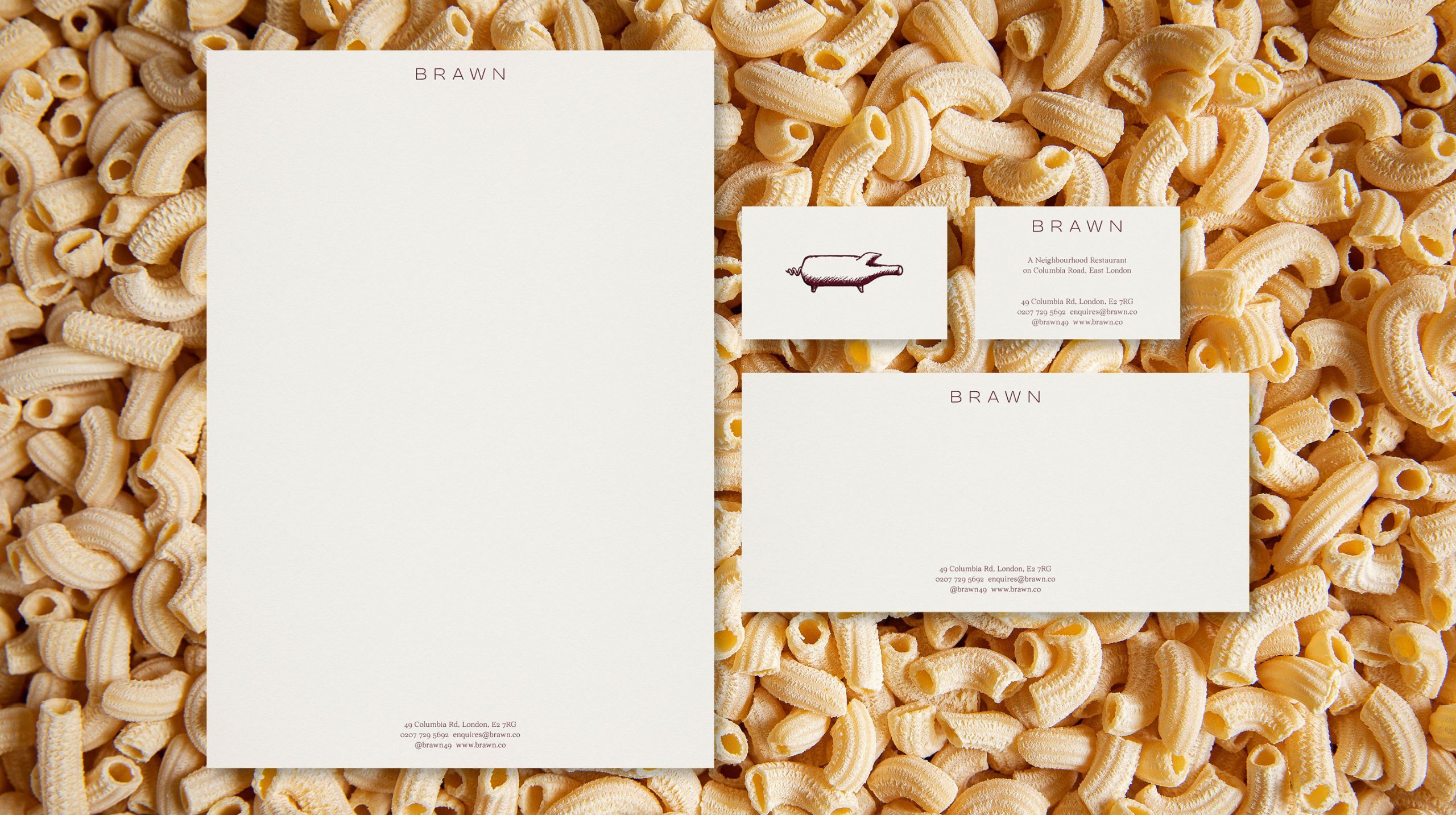
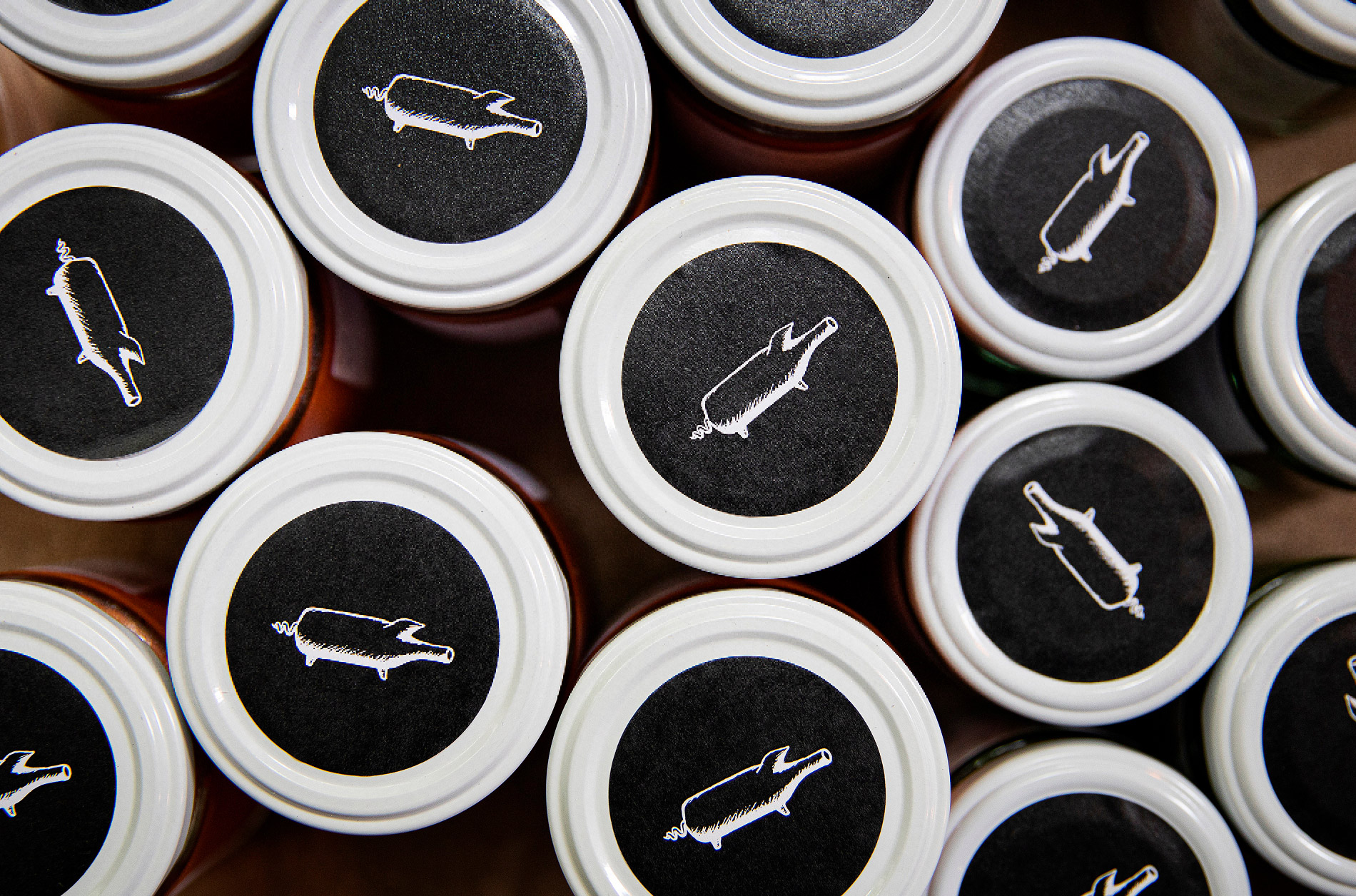
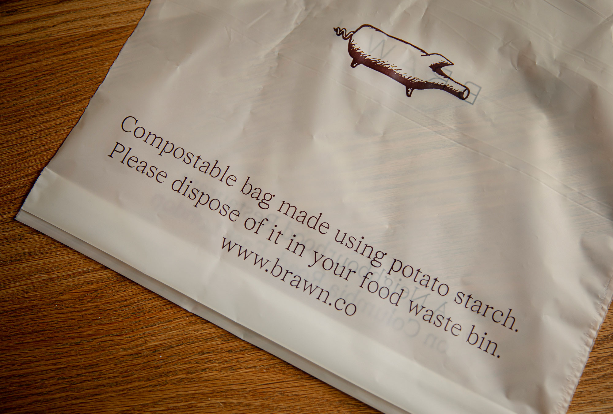
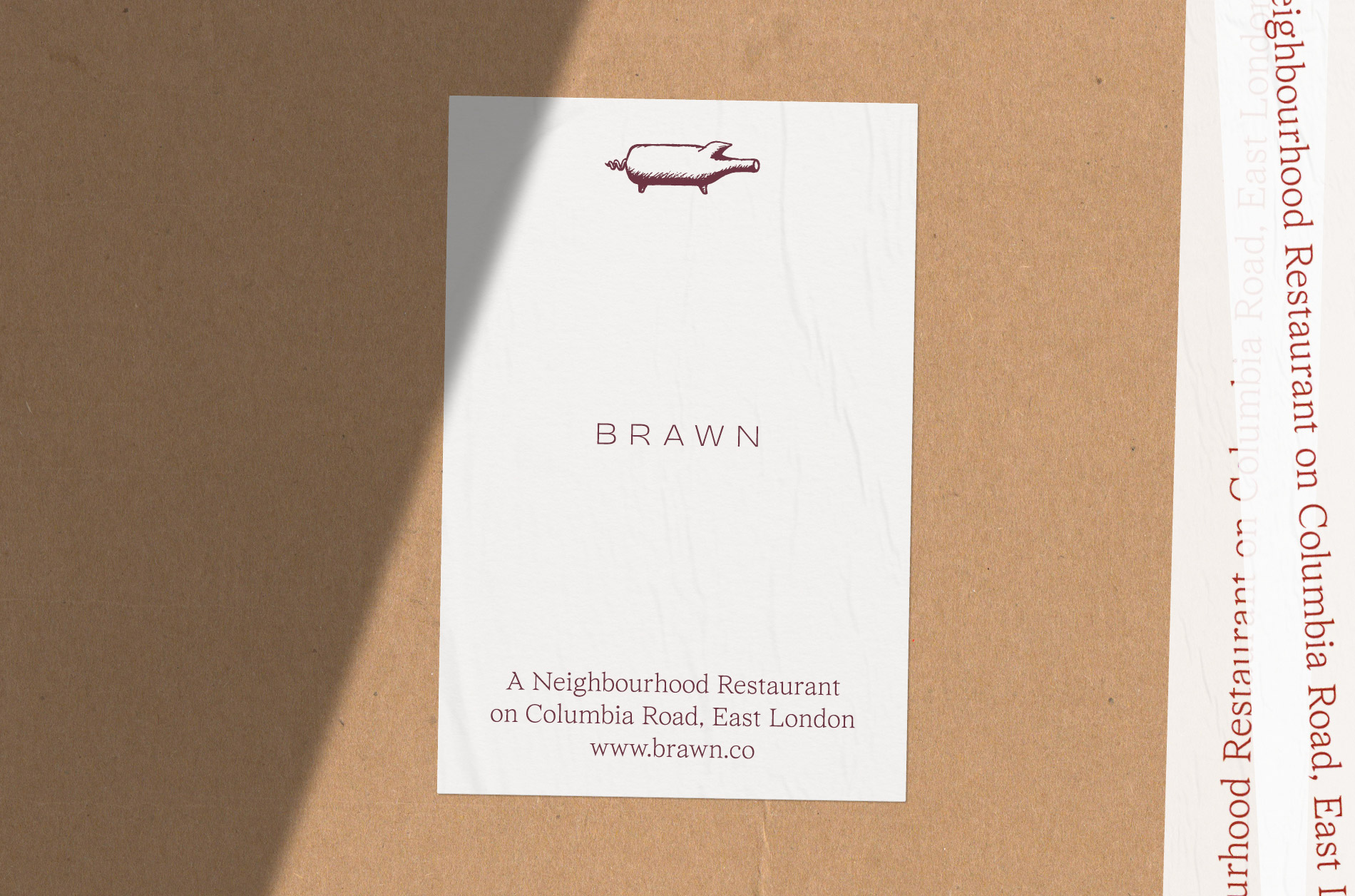
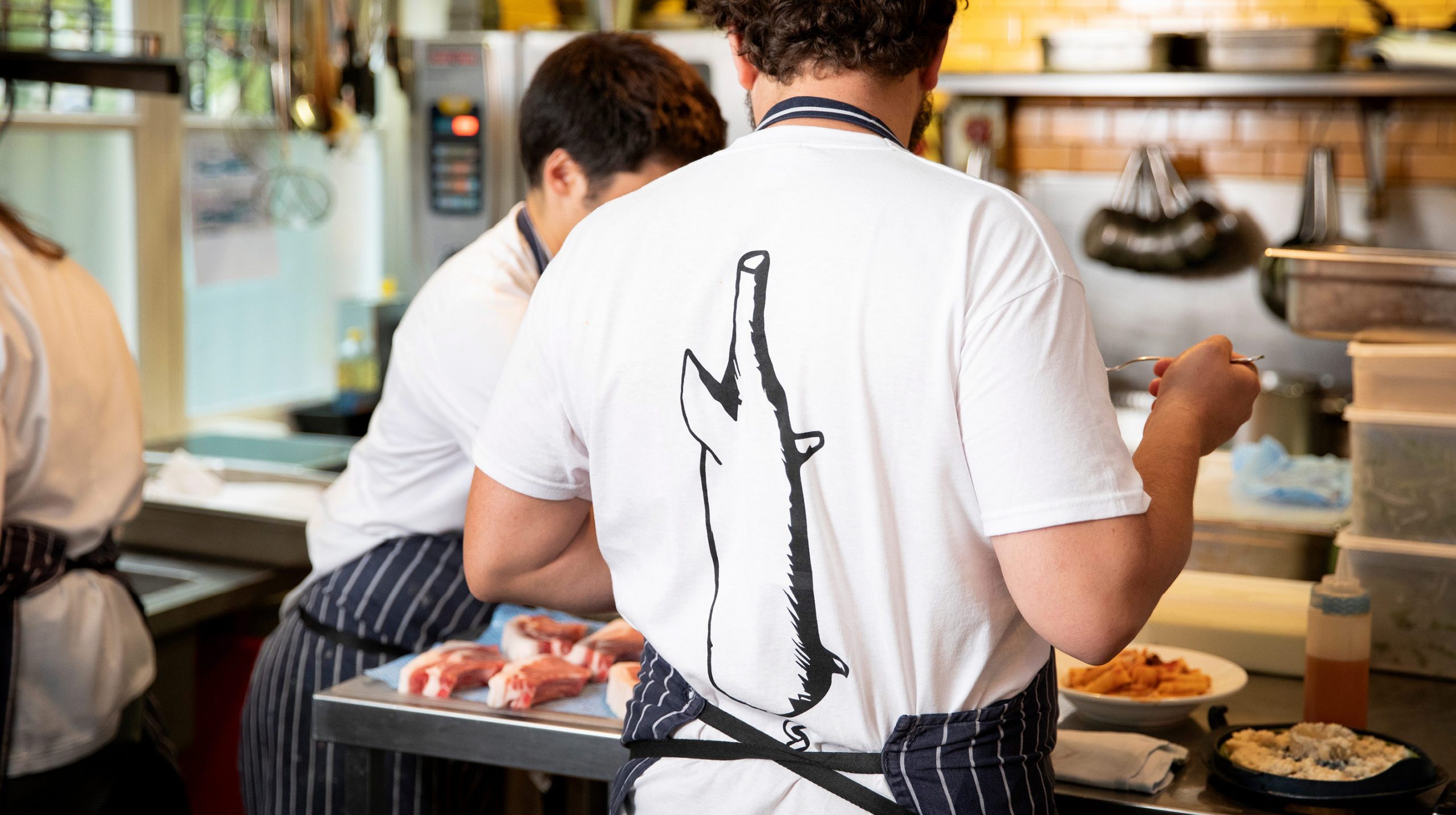
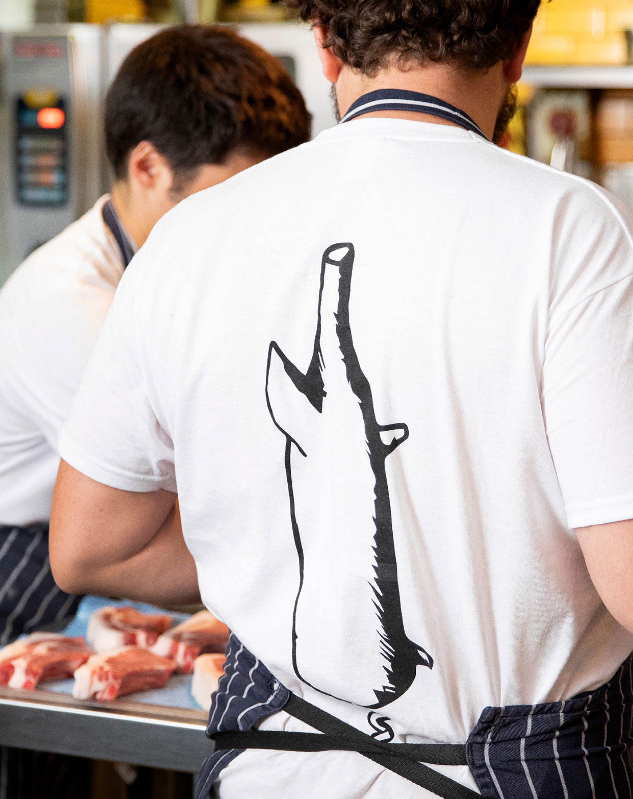
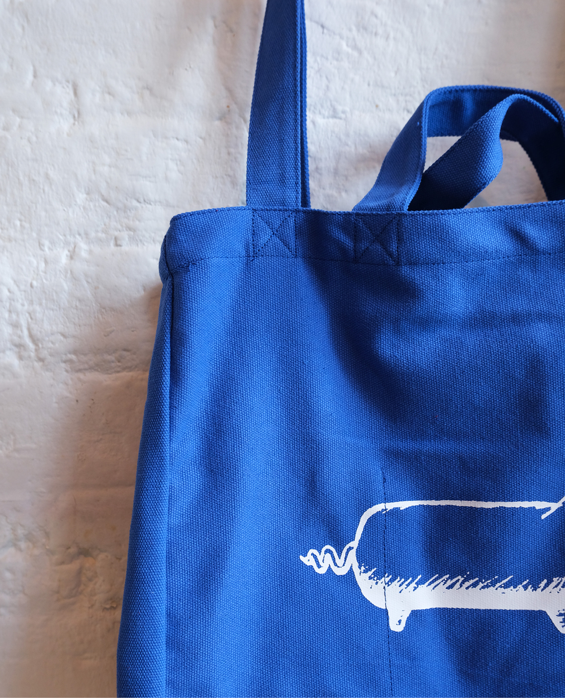
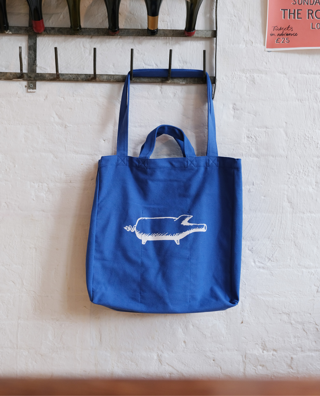
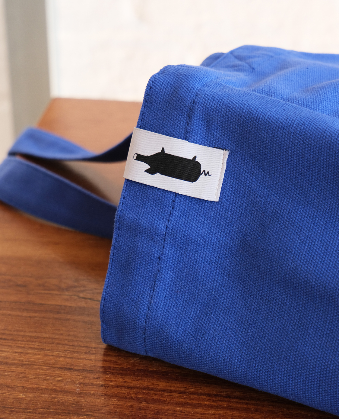
The pig symbol has always been synonymous with the restaurant and we felt it was an important visual element to retain within the new branding in order to pay homage to the past. We subtly adapted the illustration so it was usable across a wider range of digital and physical assets.
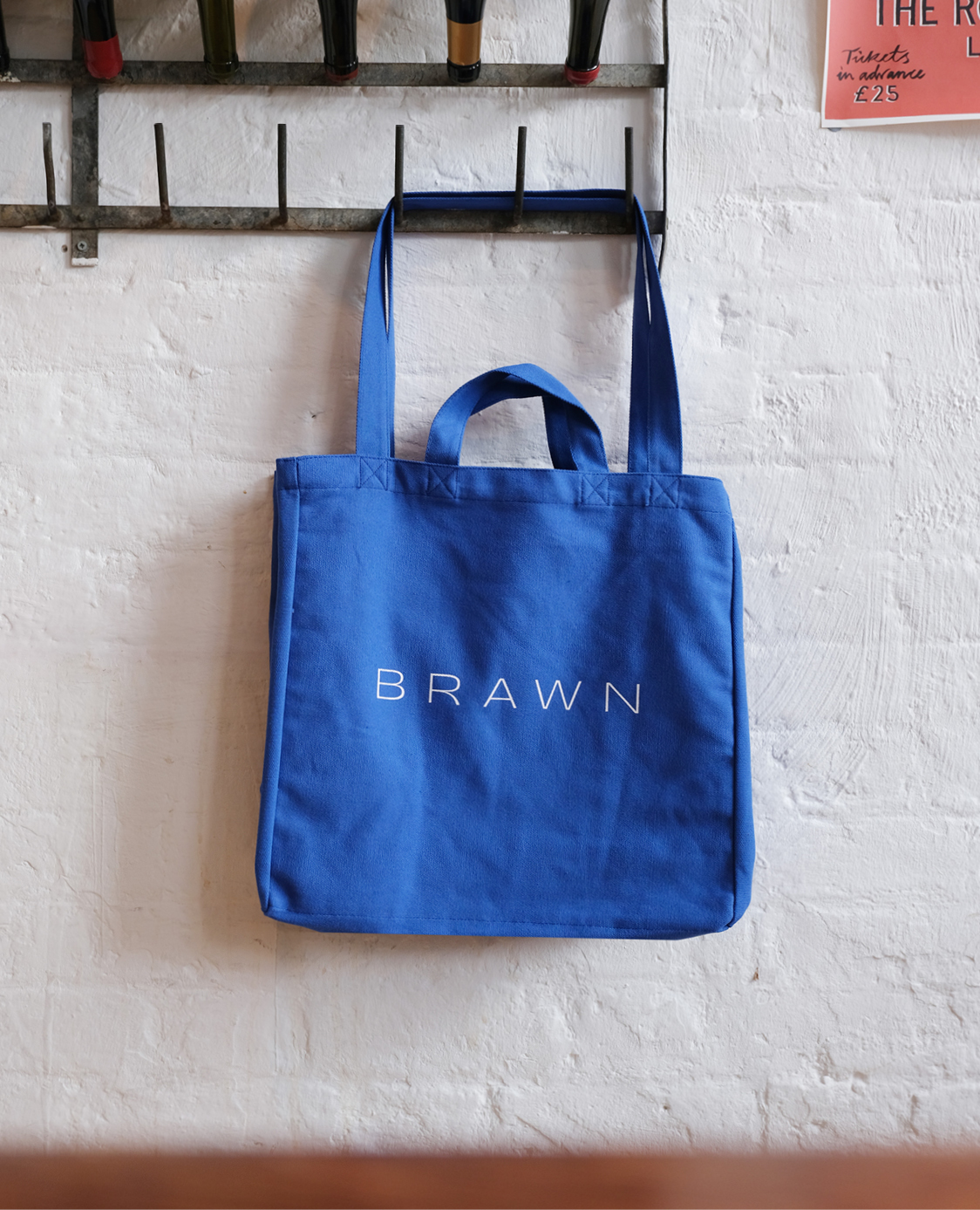
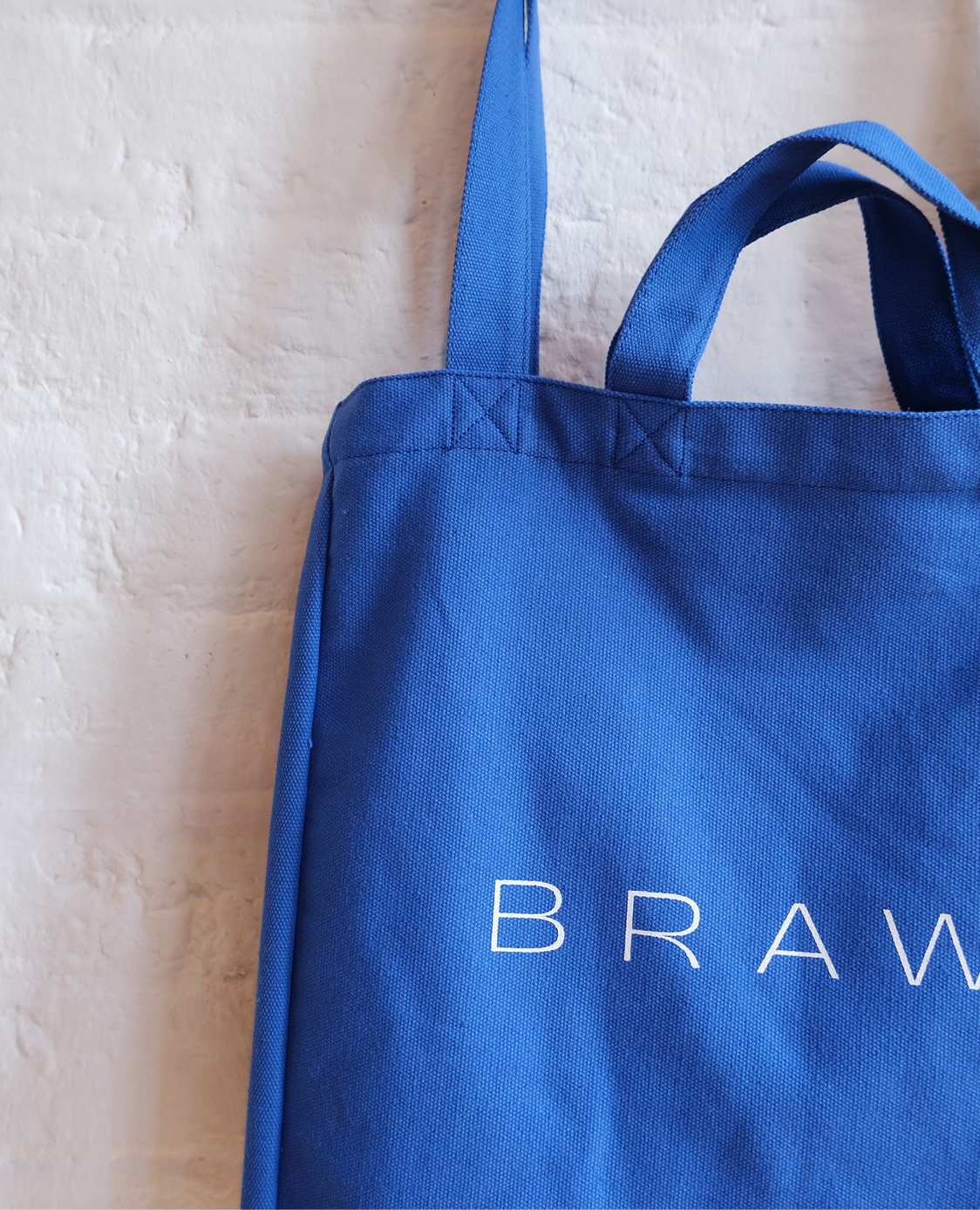
The new logotype’s proportions are also inspired by that of the pig. Although the two elements are often not used together they hold a similar form.
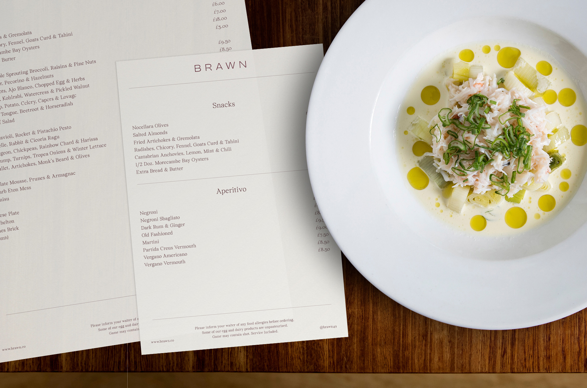
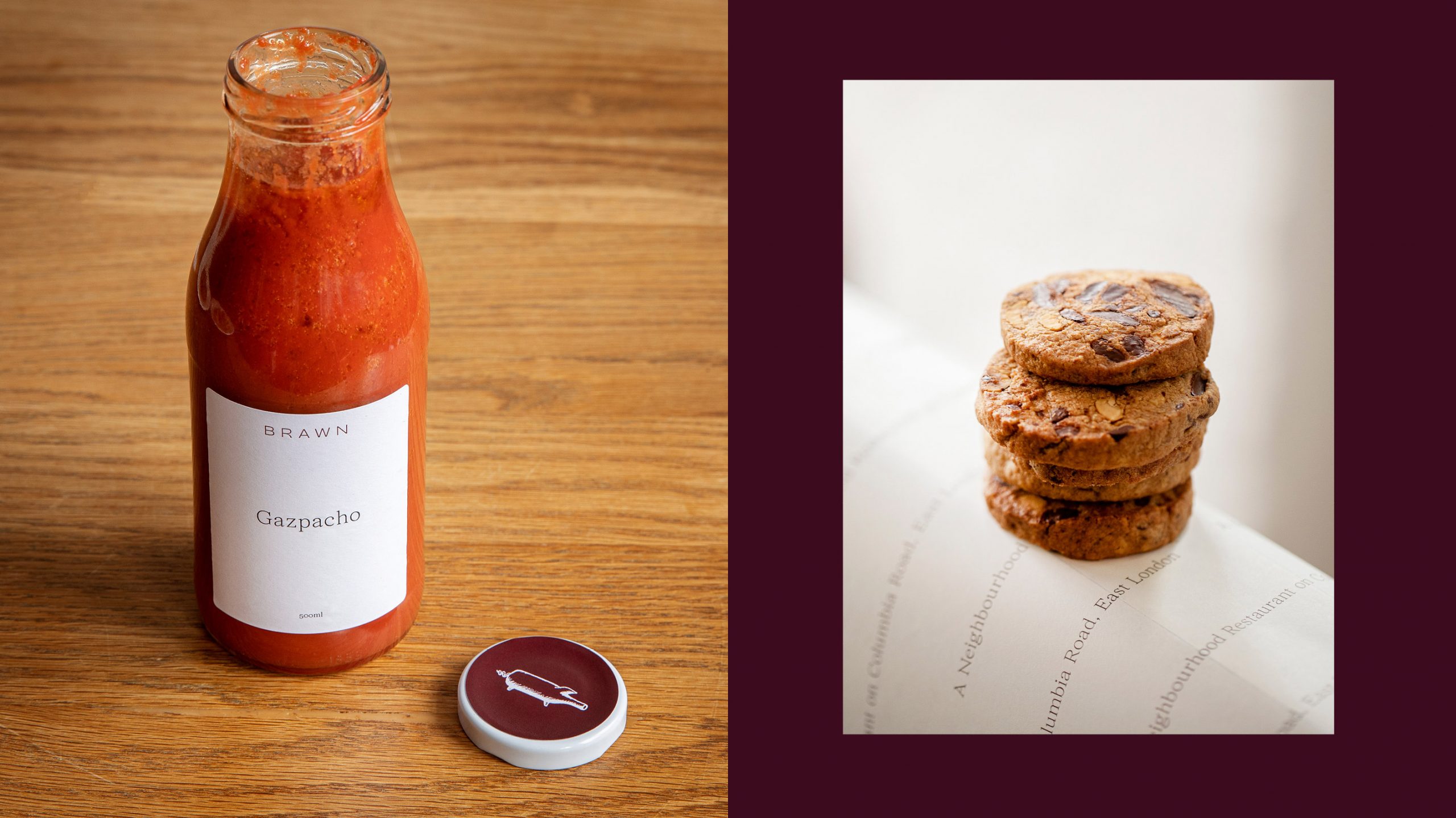
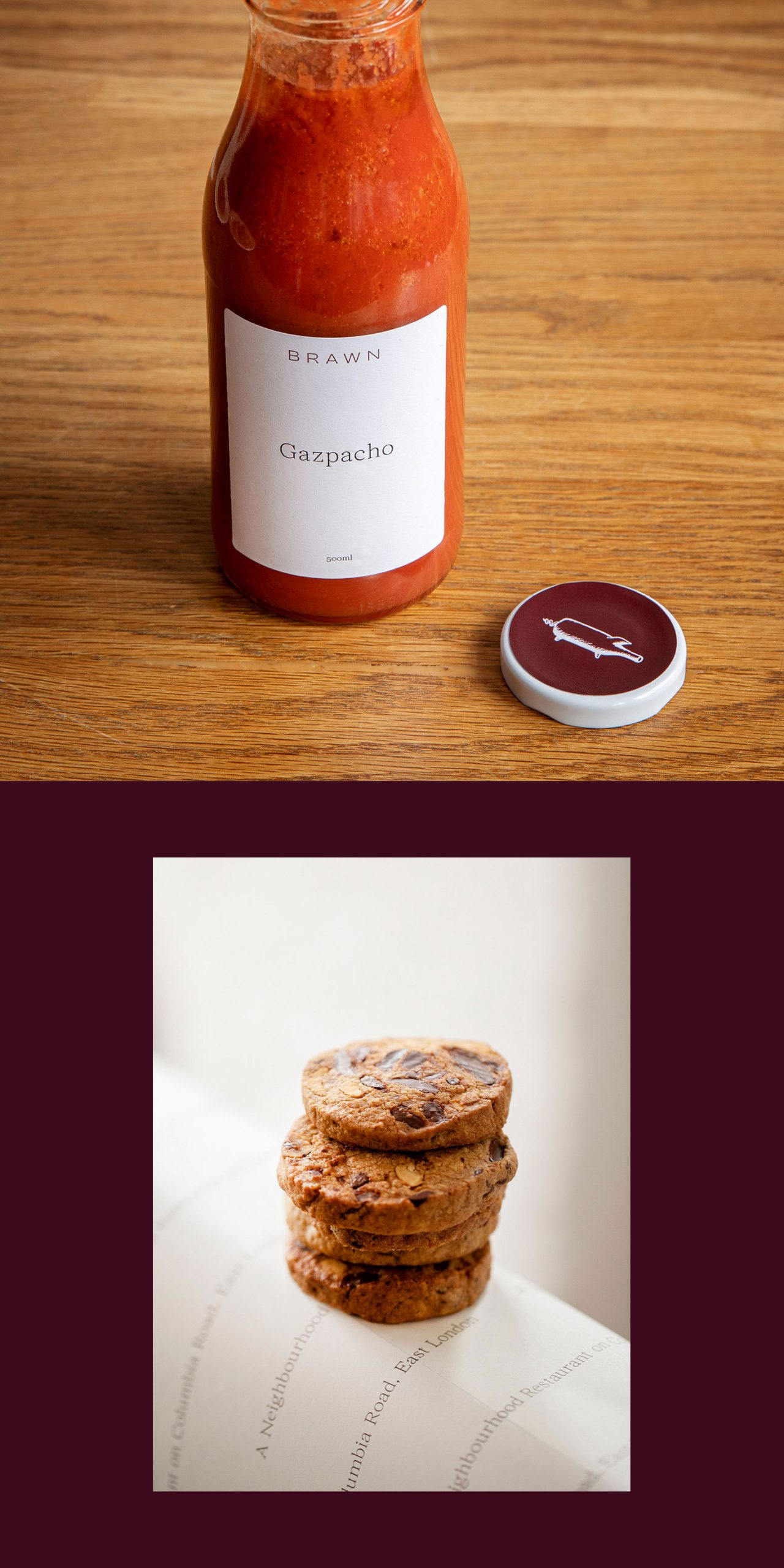
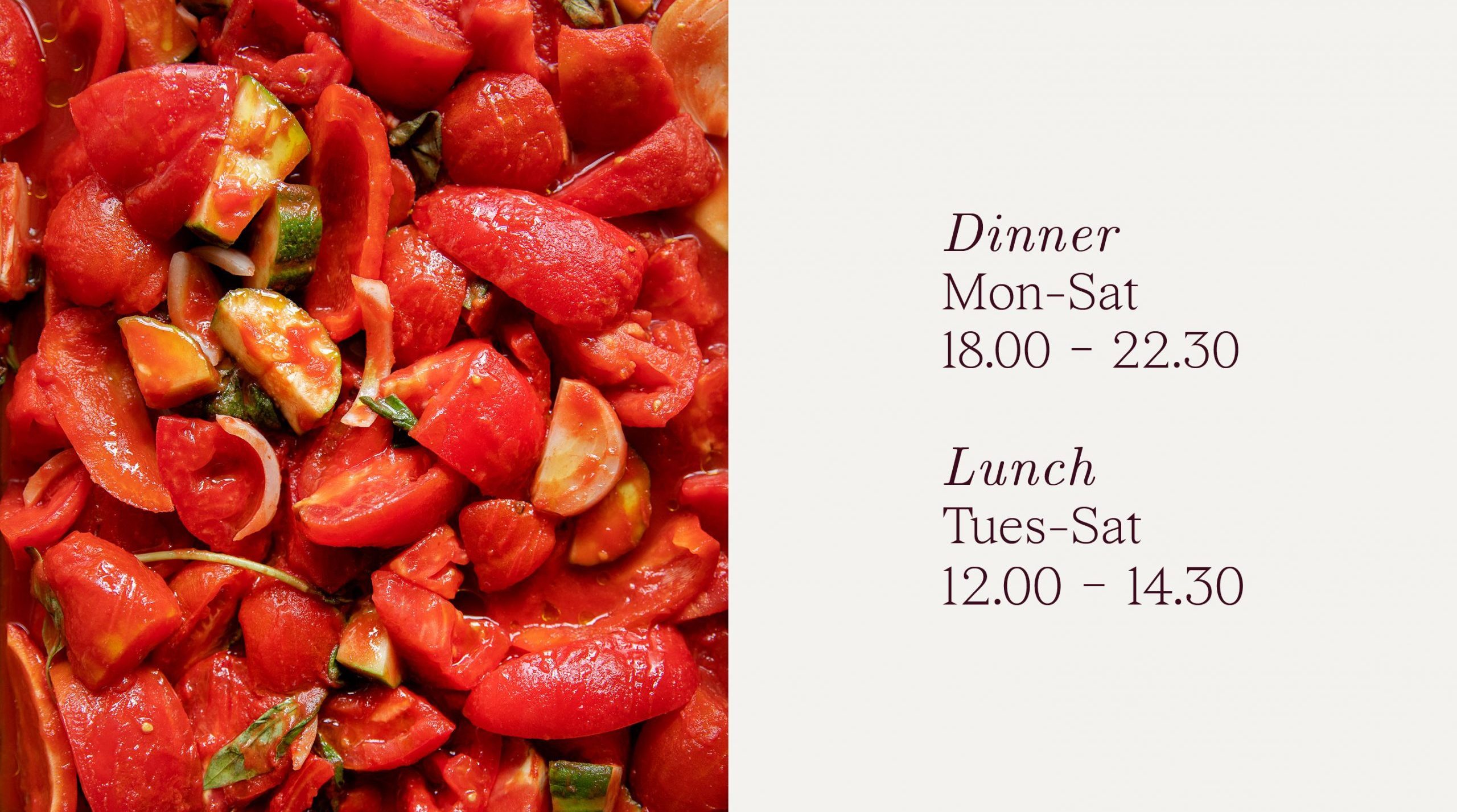
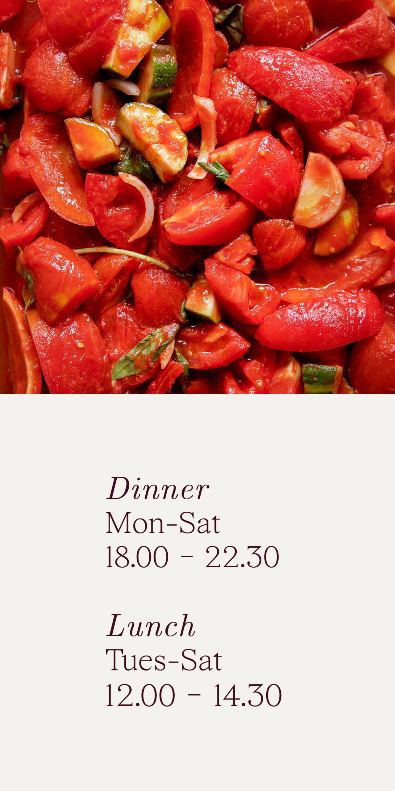
The supporting serif typeface (Wremena) was selected in order to add a subtle sense of classicism and practicality. The occasional use of italics adds character to the tone of voice.
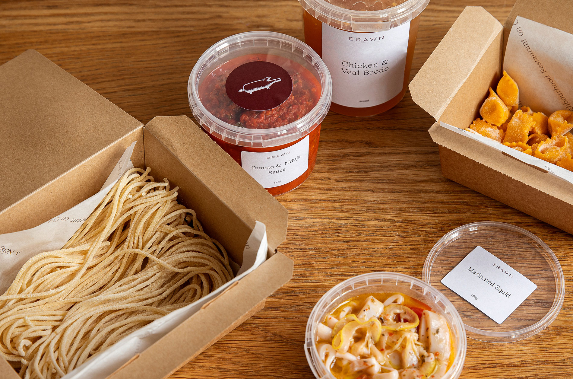
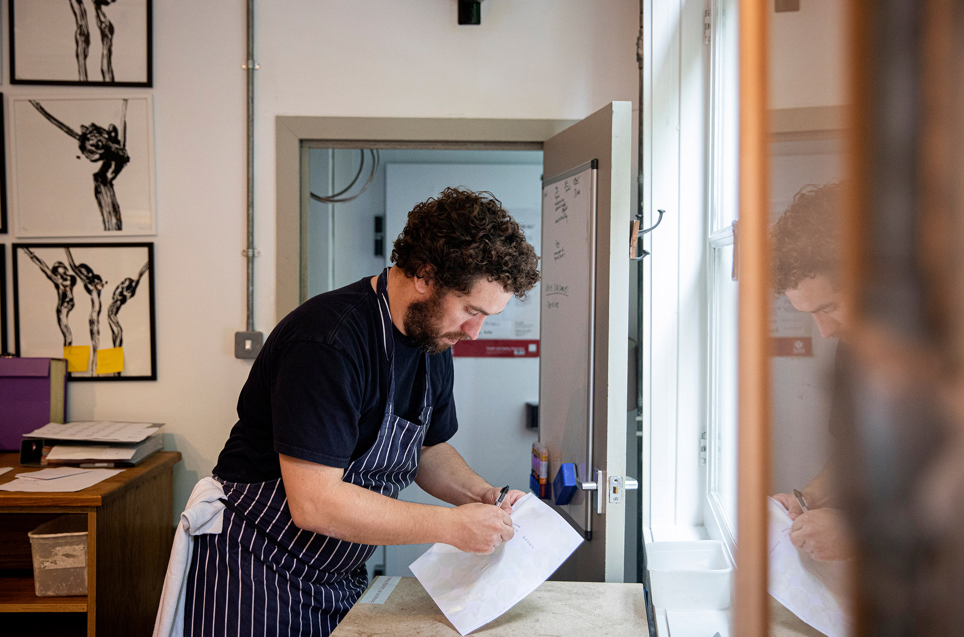
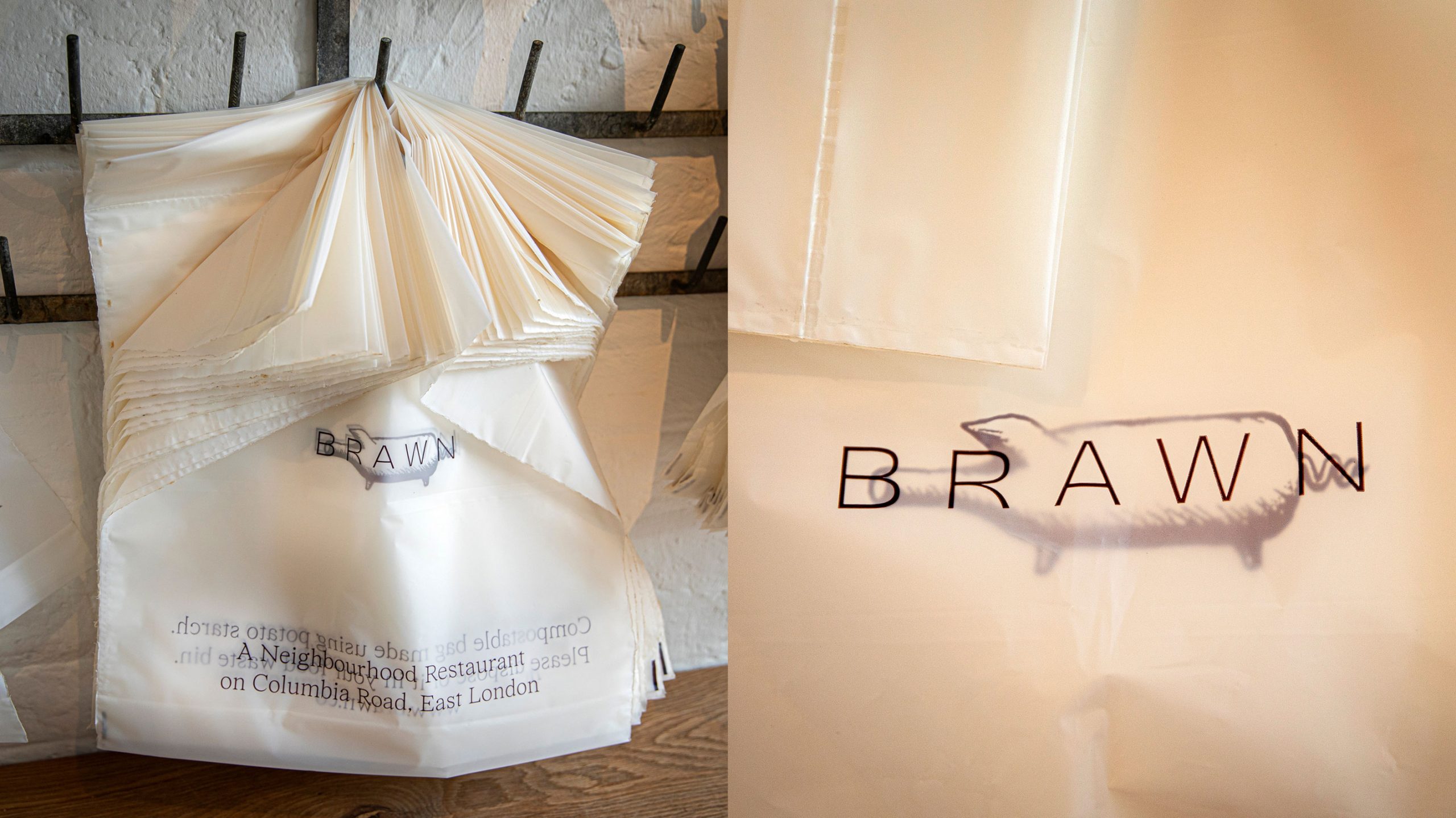
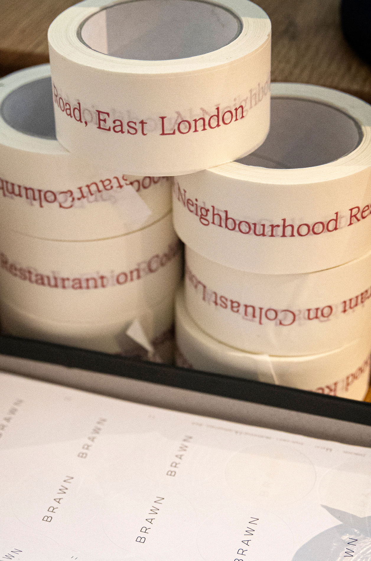
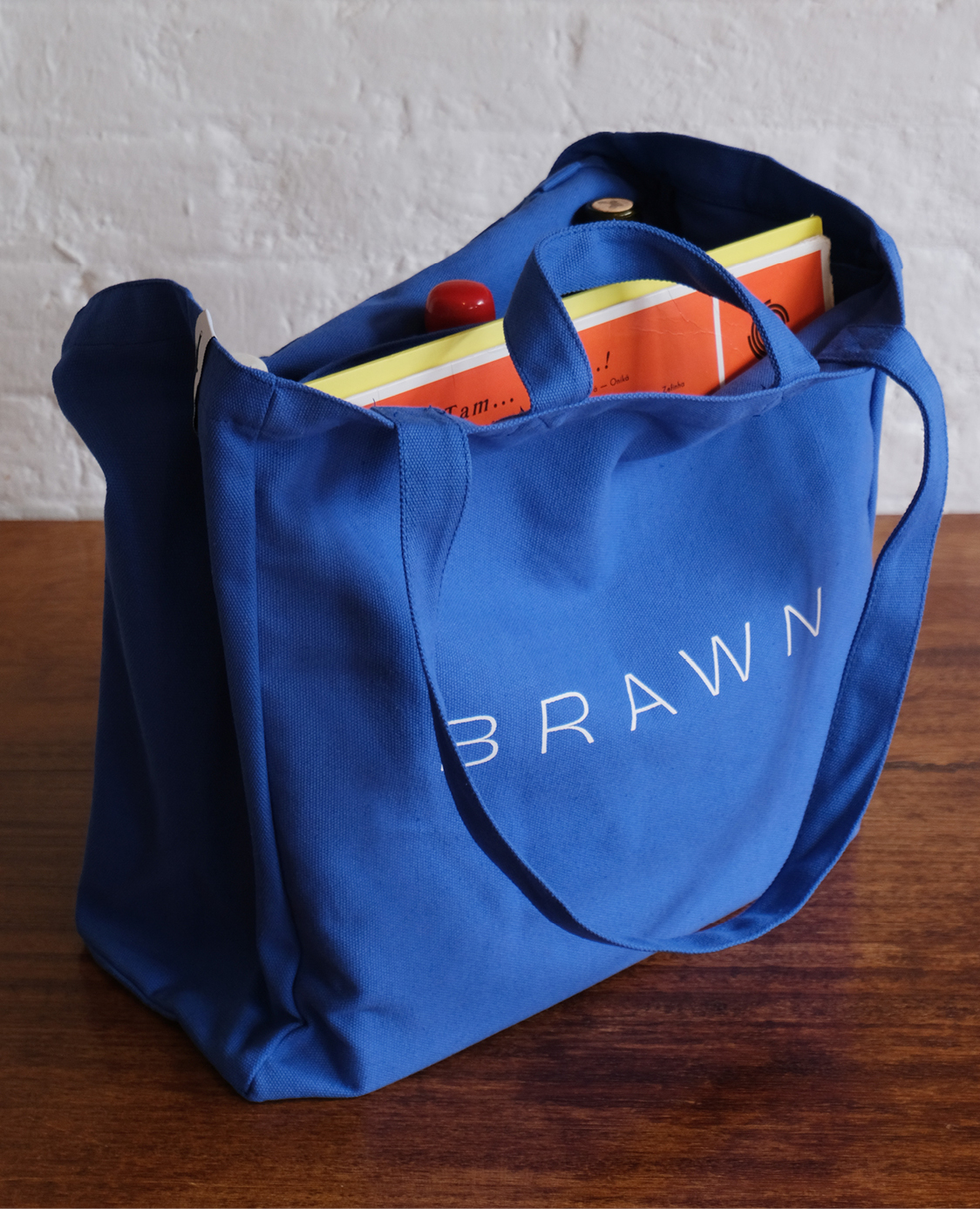
We designed a collection of branded packaging assets such as greaseproof paper, stickers, tape and potato starch carrier bags.
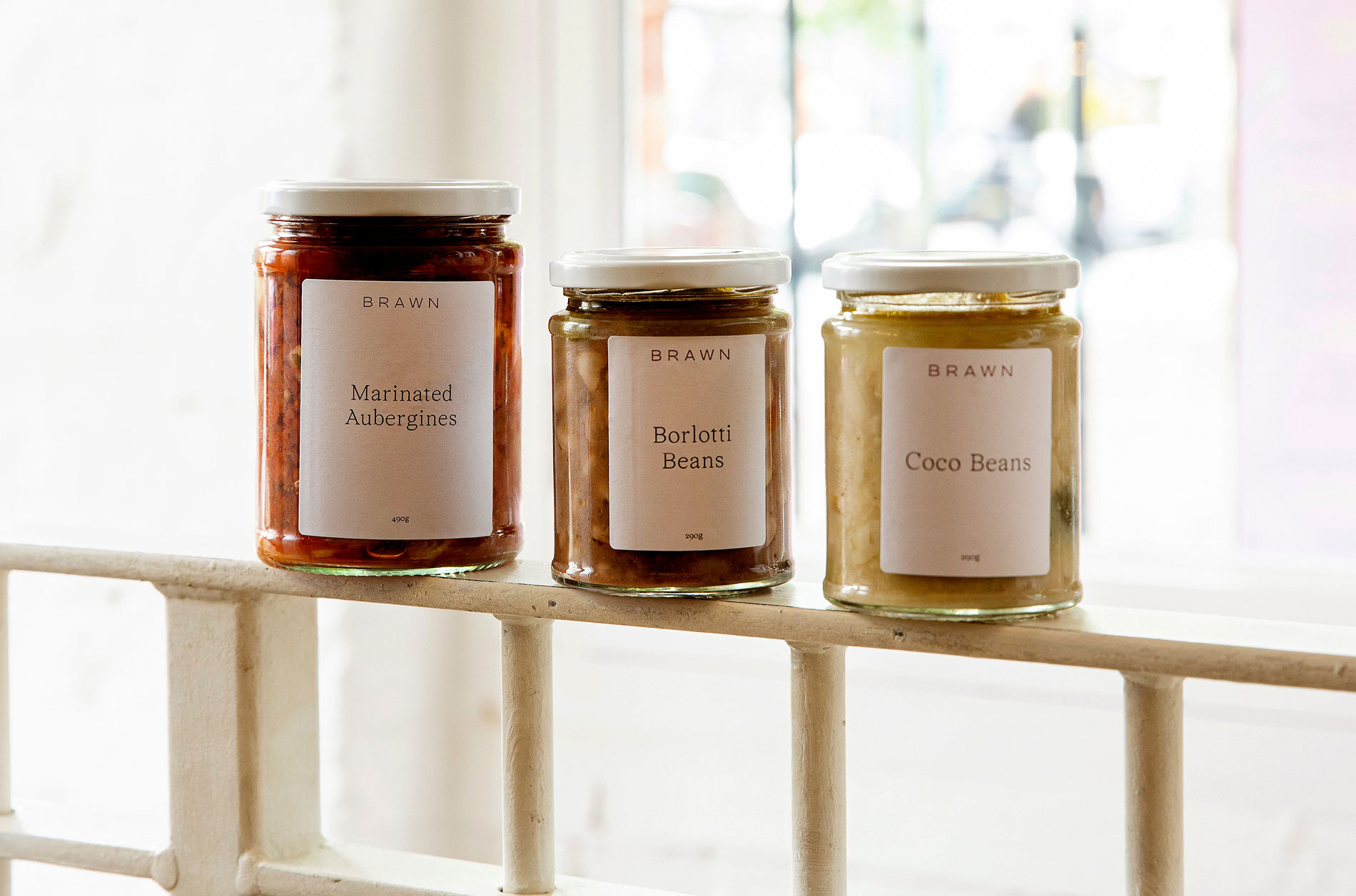
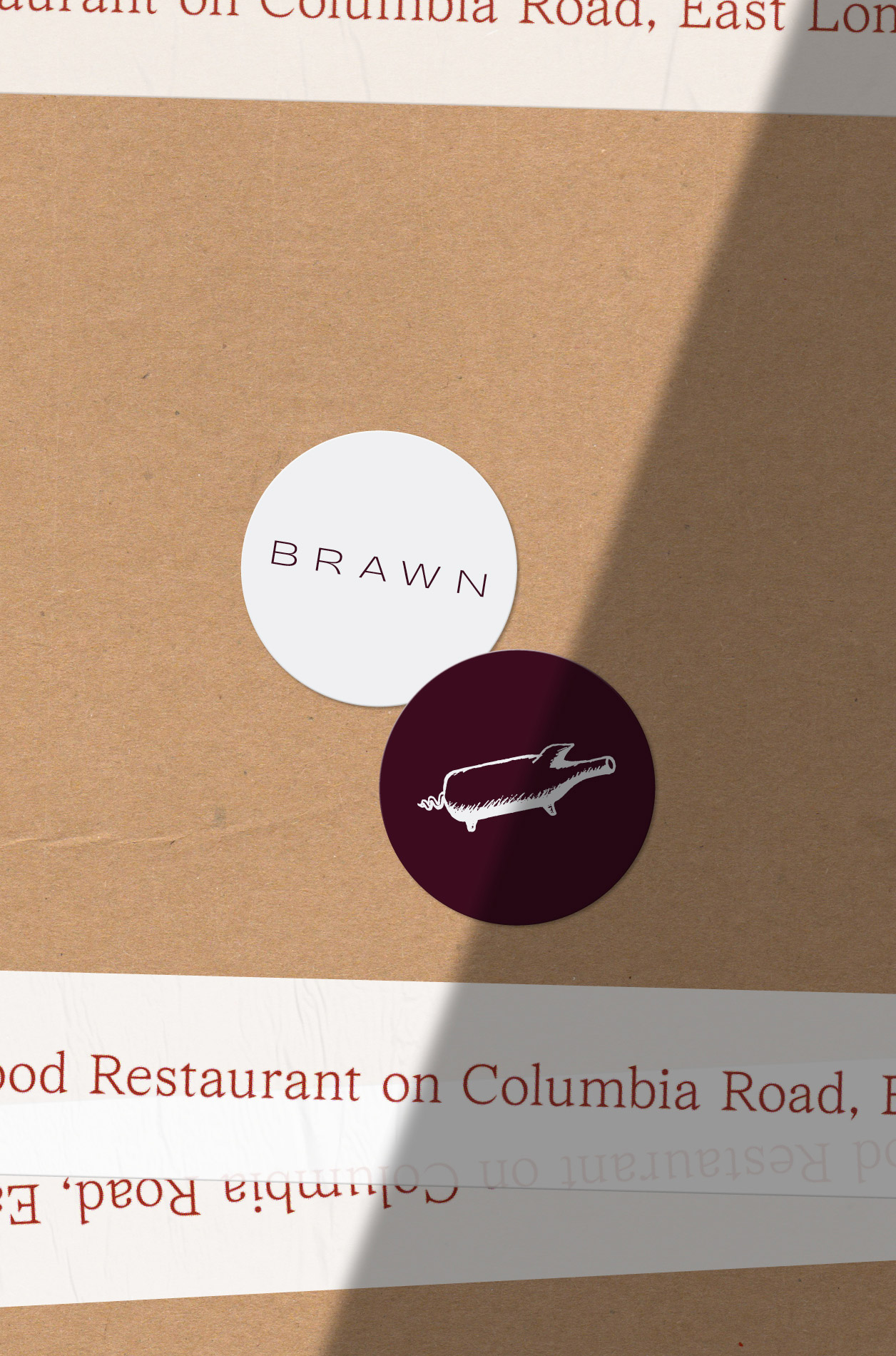
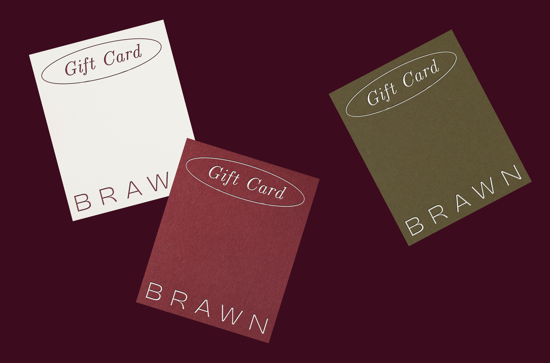
We also developed a versatile labelling system that could be applied across a wide range of products.


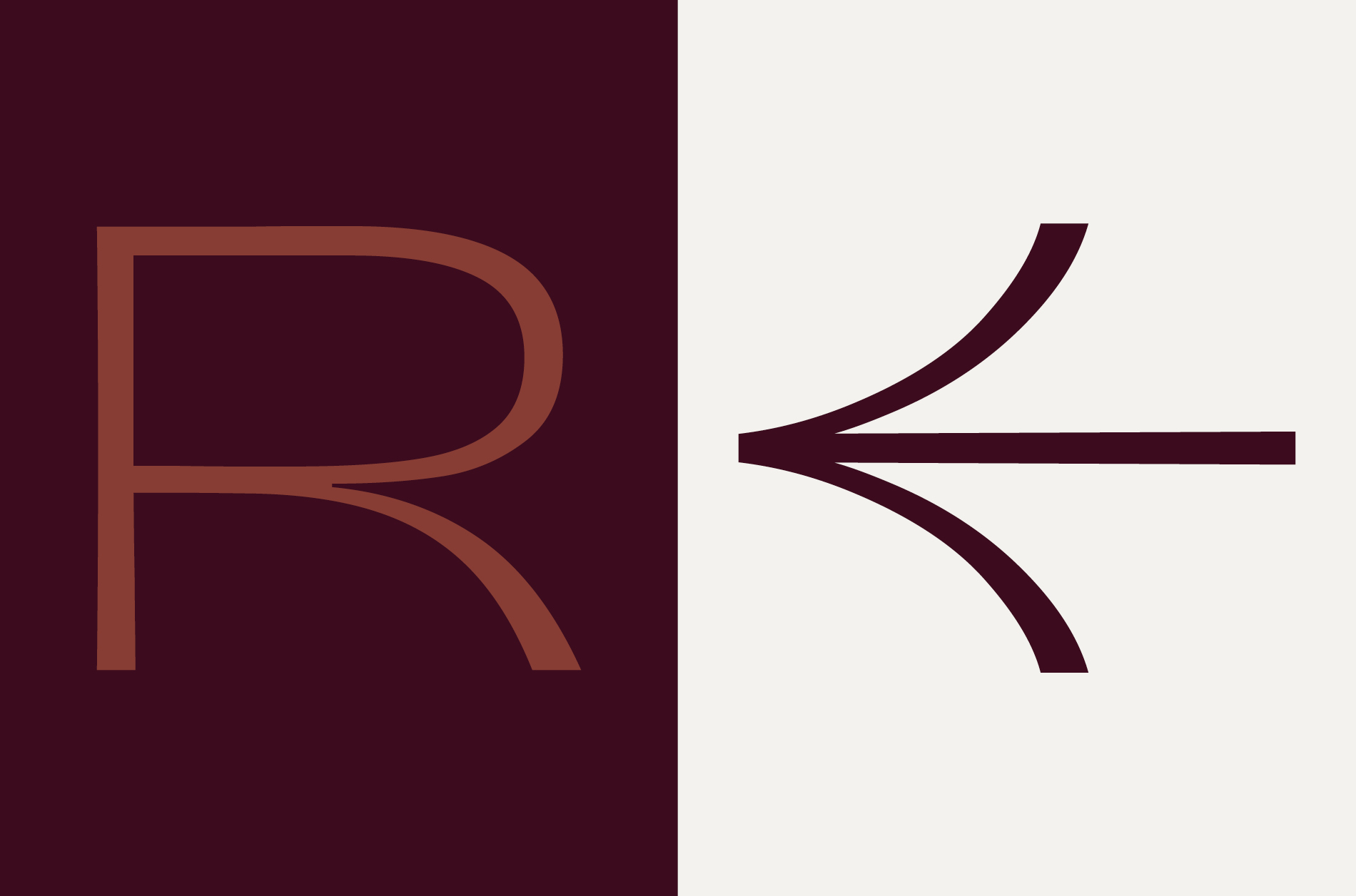
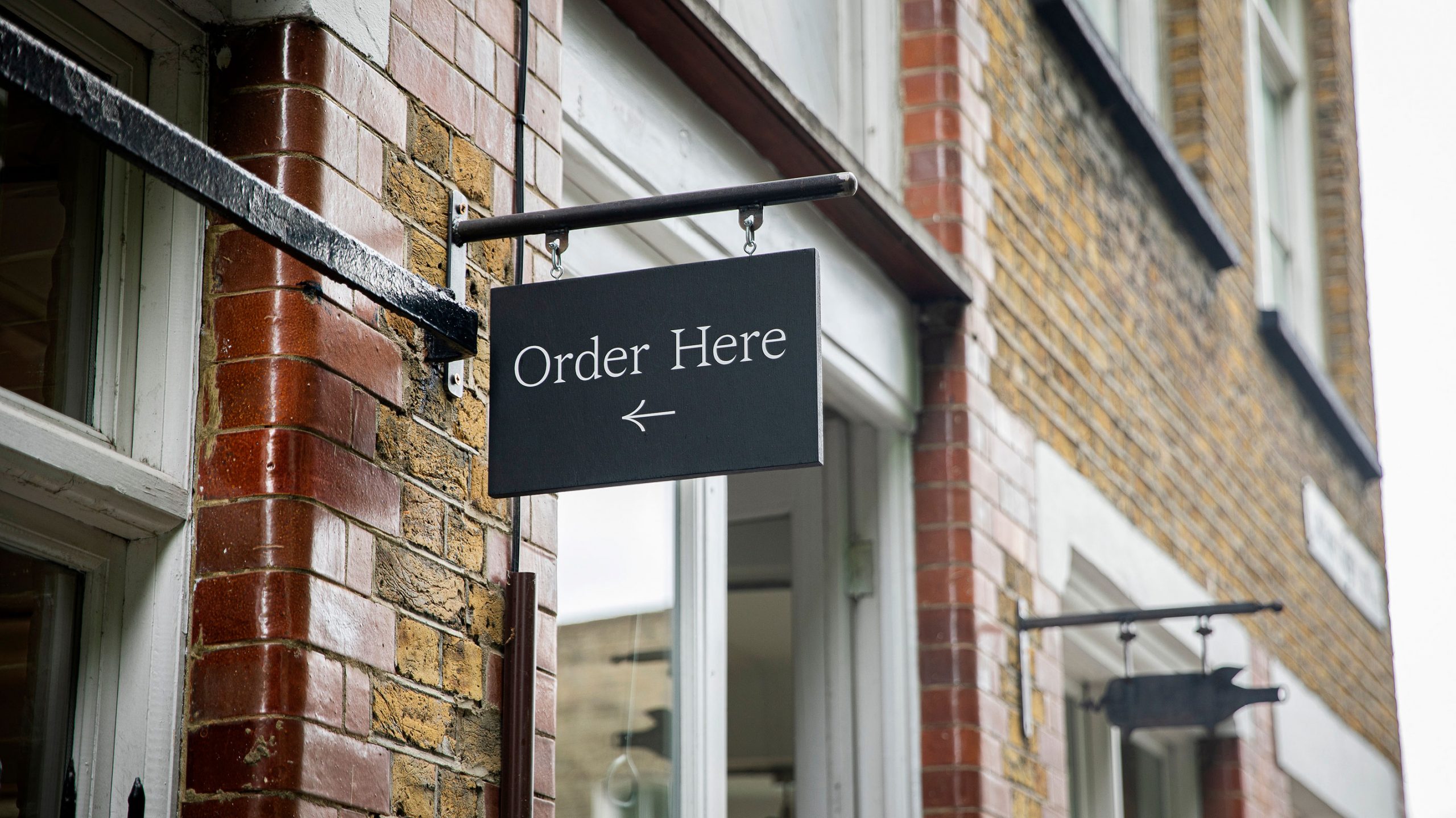
We developed a set of bespoke icons for wayfinding and signage. The arrows shown above were custom built using forms from the main logotype, giving them a familiar aesthetic.
Gallery View
Brawn
The pig symbol has always been synonymous with the restaurant and we felt it was an important visual element to retain within the new branding in order to pay homage to the past. We subtly adapted the illustration so it was usable across a wider range of digital and physical assets.
The new logotype’s proportions are also inspired by that of the pig. Although the two elements are often not used together they hold a similar form.
The supporting serif typeface (Wremena) was selected in order to add a subtle sense of classicism and practicality. The occasional use of italics adds character to the tone of voice.
We designed a collection of branded packaging assets such as greaseproof paper, stickers, tape and potato starch carrier bags.
We also developed a versatile labelling system that could be applied across a wide range of products.
We developed a set of bespoke icons for wayfinding and signage. The arrows shown above were custom built using forms from the main logotype, giving them a familiar aesthetic.