Octagon
Project:
Octagon are a global sports and entertainment agency connecting talent with fans and brands with culture. They are part of the Interpublic Group of Companies (IPG), one of the world’s most respected advertising networks.
We were commissioned to build a new visual language that would reflect the company’s new and evolving ambitions such as expanding their services to include a creative agency offering.
They had outgrown their previous visual language and were finding themselves restricted by the old identity. Although the logo was to remain unchanged, the entire visual world around it would. It was now imperative that the wider visual language immediately and clearly communicated the fact they are not only a sports talent agency but also a creative agency striving to inspire world audiences and incite play.
Our concept’s foundations were rooted in the principles of ‘Made by Culture’ and ‘It’s All In Play’. The new graphical system had to be robust yet expressive and flexible enough to adapt with the ever-evolving portfolio.
Scope:
Global Rebrand, Visual Language, Brand Guidelines Portal, Website, Animation.
Octagon
Once we had built the new identity, we began the task of creating a new website: Octagon’s lead tool for showcasing their diverse and dynamic portfolio. Although rich with extensive content, the website needed to clearly summarise their two key areas of focus: working with brands and talent management.
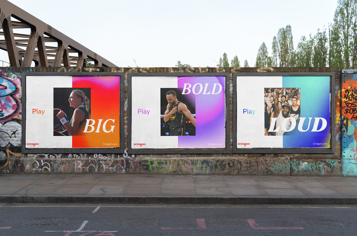
The website offered us an opportunity to evolve the gradients and inject a sense of movement to the wider language. Octagon wanted to stand out from the crowd and build something that was unashamedly LOUD.
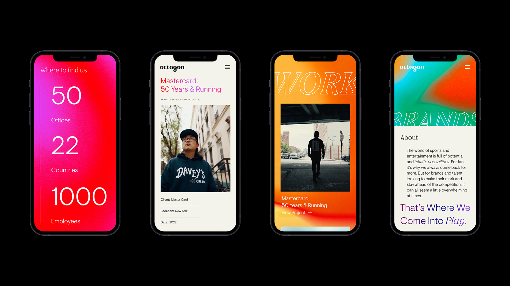
Our immediate response to the brief was to inject a sense of movement via the means of animation and develop refined yet adaptable typographic structures, bespoke image treatments, dynamic colour applications and energy, all whilst retaining clarity.
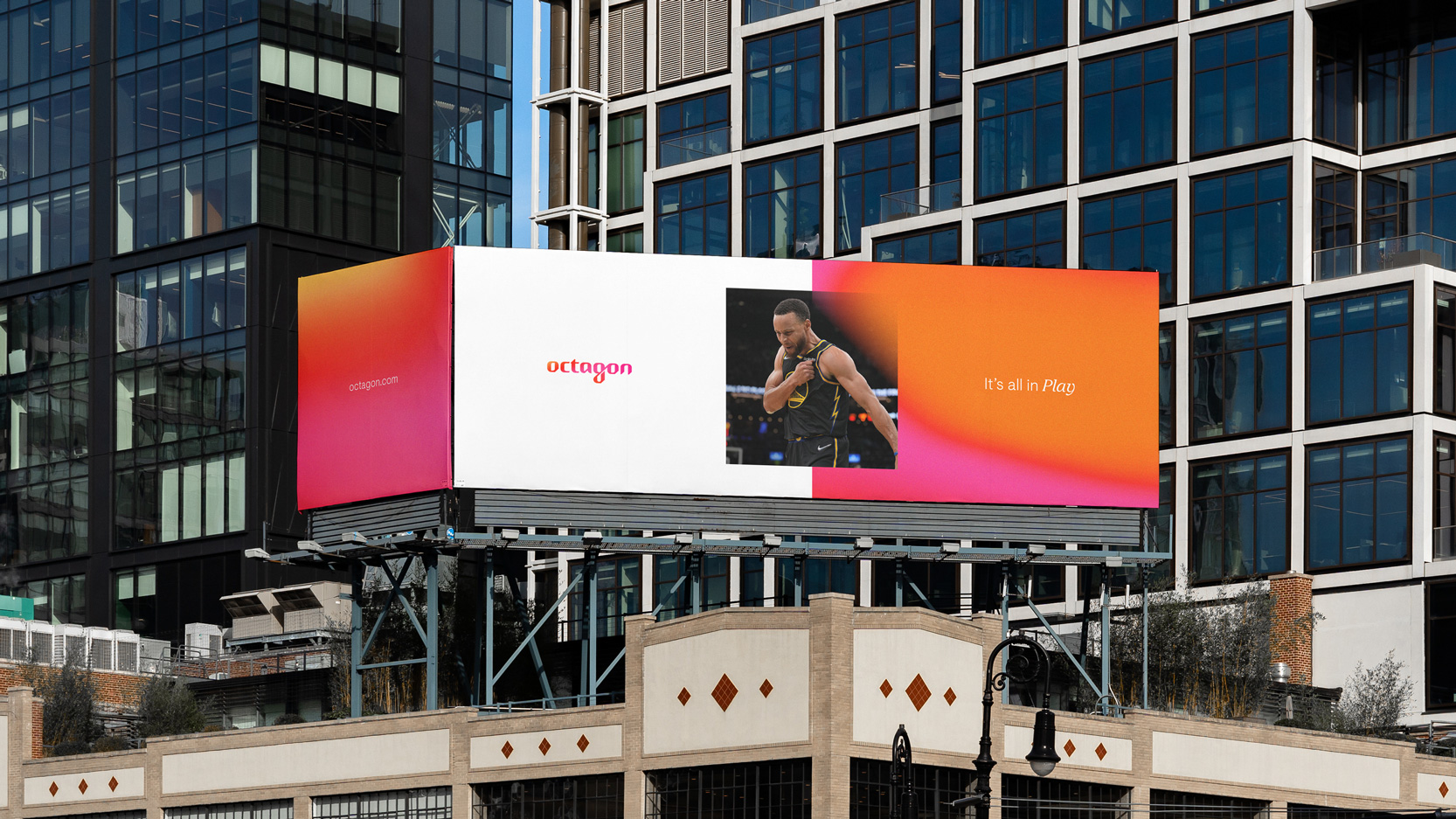
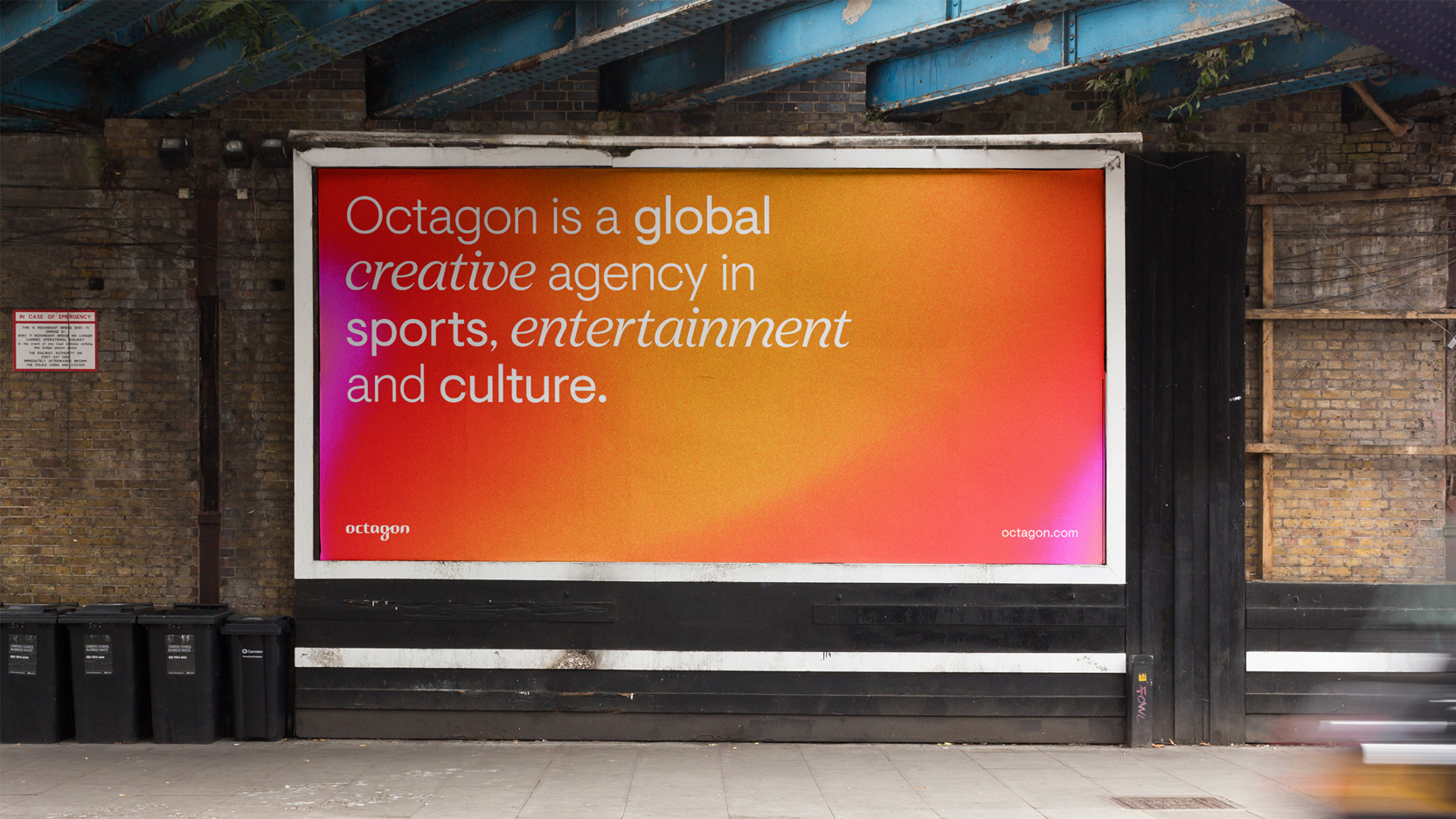
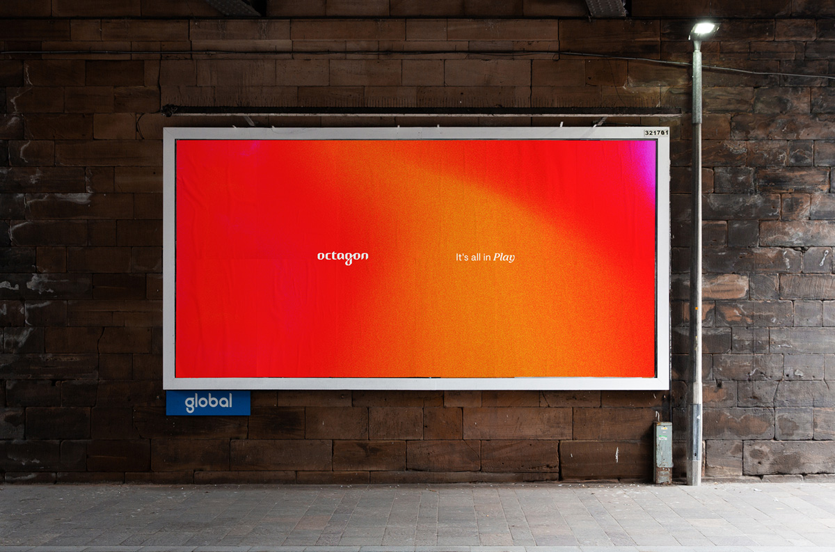
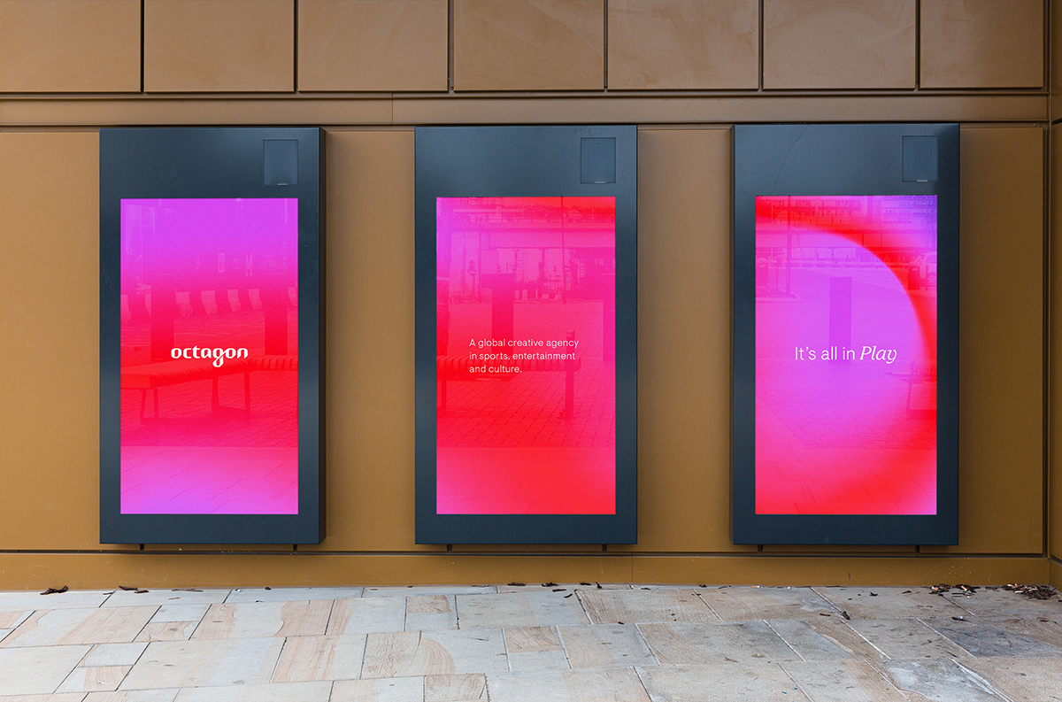
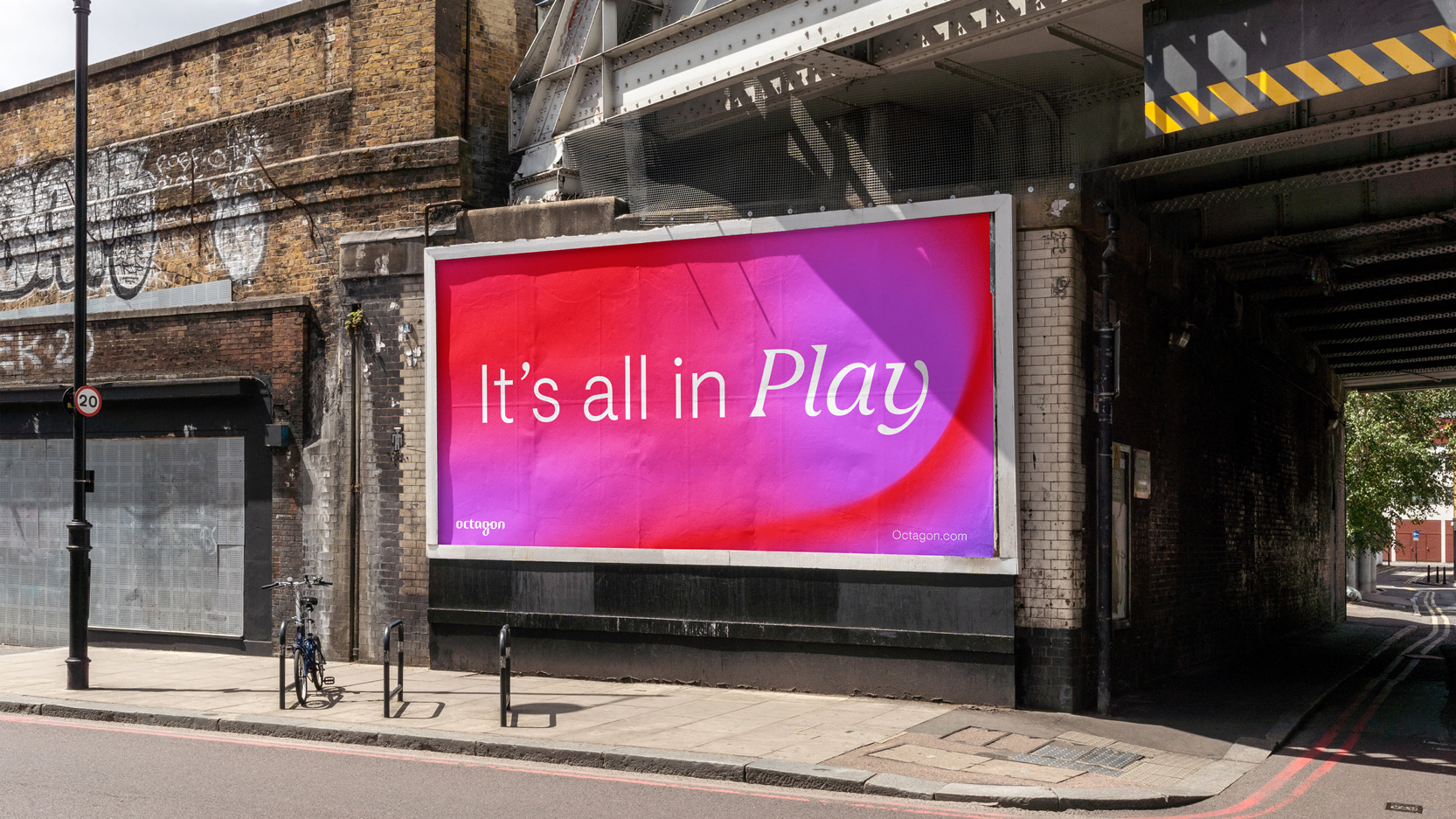
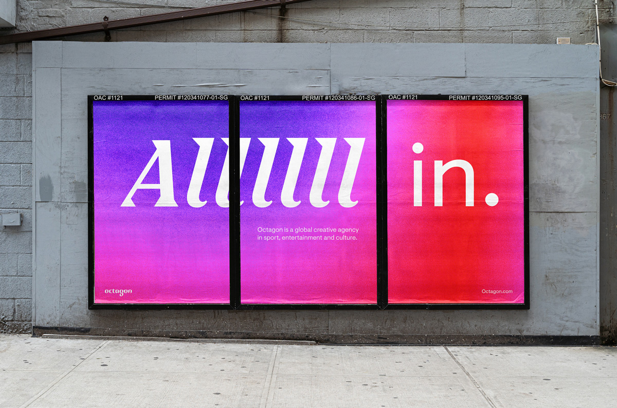
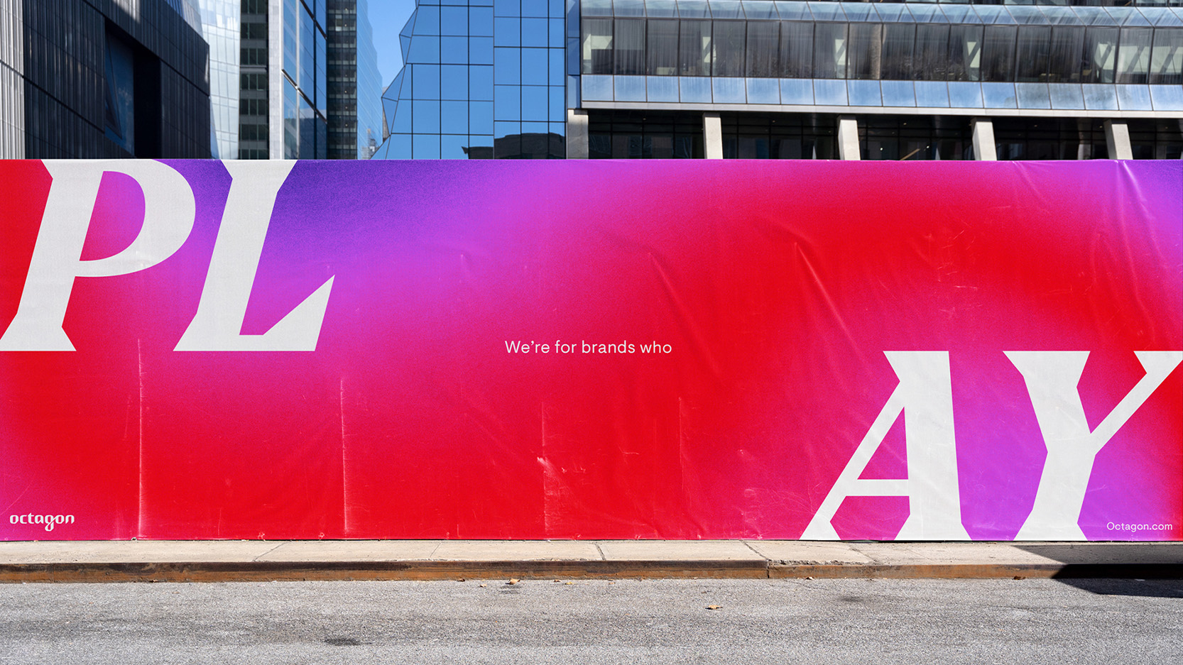
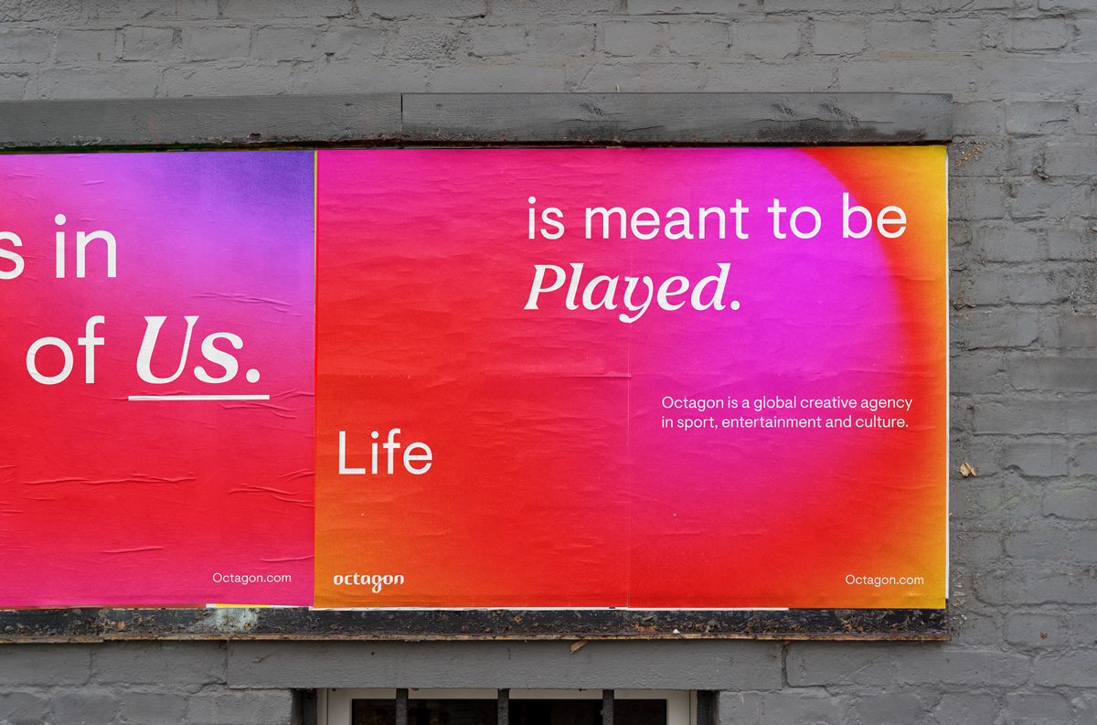
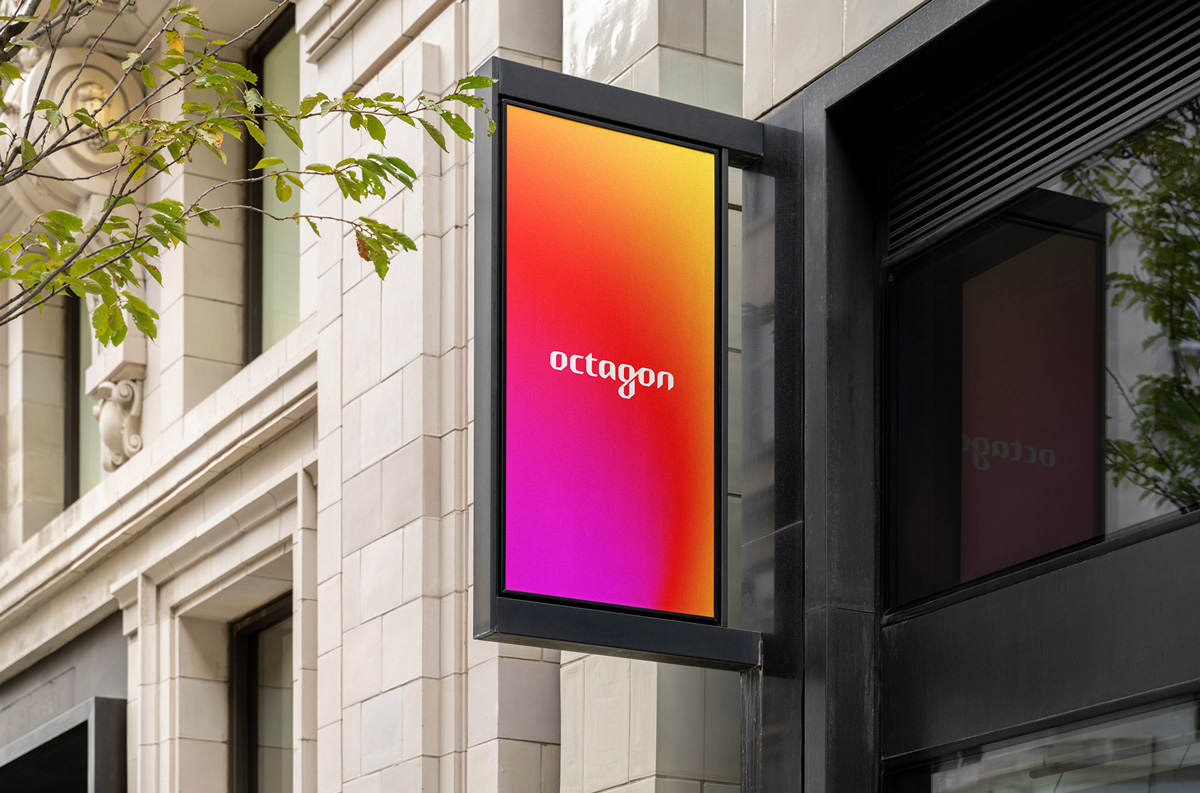
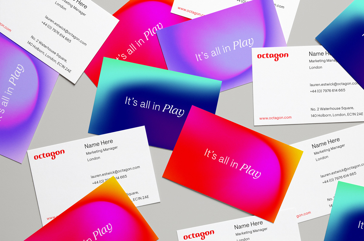
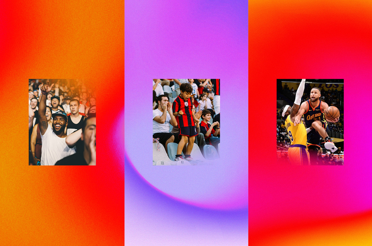
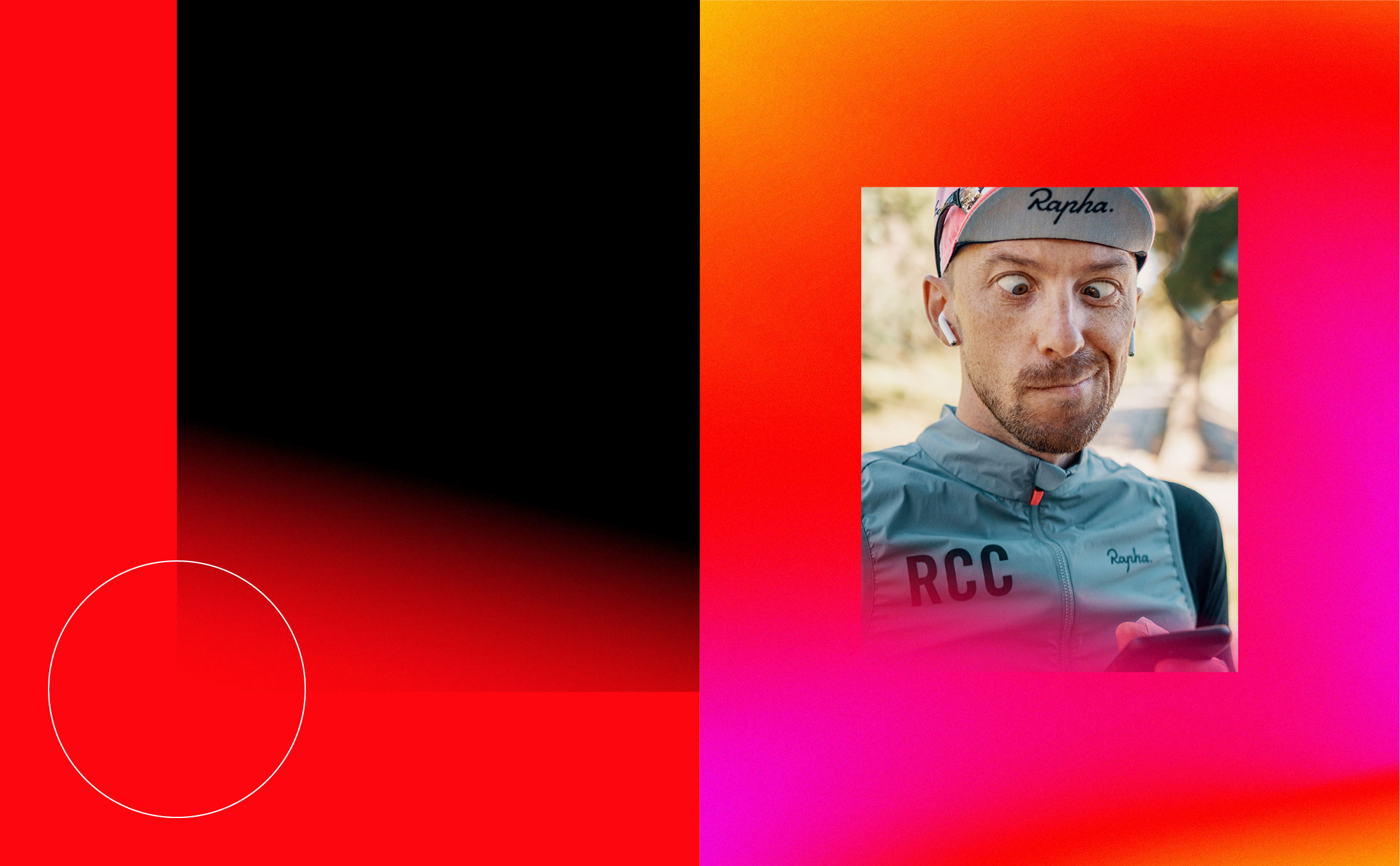
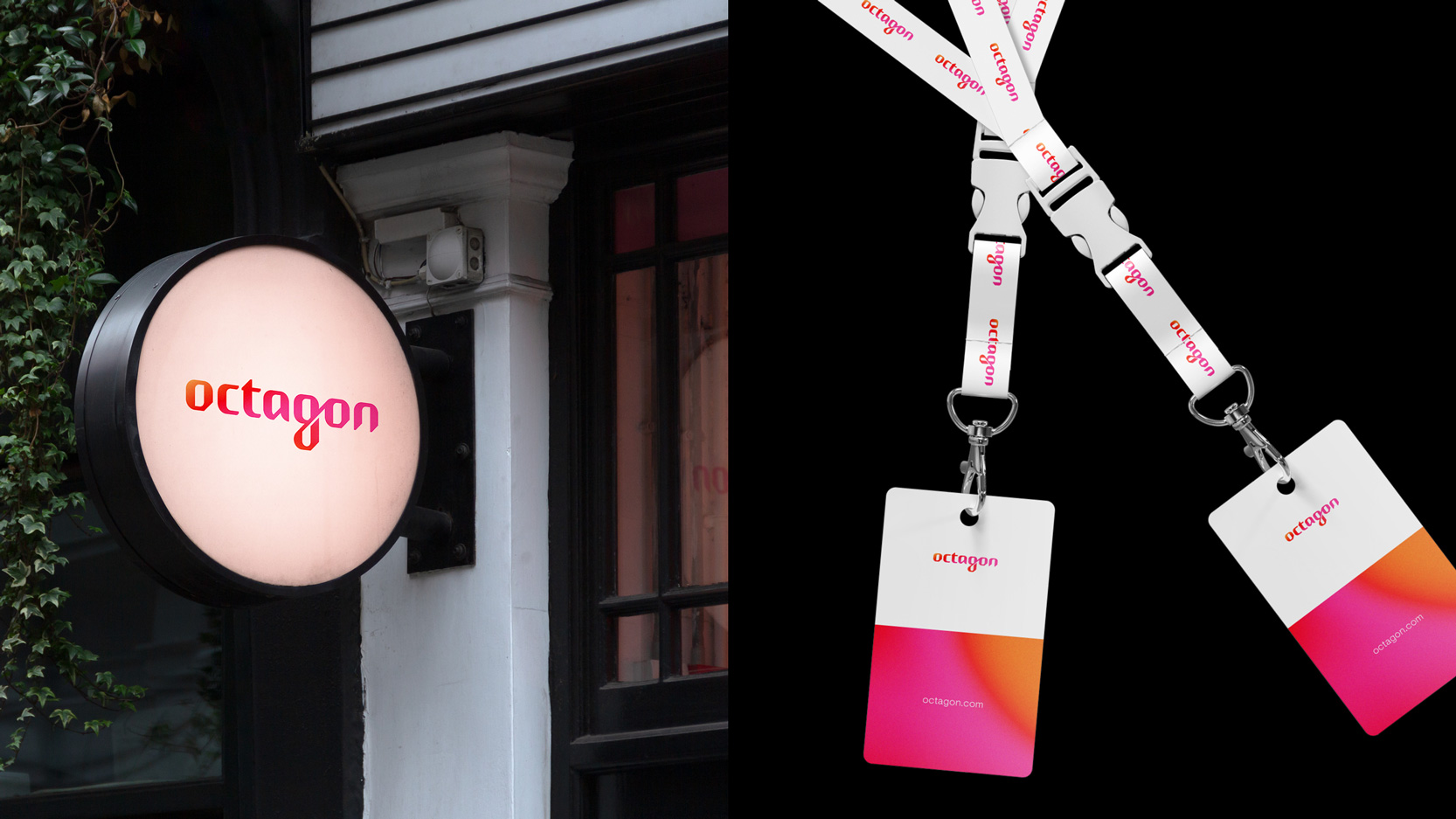
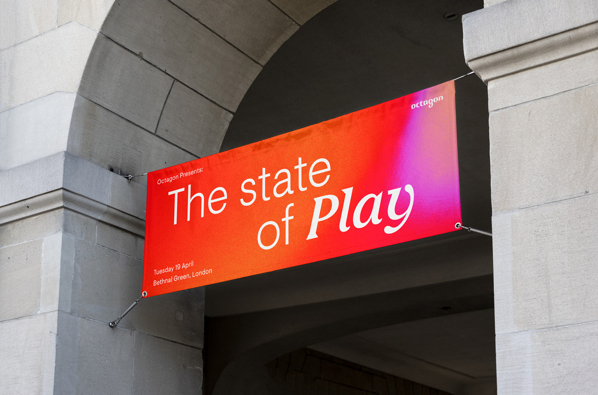
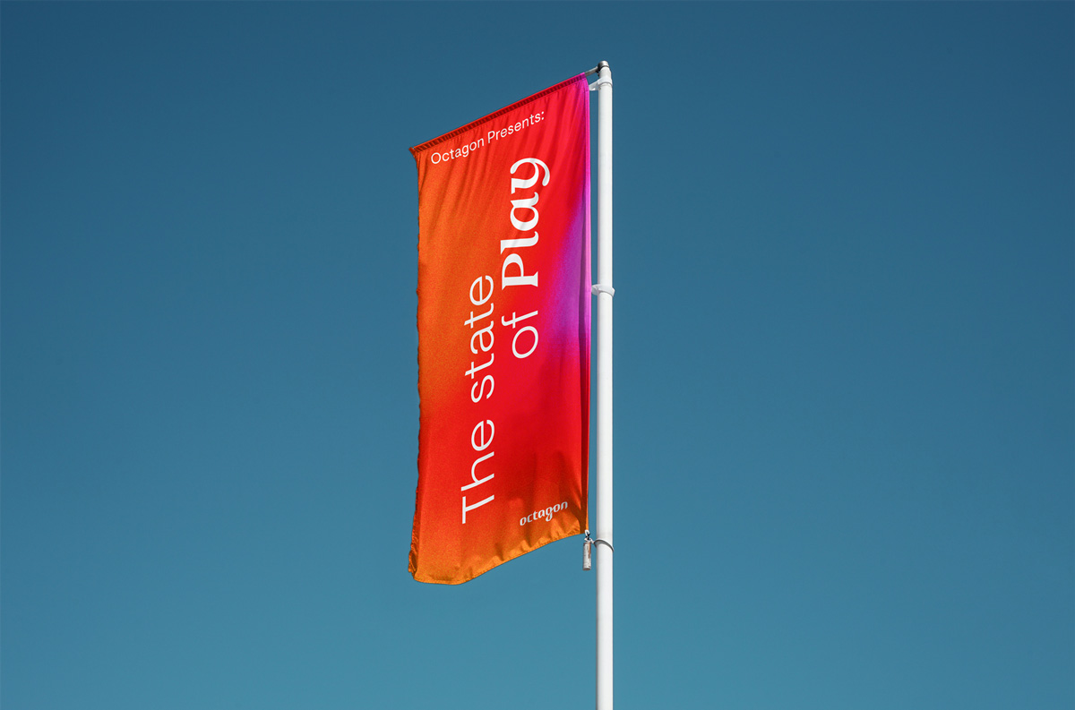
The gradients are an essential element to the visual language. They are a representation of Octagon’s ability to adapt and immerse itself within the vibrant, shifting landscape of sport, entertainment and culture.
The forms and movement are inspired by heat map technology used in sport analysis to highlight where the action is. They provided us with the opportunity to evolve the previously solid Octagon red in to new ever-evolving, dynamic territories. All the gradients start with a solid red which was our subtle way of visually representing the narrative of the company evolving.
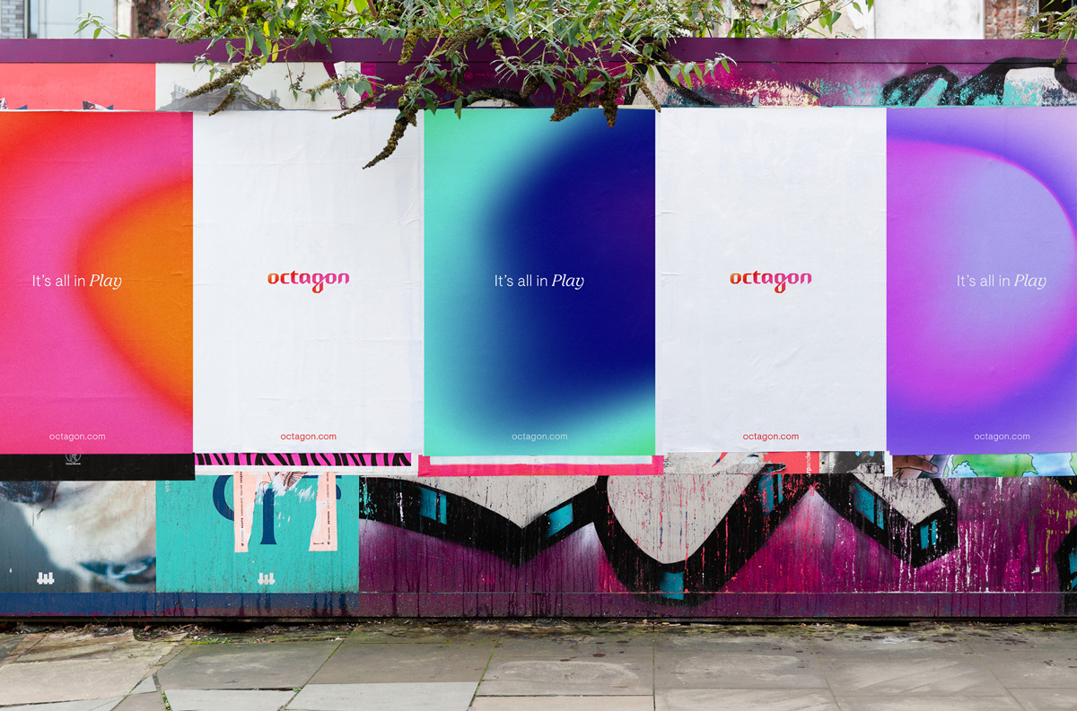
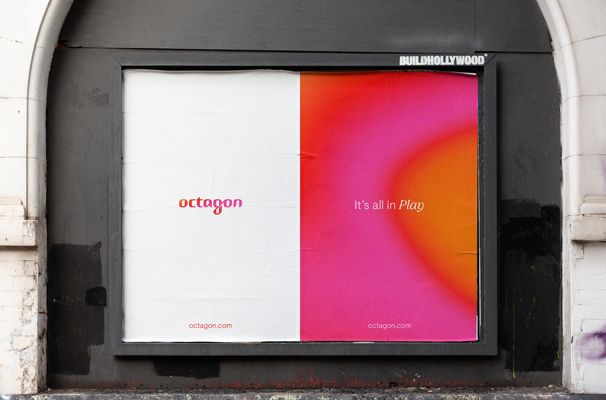
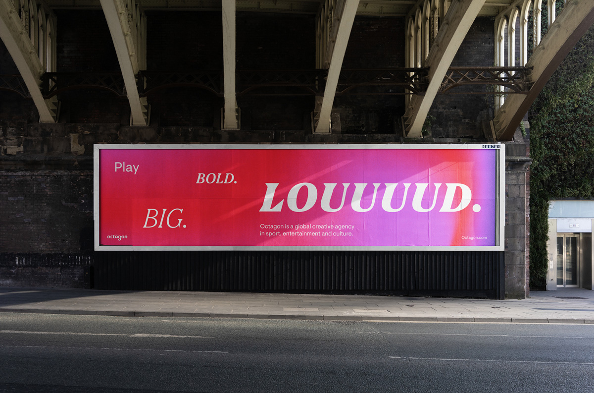
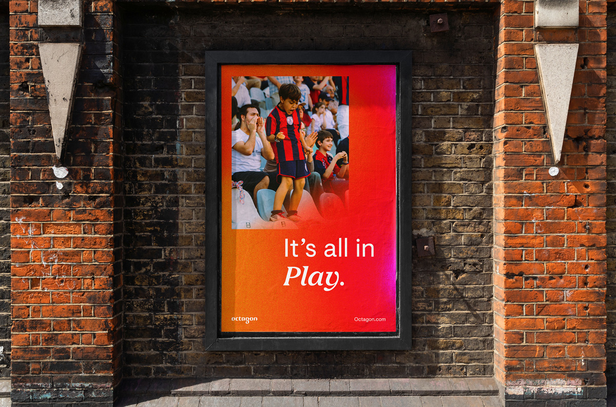
The layout system has untraditional layout rules that are variable and flexible. The key intention when building the artworks was clarity and to ensure that the focus was on the core message behind the piece of communication. We wanted the layouts to provide a platform that elevated the content in a dynamic way but also allows moments of calm and simplicity.
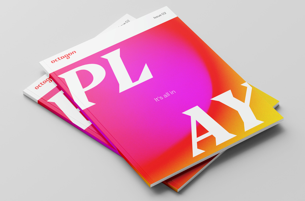
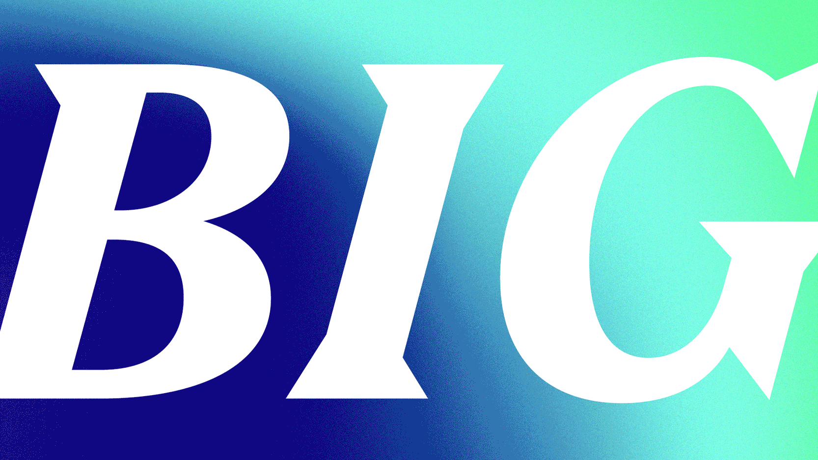
Typography is the most integral part of the new Octagon brand language and the most powerful tool to communicate to their audience.
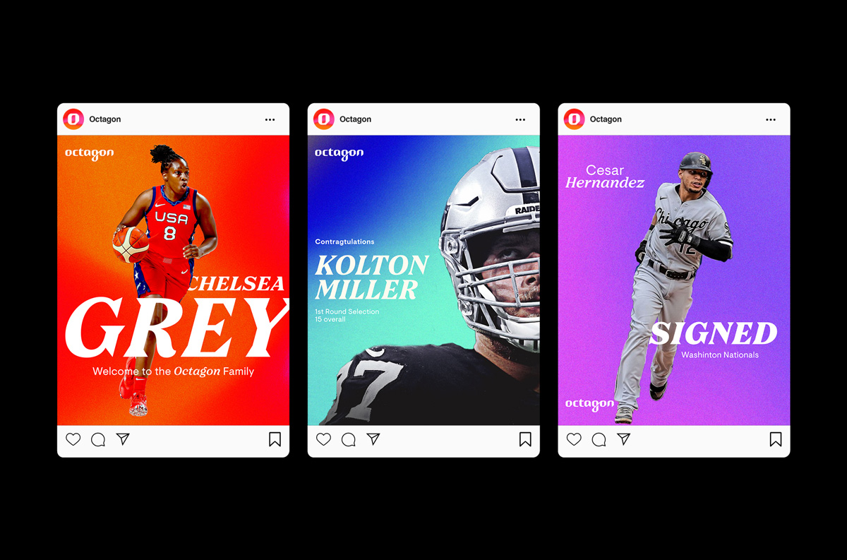
Using a playful mix of serif and sans-serif fonts meant we were able to add expression and emphasis on particular words of interest for maximum impact.
Emotive language was an essential part of the output and once the dynamic styling is applied to the copy, it gives Octagon a unique and instantly recognisable voice.
Brand Guidelines Portal
Due to the international nature of the Octagon business, they required a more contemporary and versatile approach to the company’s design resources. Rather than traditional PDF guidelines we built a completely custom brand guidelines portal for the staff around the World to use as the sole resource for anything related to the newly launched brand. As well as being a home for all the fundamental design elements, rules, templates, and tools it included an introduction to the new Brand DNA and Tone of Voice.
“Here you’ll find all of the fundamental elements, assets and tools for building our brand. We hope this portal helps you get acquainted with our foundations and our intentions. You’ll get a sense of who we are, what we believe, what how we communicate with others. Basically, it should provide you with everything you need to deliver the new Octagon brand. You’ll have access to detailed guides, typographic styles, layout samples, animation examples, digital assets and much more. Please, have a play.”
Due to the intense visual impact of the gradients and the usage of expressive typography it was important for the layouts and compositions to possess moments of space and calm to make sure the design didn’t appear too busy.

Credits:
Fonts: Nib and Visuelt by Colophon Foundry
Animation: Bill Porter
Gallery View
Octagon
Once we had built the new identity, we began the task of creating a new website: Octagon’s lead tool for showcasing their diverse and dynamic portfolio. Although rich with extensive content, the website needed to clearly summarise their two key areas of focus: working with brands and talent management.
The website offered us an opportunity to evolve the gradients and inject a sense of movement to the wider language. Octagon wanted to stand out from the crowd and build something that was unashamedly LOUD.
Our immediate response to the brief was to inject a sense of movement via the means of animation and develop refined yet adaptable typographic structures, bespoke image treatments, dynamic colour applications and energy, all whilst retaining clarity.
The gradients are an essential element to the visual language. They are a representation of Octagon’s ability to adapt and immerse itself within the vibrant, shifting landscape of sport, entertainment and culture.
The forms and movement are inspired by heat map technology used in sport analysis to highlight where the action is. They provided us with the opportunity to evolve the previously solid Octagon red in to new ever-evolving, dynamic territories. All the gradients start with a solid red which was our subtle way of visually representing the narrative of the company evolving.
The layout system has untraditional layout rules that are variable and flexible. The key intention when building the artworks was clarity and to ensure that the focus was on the core message behind the piece of communication. We wanted the layouts to provide a platform that elevated the content in a dynamic way but also allows moments of calm and simplicity.
Typography is the most integral part of the new Octagon brand language and the most powerful tool to communicate to their audience.
Using a playful mix of serif and sans-serif fonts meant we were able to add expression and emphasis on particular words of interest for maximum impact.
Emotive language was an essential part of the output and once the dynamic styling is applied to the copy, it gives Octagon a unique and instantly recognisable voice.
Brand Guidelines Portal
Due to the international nature of the Octagon business, they required a more contemporary and versatile approach to the company’s design resources. Rather than traditional PDF guidelines we built a completely custom brand guidelines portal for the staff around the World to use as the sole resource for anything related to the newly launched brand. As well as being a home for all the fundamental design elements, rules, templates, and tools it included an introduction to the new Brand DNA and Tone of Voice.
“Here you’ll find all of the fundamental elements, assets and tools for building our brand. We hope this portal helps you get acquainted with our foundations and our intentions. You’ll get a sense of who we are, what we believe, what how we communicate with others. Basically, it should provide you with everything you need to deliver the new Octagon brand. You’ll have access to detailed guides, typographic styles, layout samples, animation examples, digital assets and much more. Please, have a play.”
Due to the intense visual impact of the gradients and the usage of expressive typography it was important for the layouts and compositions to possess moments of space and calm to make sure the design didn’t appear too busy.
Credits:
Fonts: Nib and Visuelt by Colophon Foundry
Animation: Bill Porter