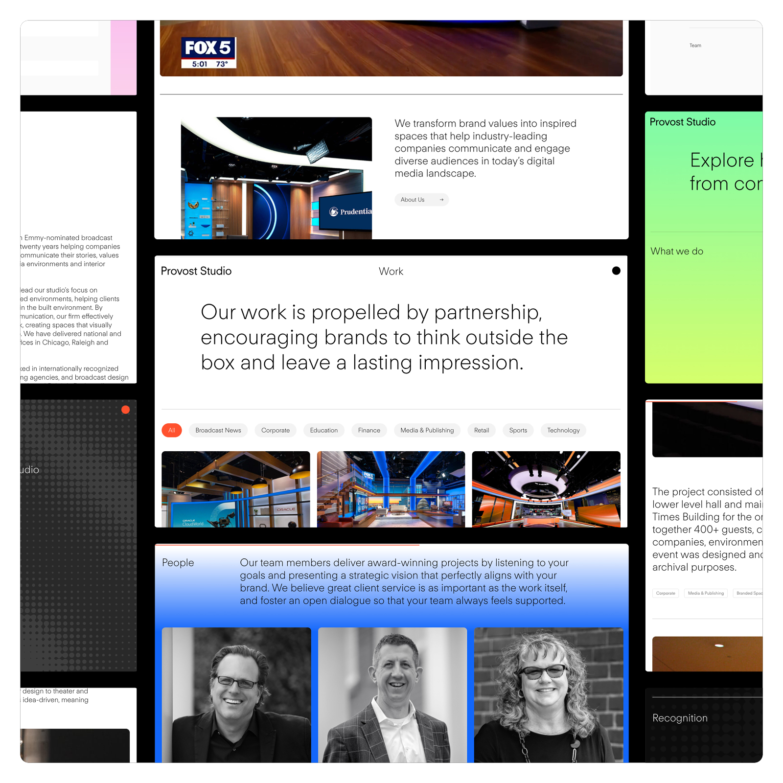
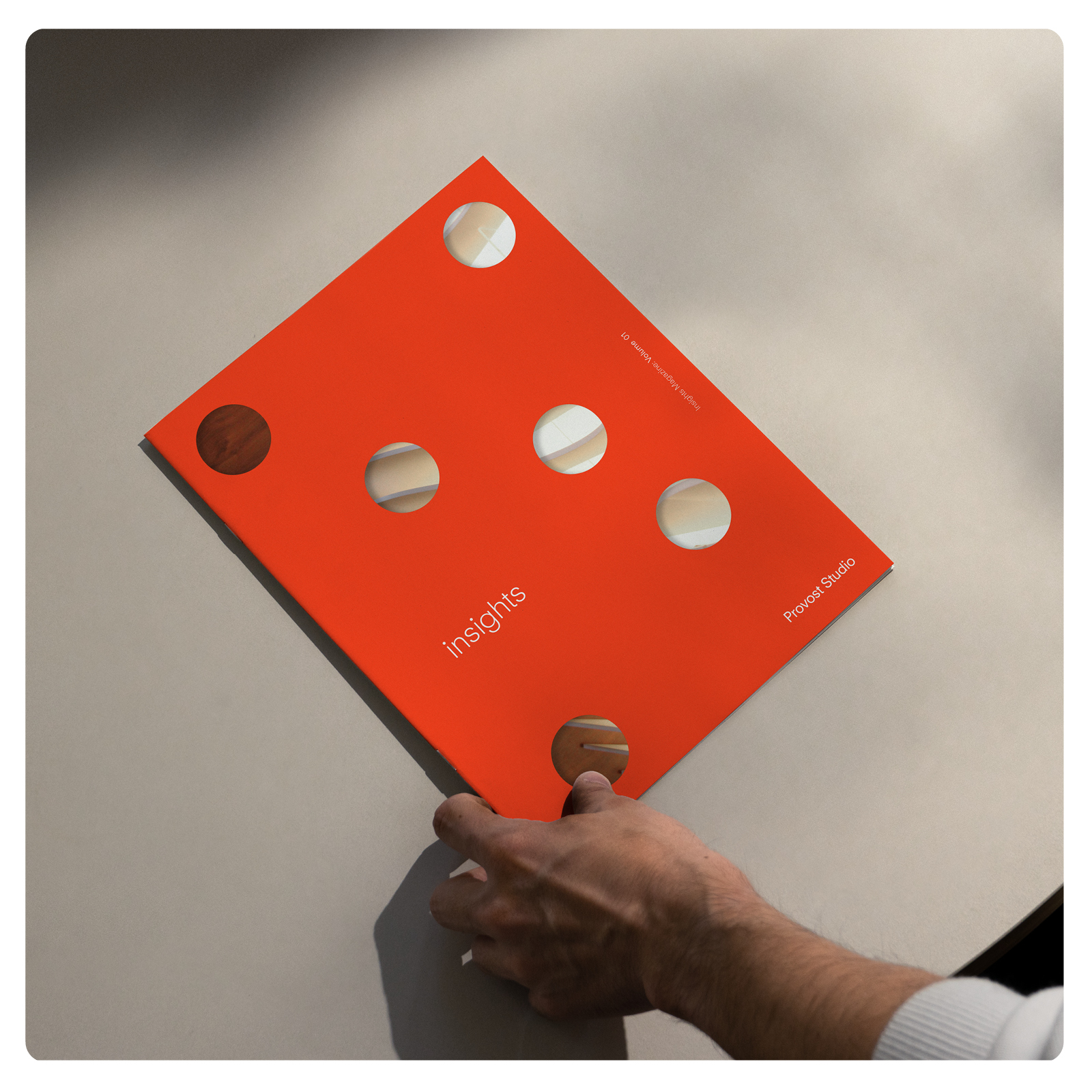
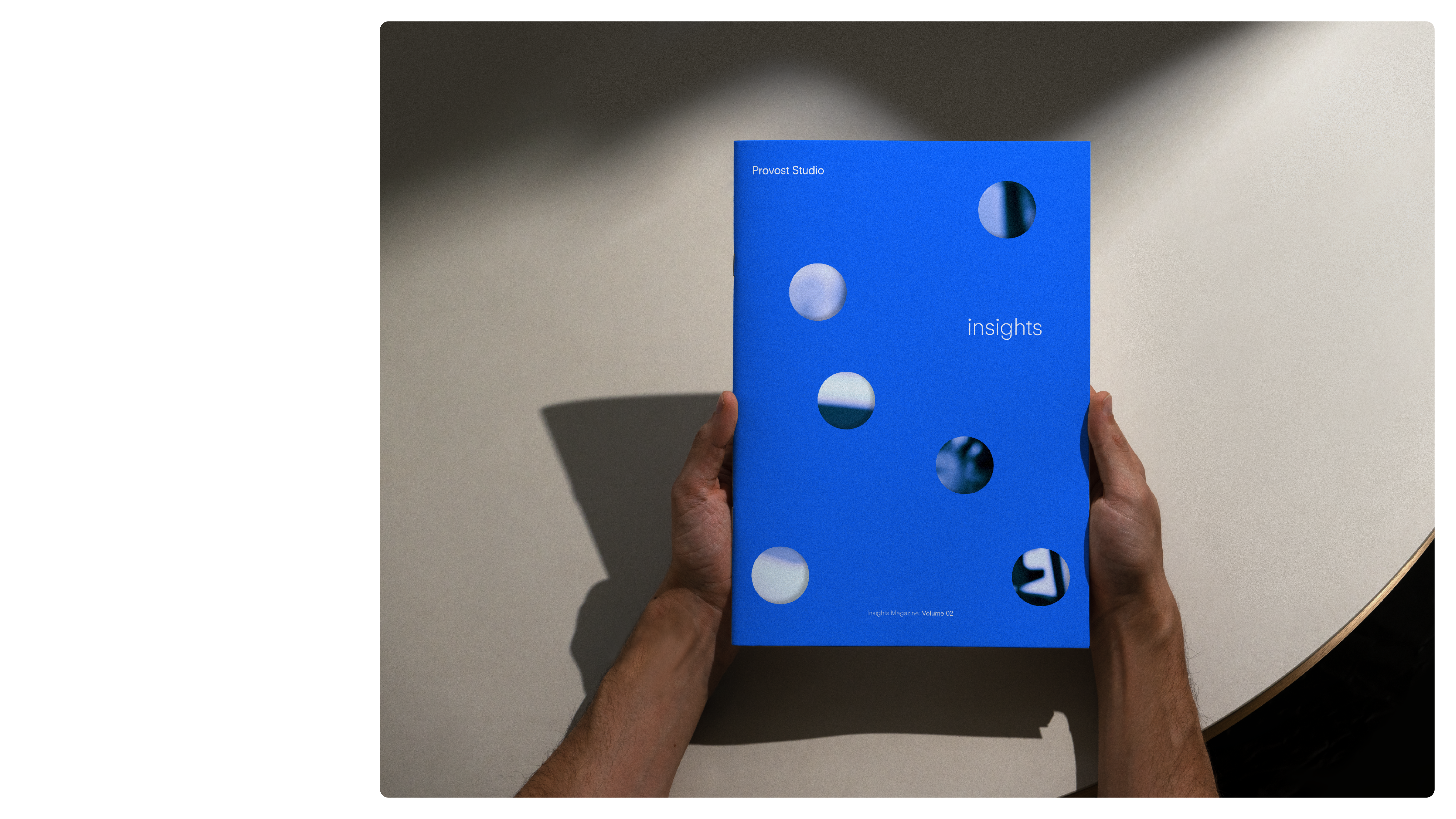
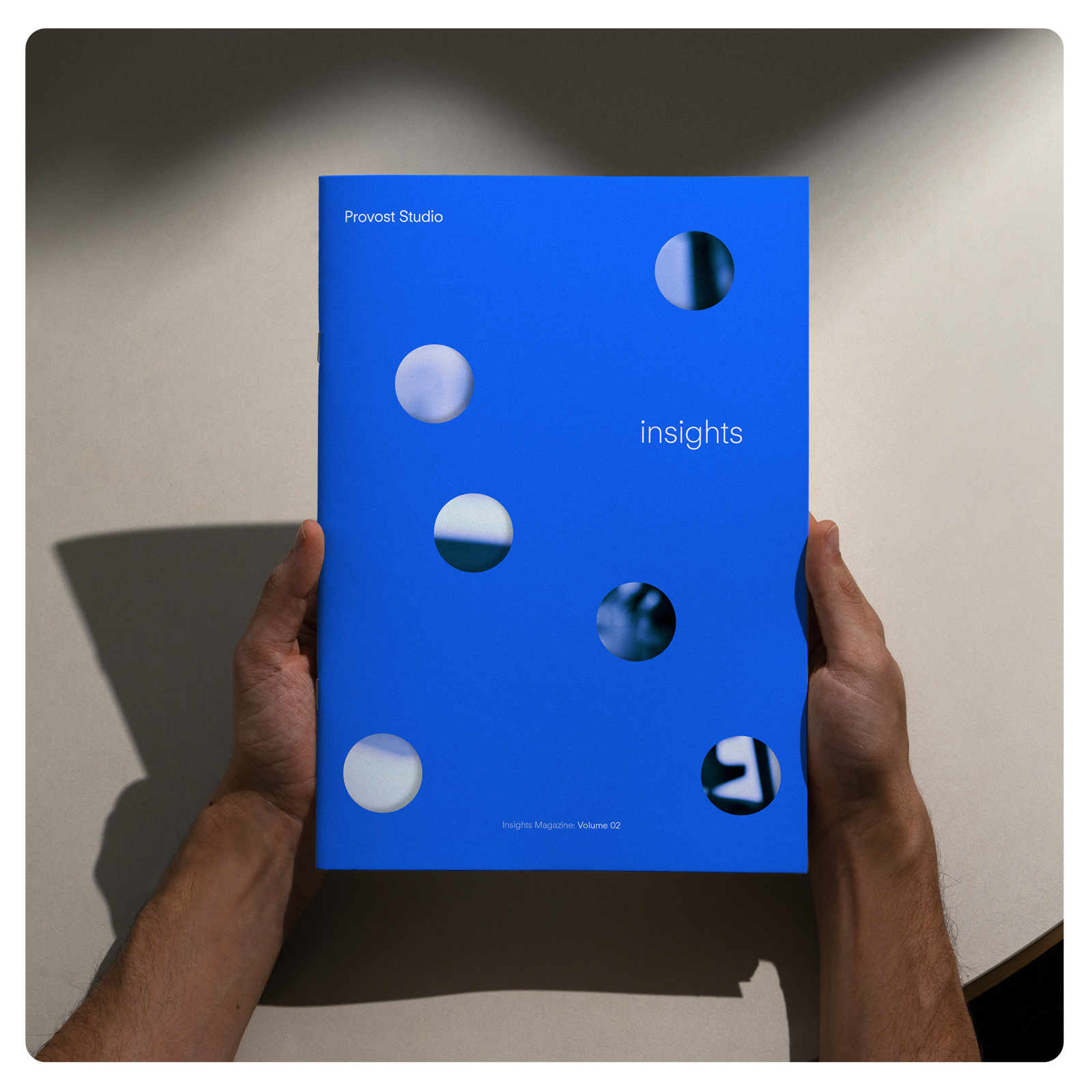
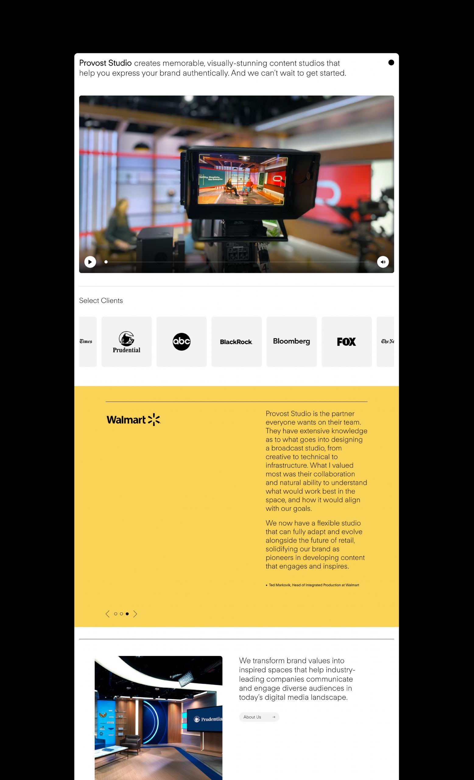
Provost Studio
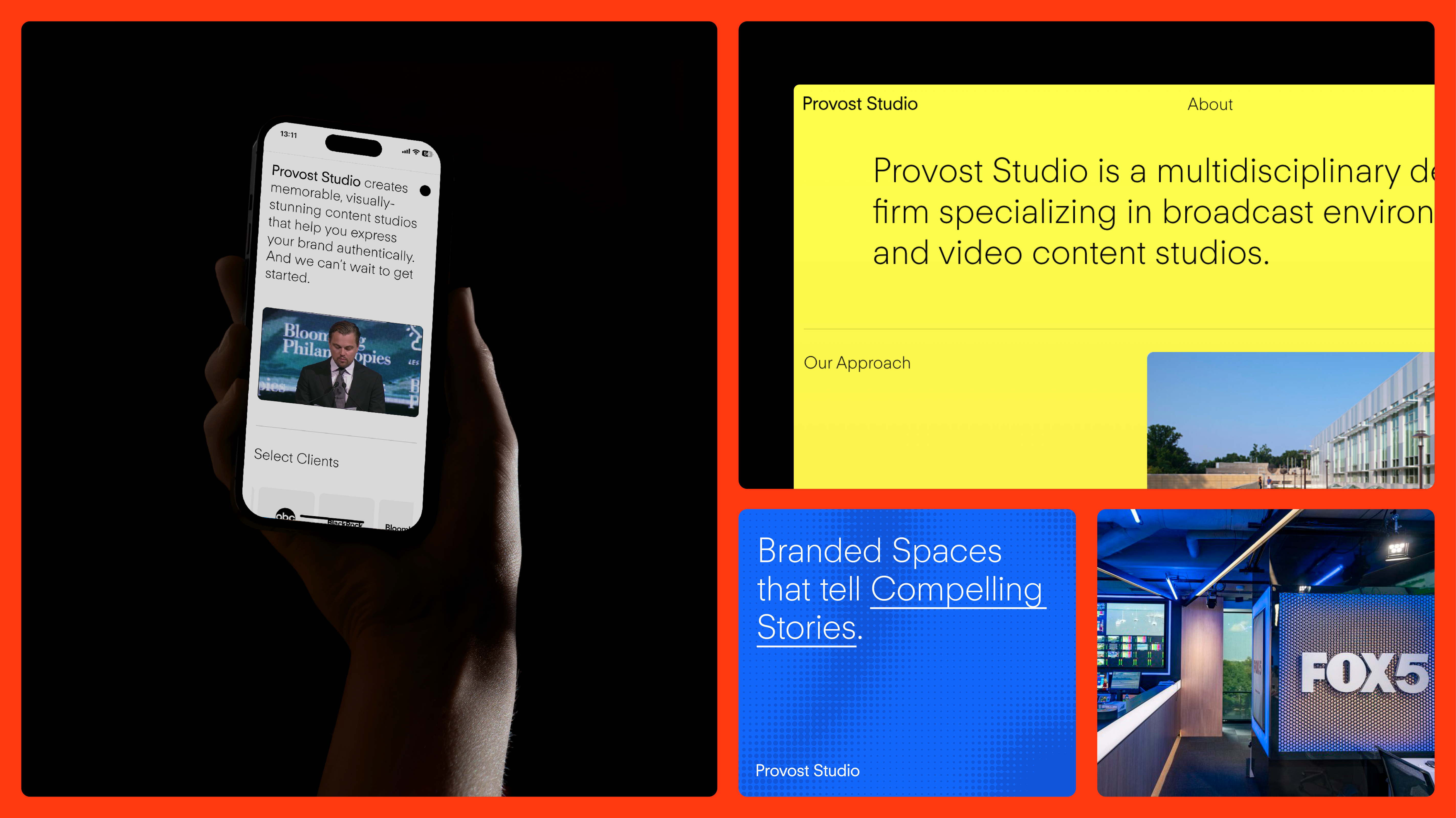
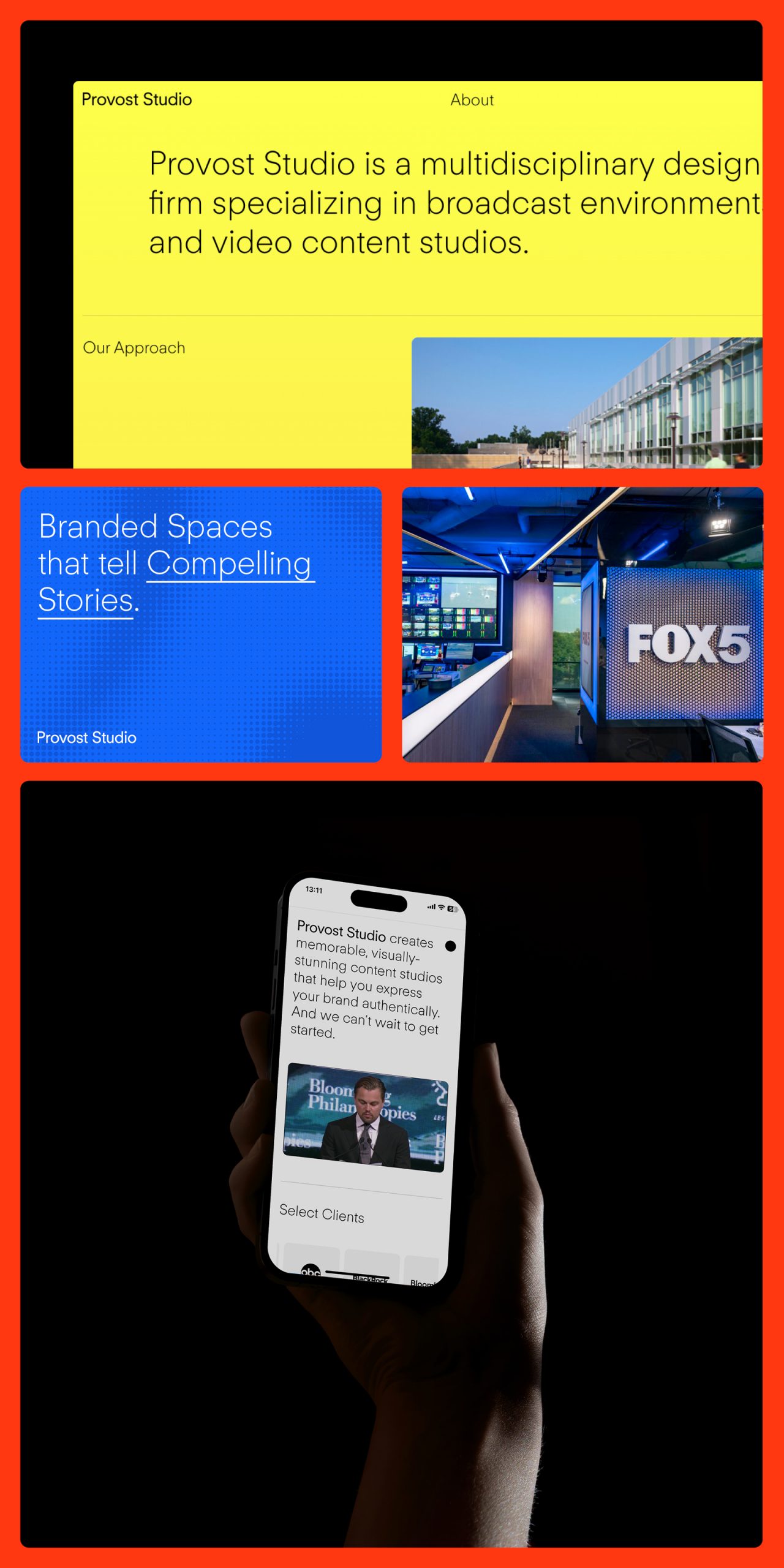
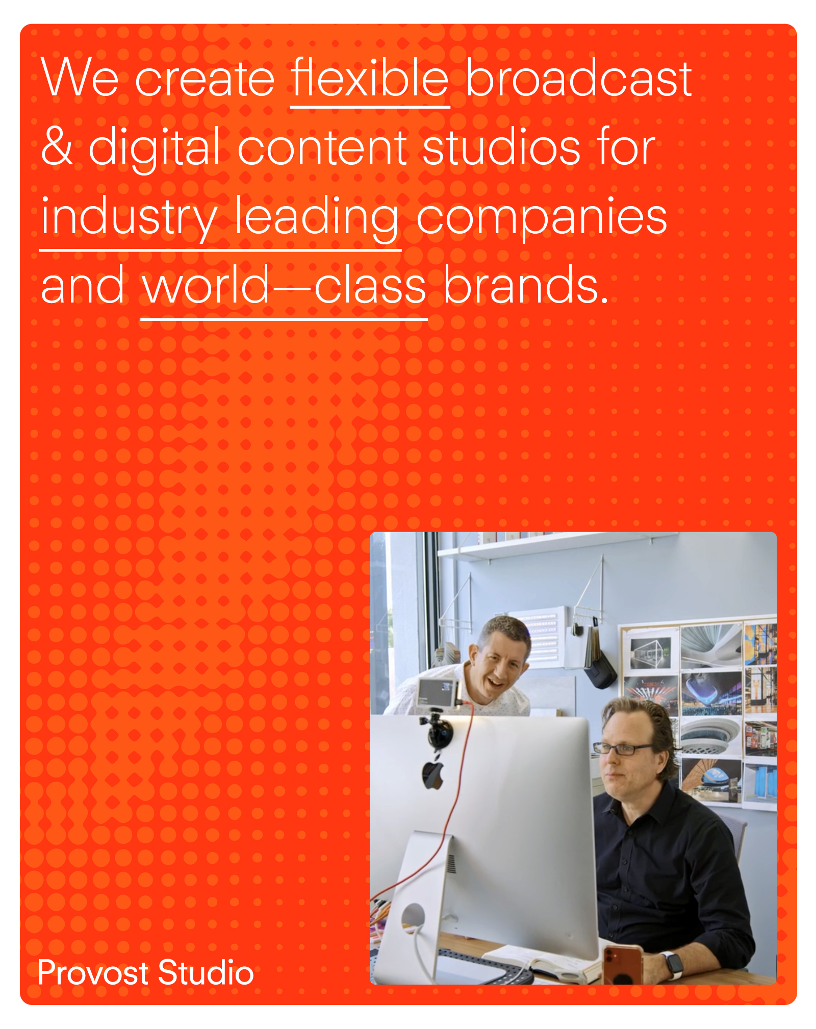
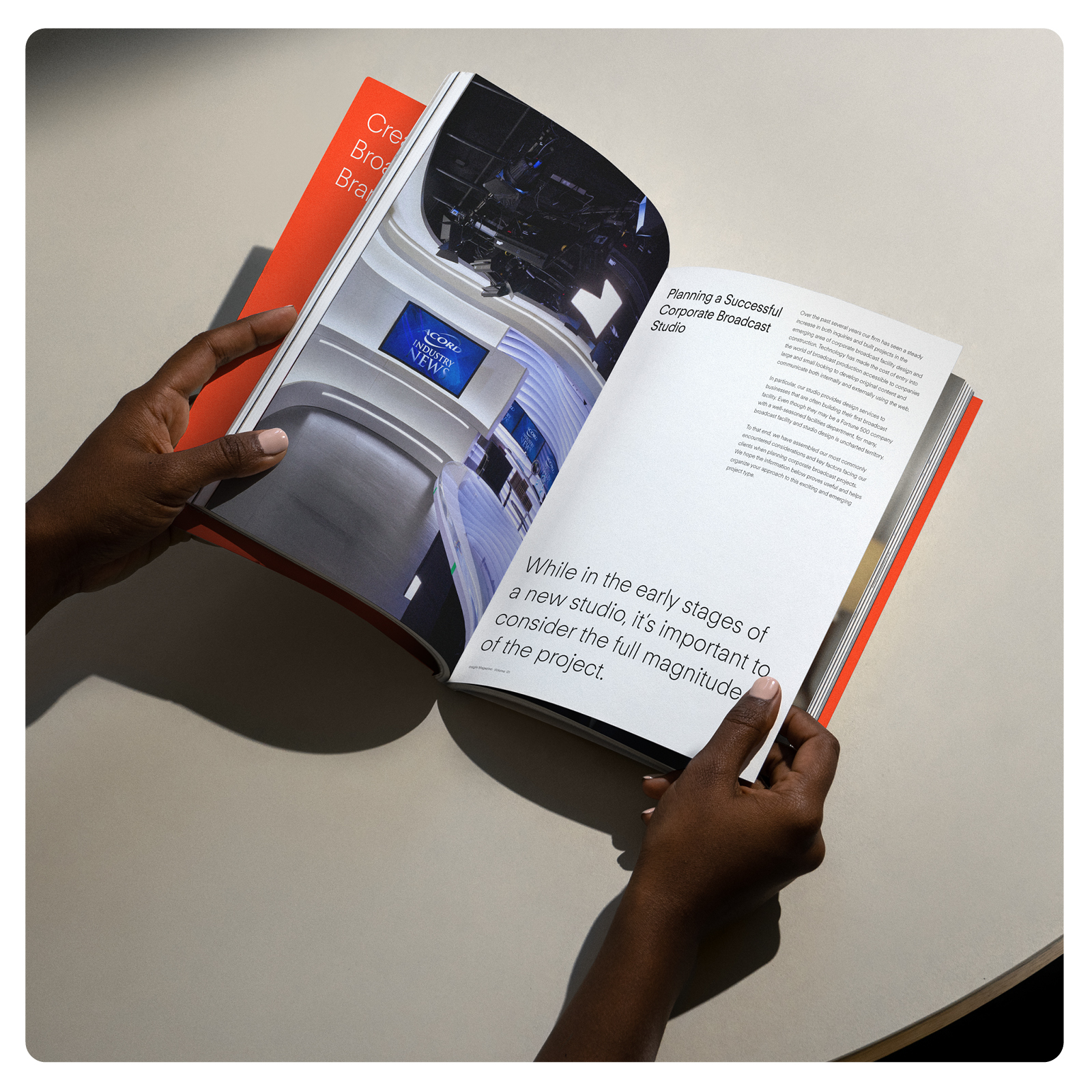
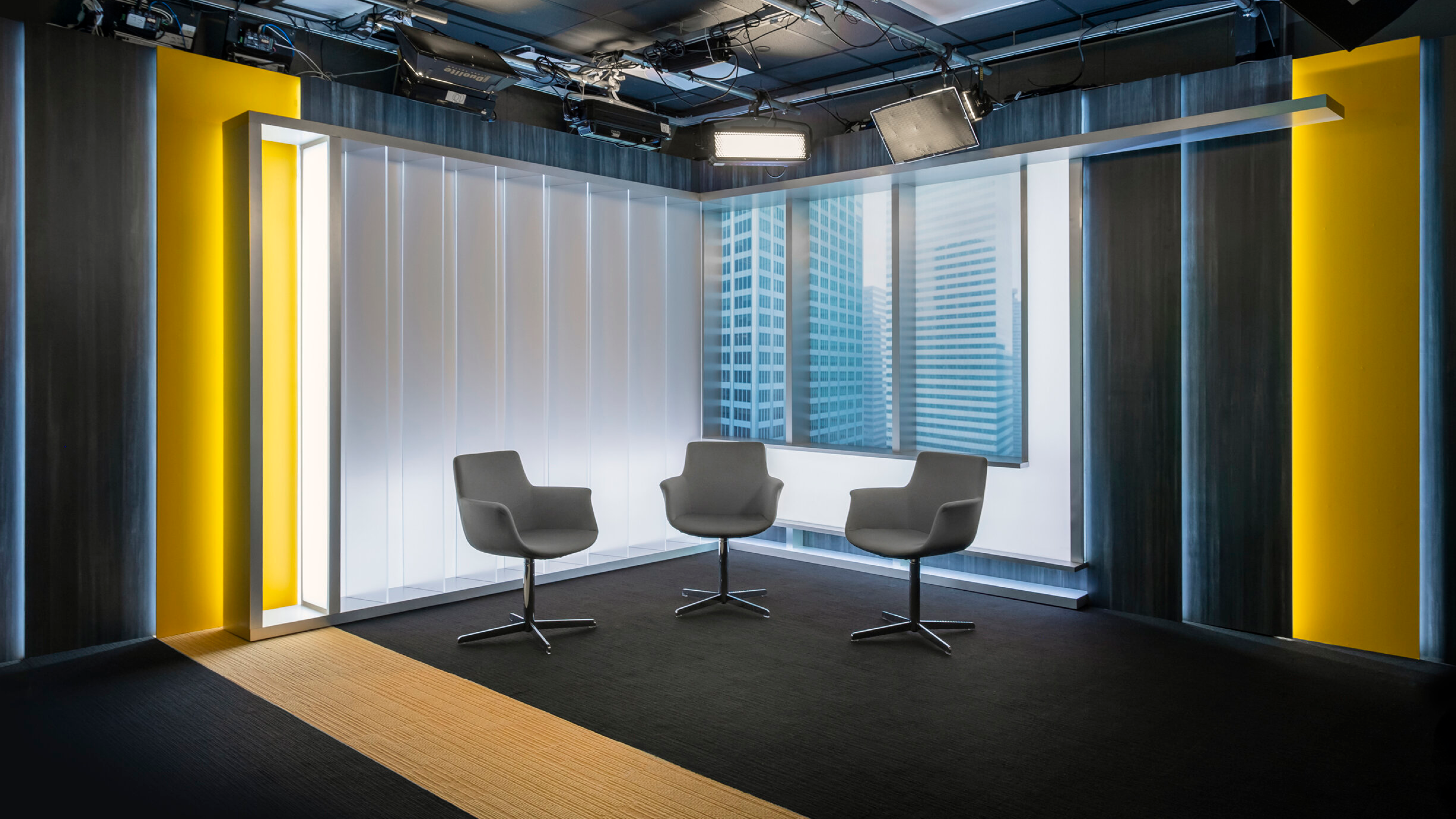
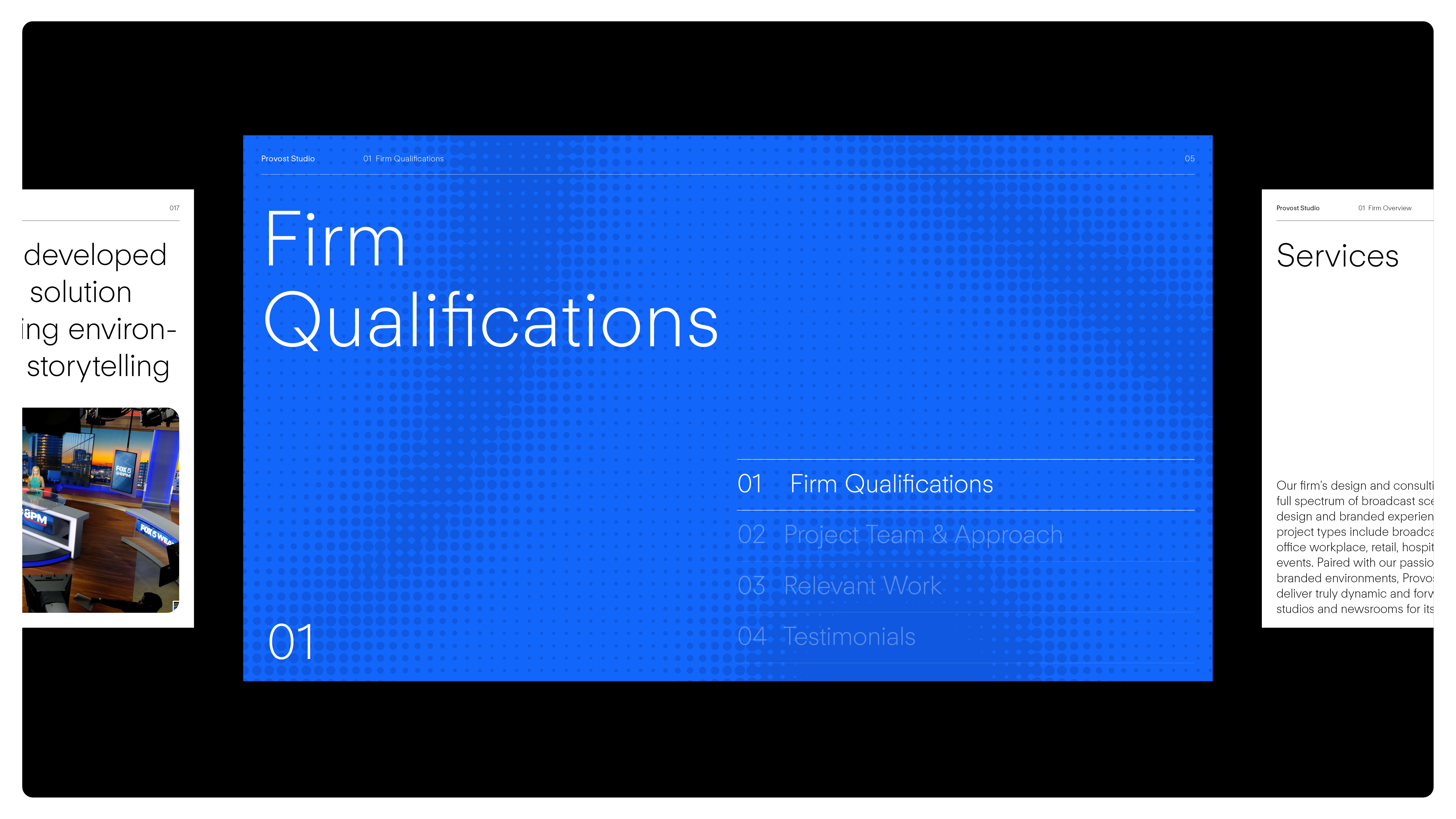
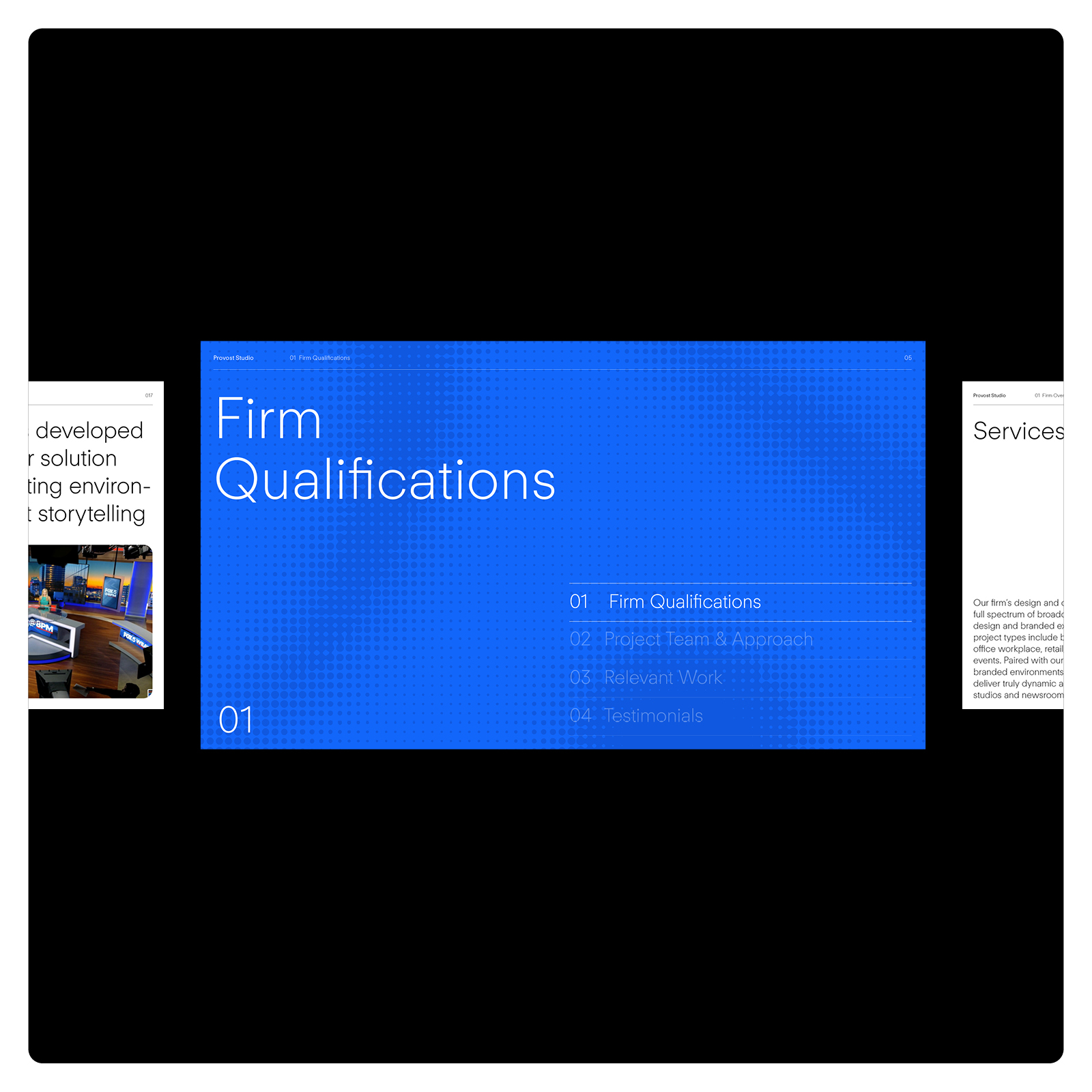
Provost Studio is known for creating visually-stunning broadcast studios and branded environments for Fortune 500 companies. A Common Thread was tasked with evolving their visual language while preserving their original ‘P’ symbol, representing space, modularity, and creativity.
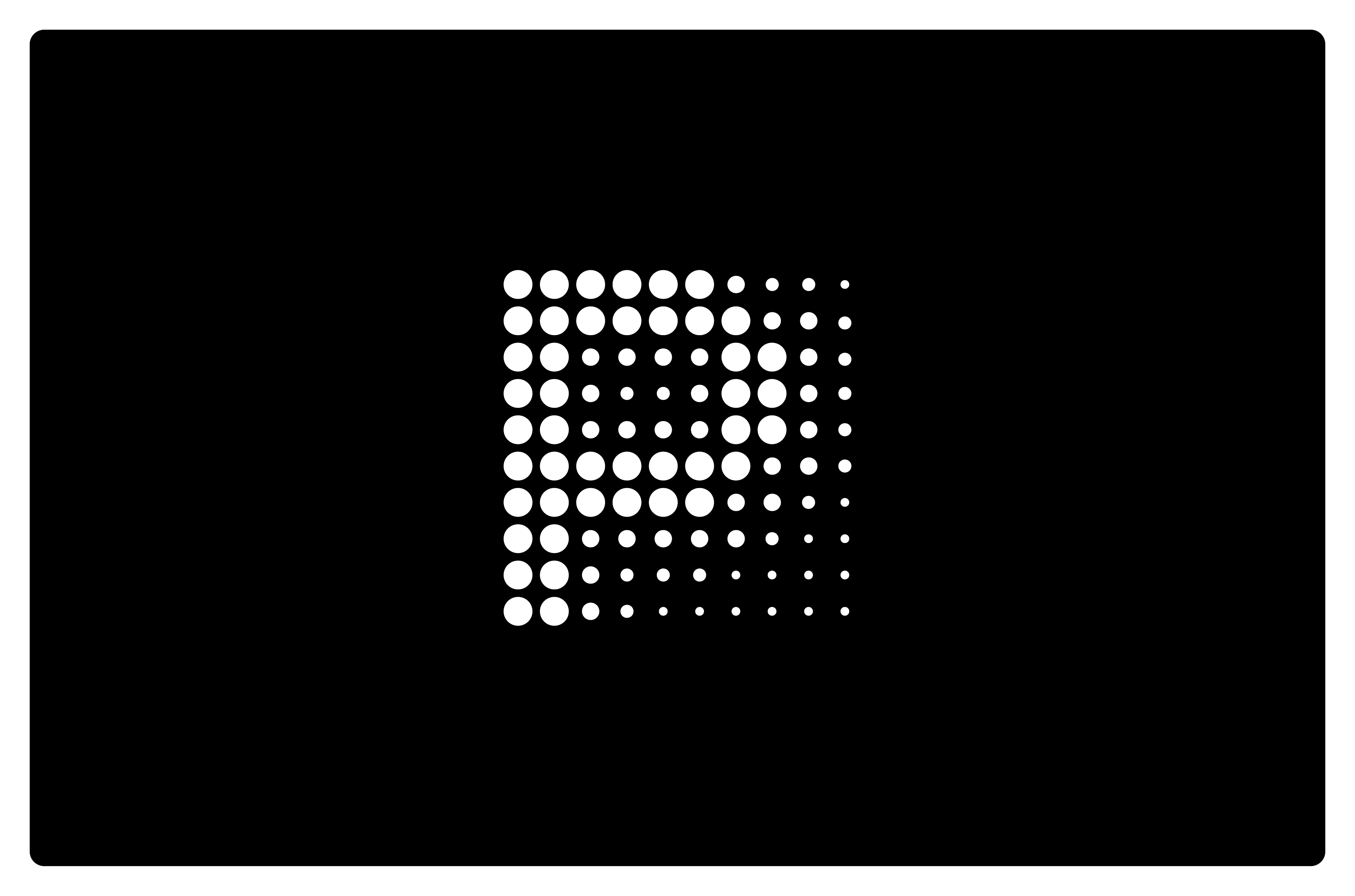
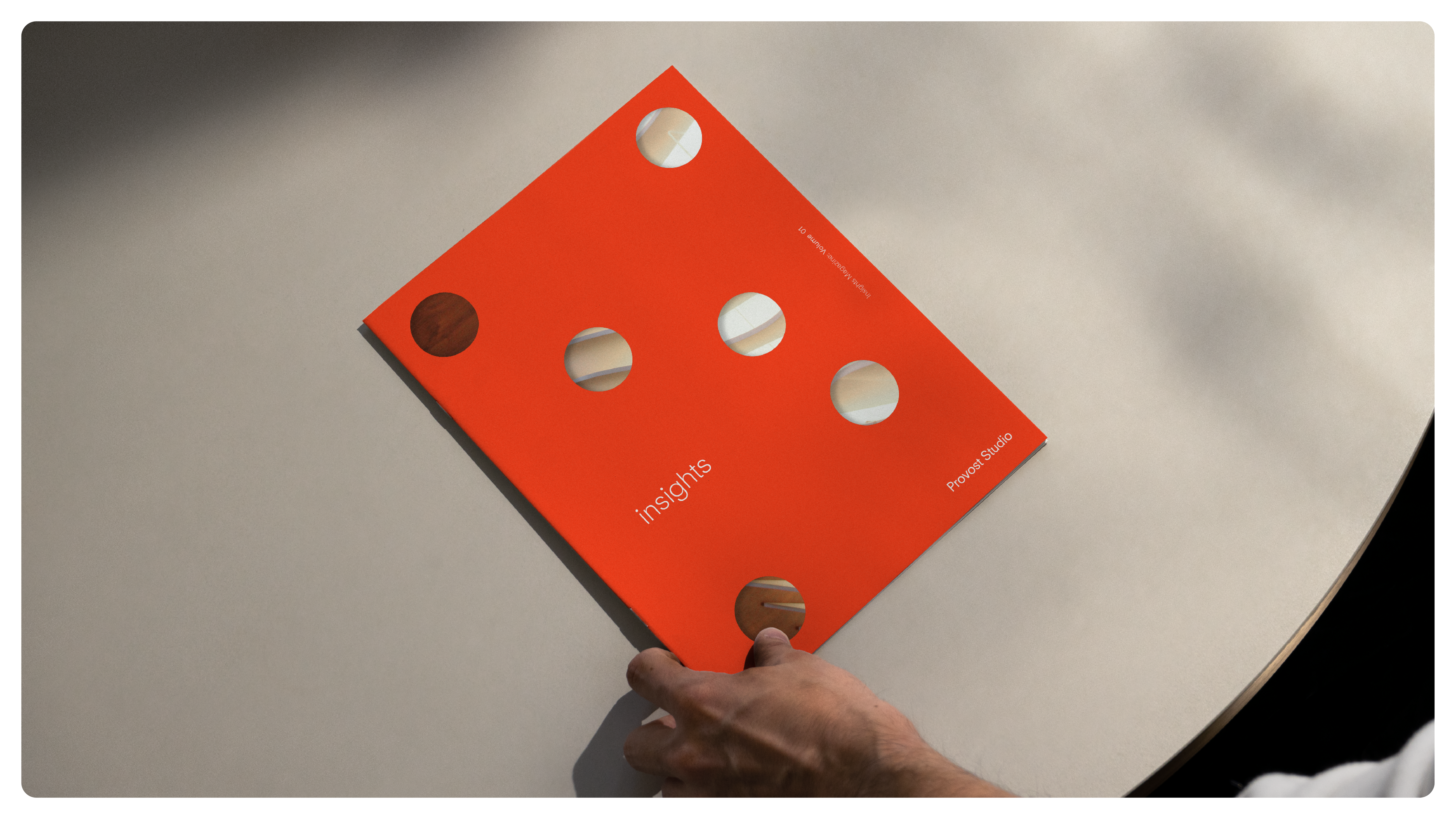
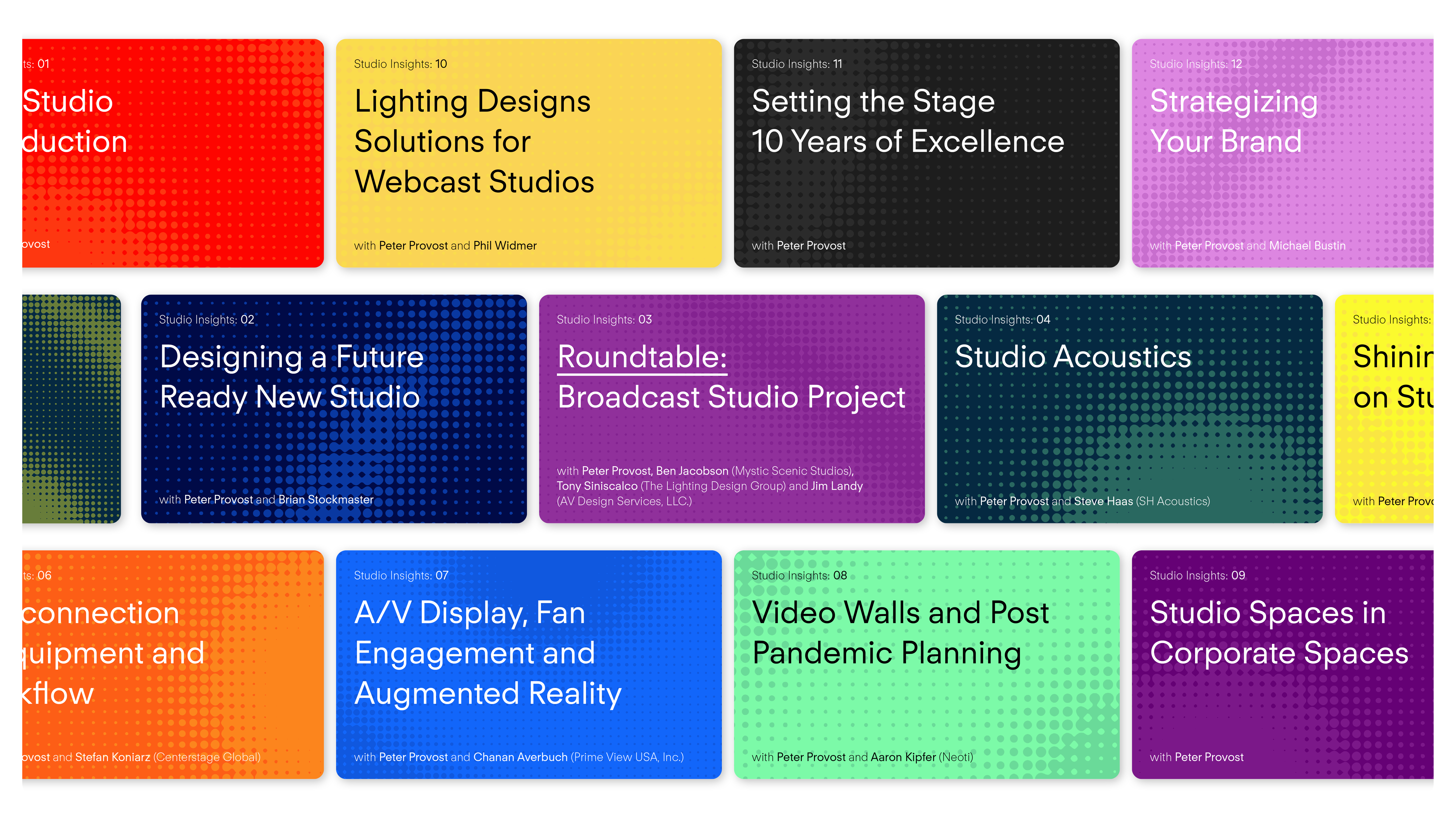
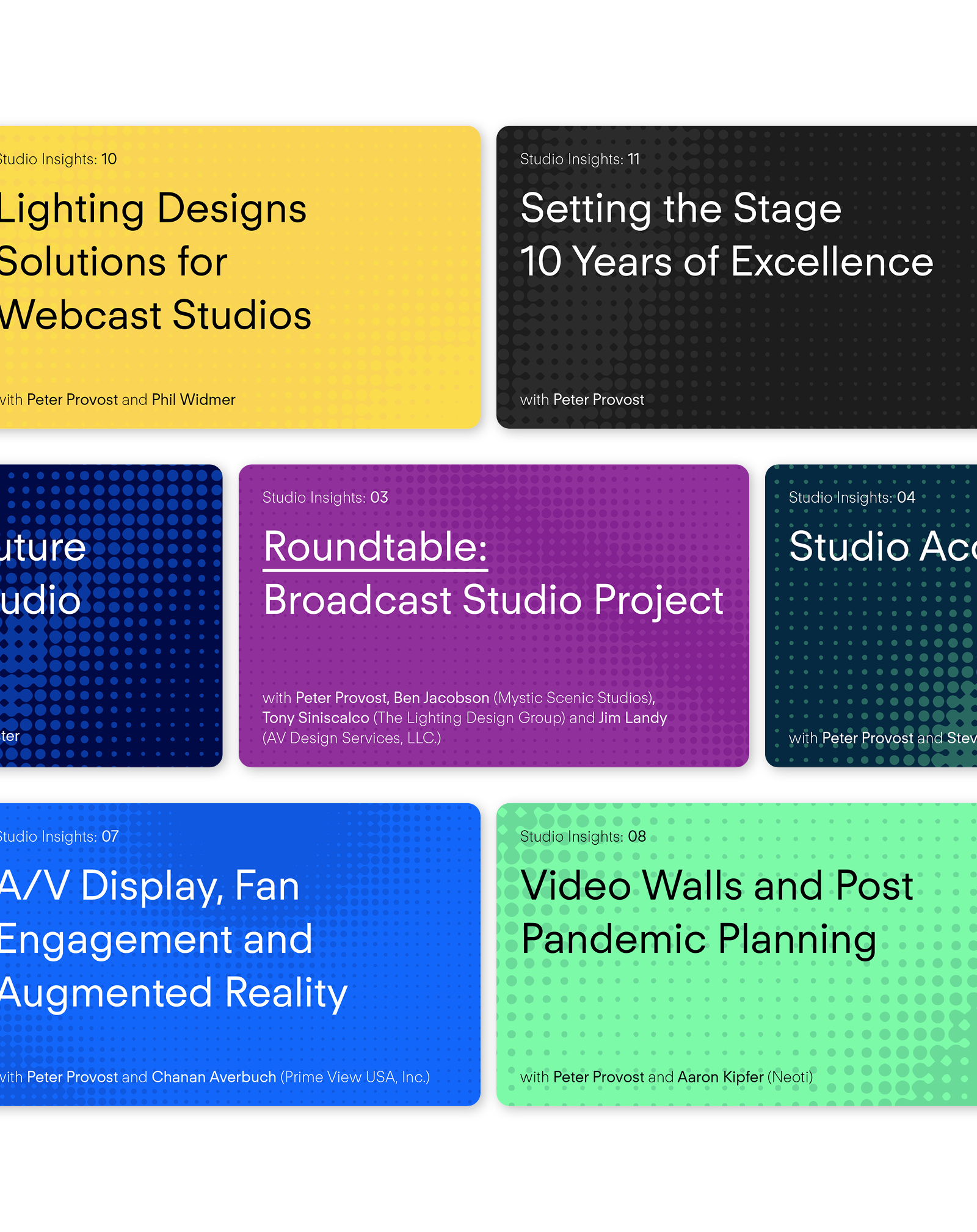
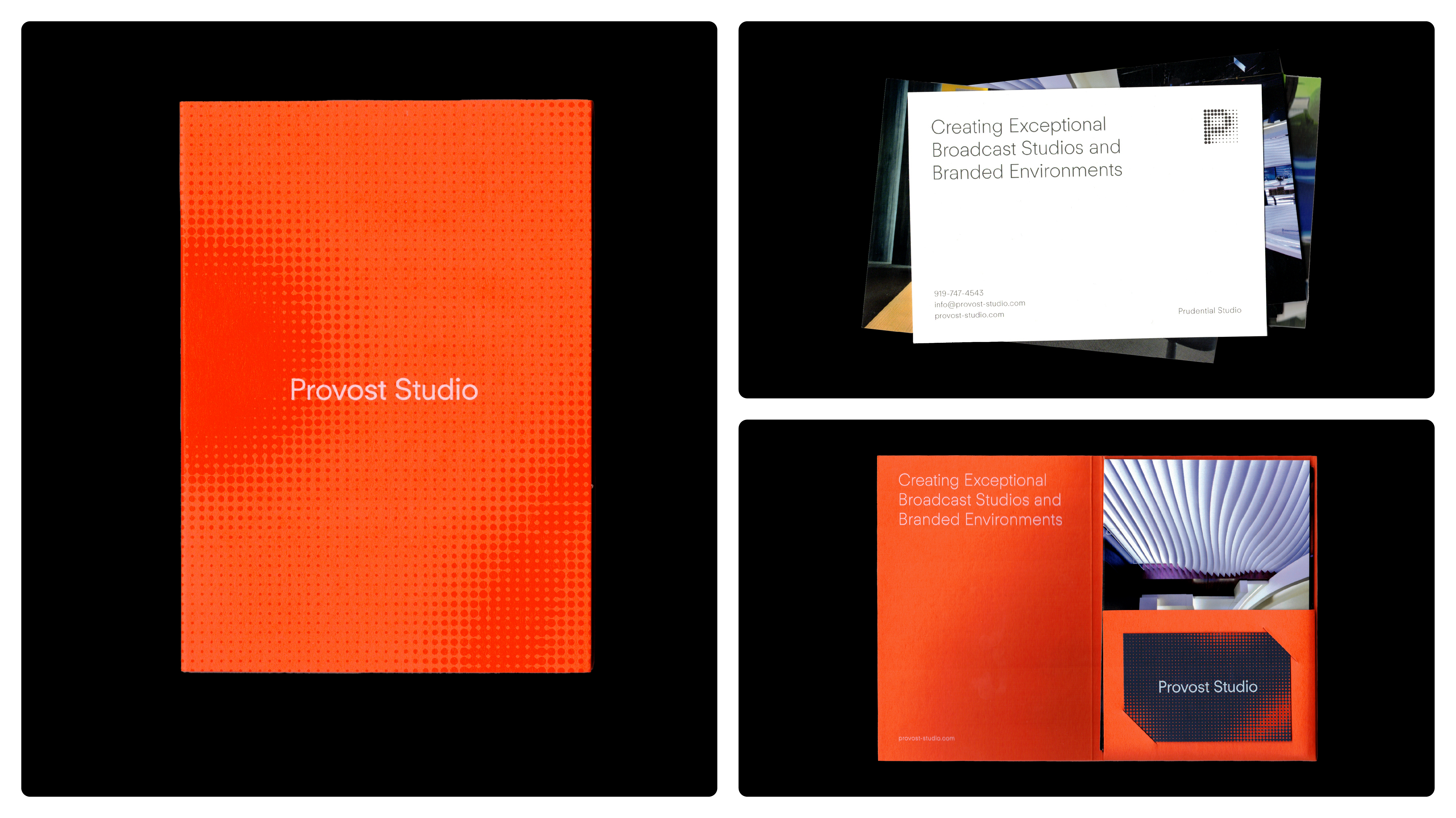
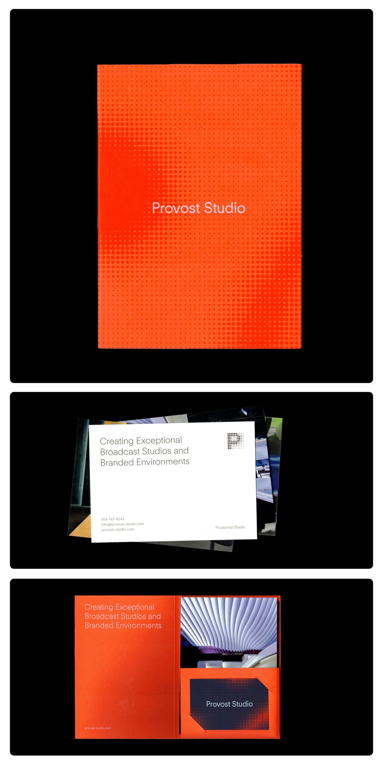
The design phase involved modernising the logotype, typography, and colour palette. We focused on developing the ‘P’ icon by extrapolating its dots into a playful and versatile graphic tool inspired by printed halftone methods. This was central to creating consistent patterns across printed and digital assets, ensuring a cohesive visual language.
The project culminated in a contemporary, cohesive brand identity, enhancing Provost Studio’s image and ensuring consistent brand recognition within their industry.
Provost Studio

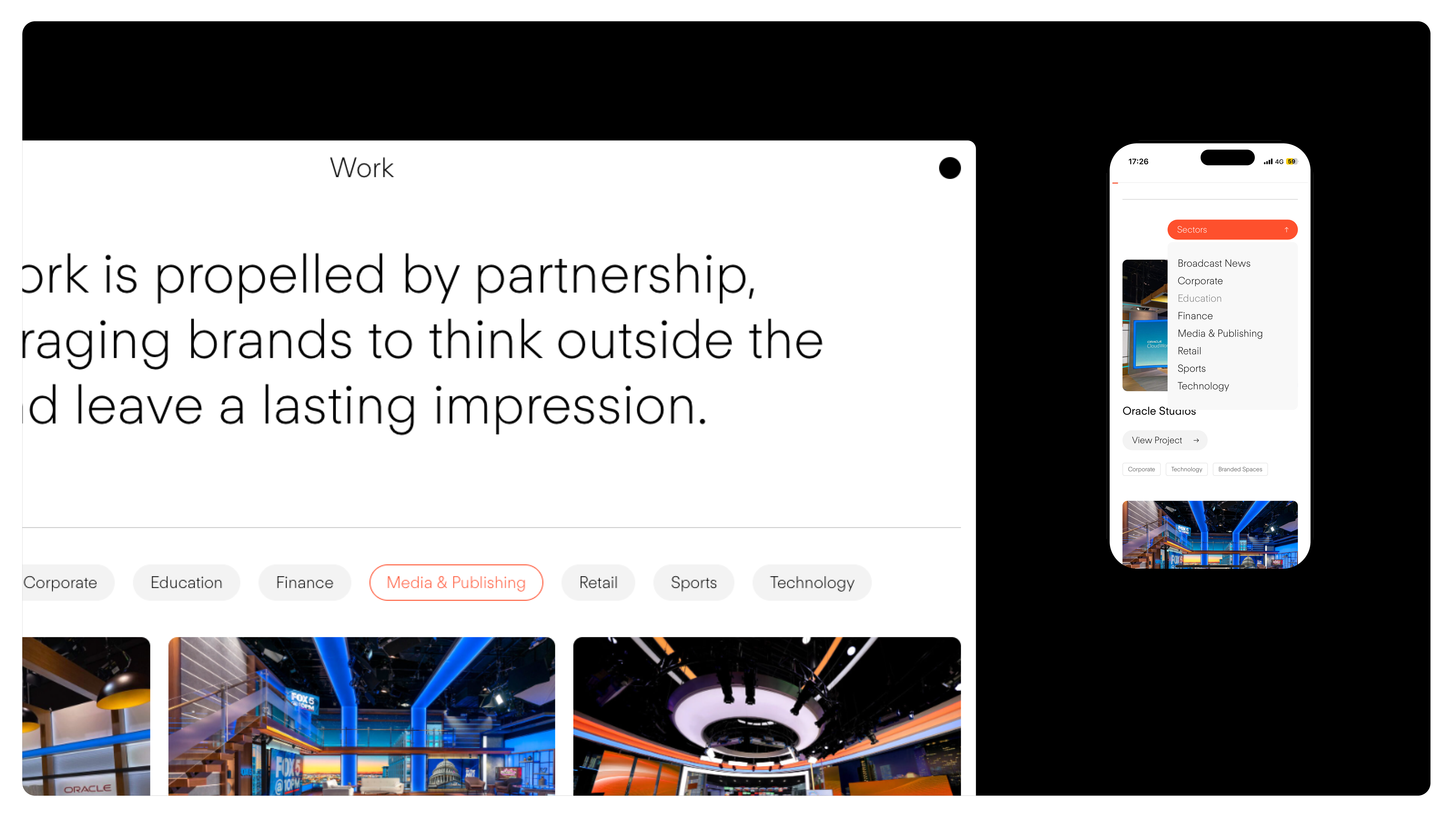
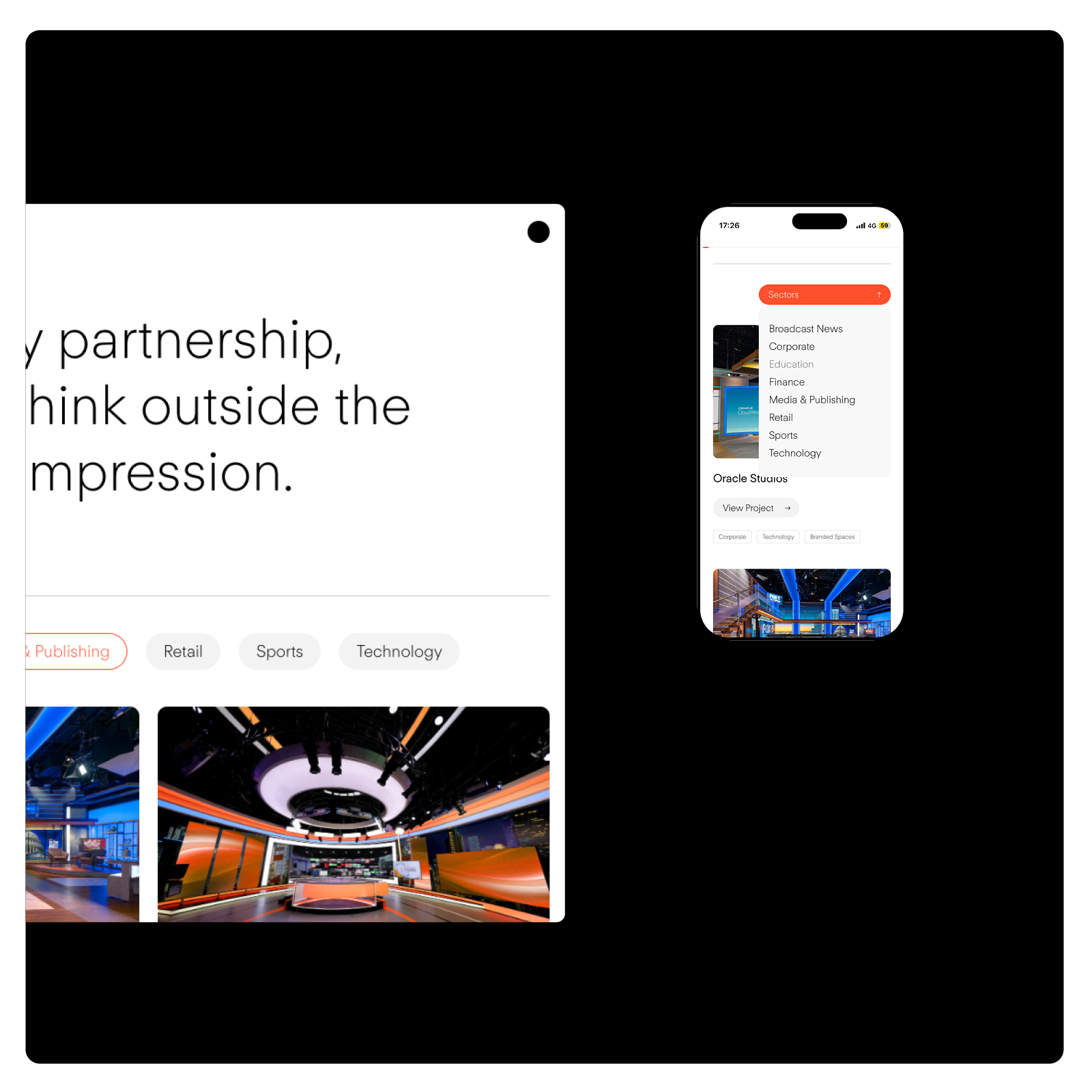
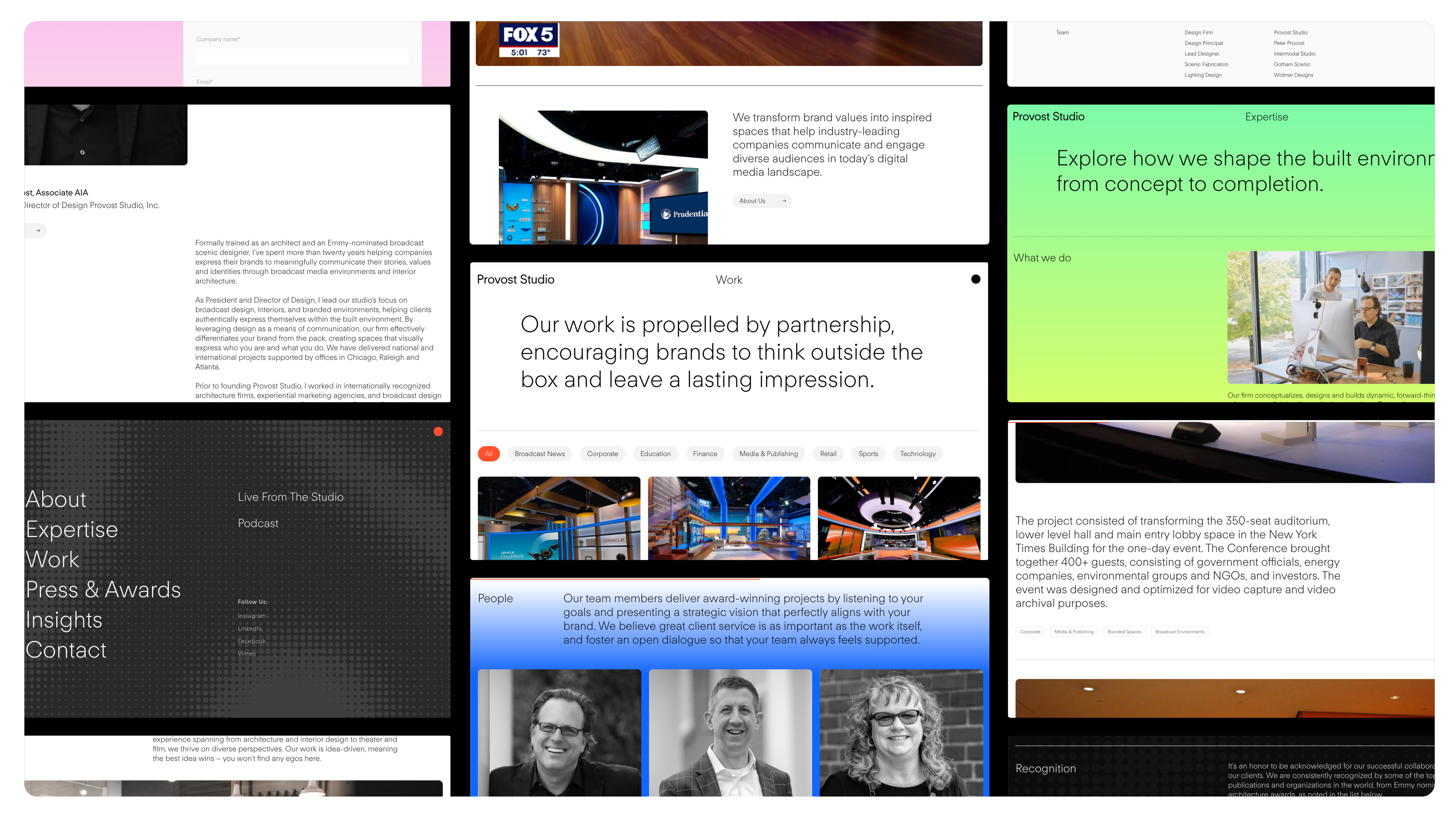
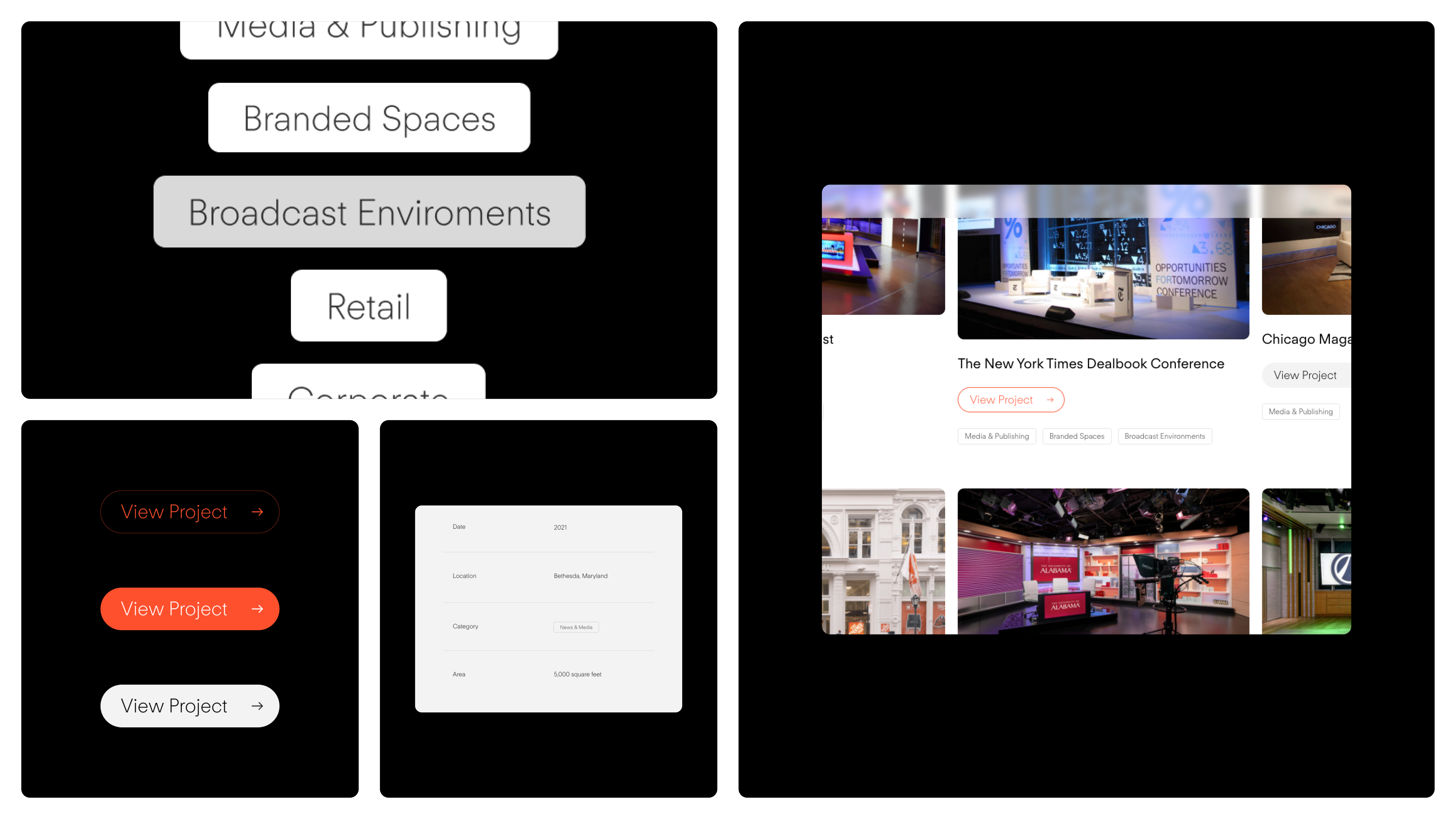
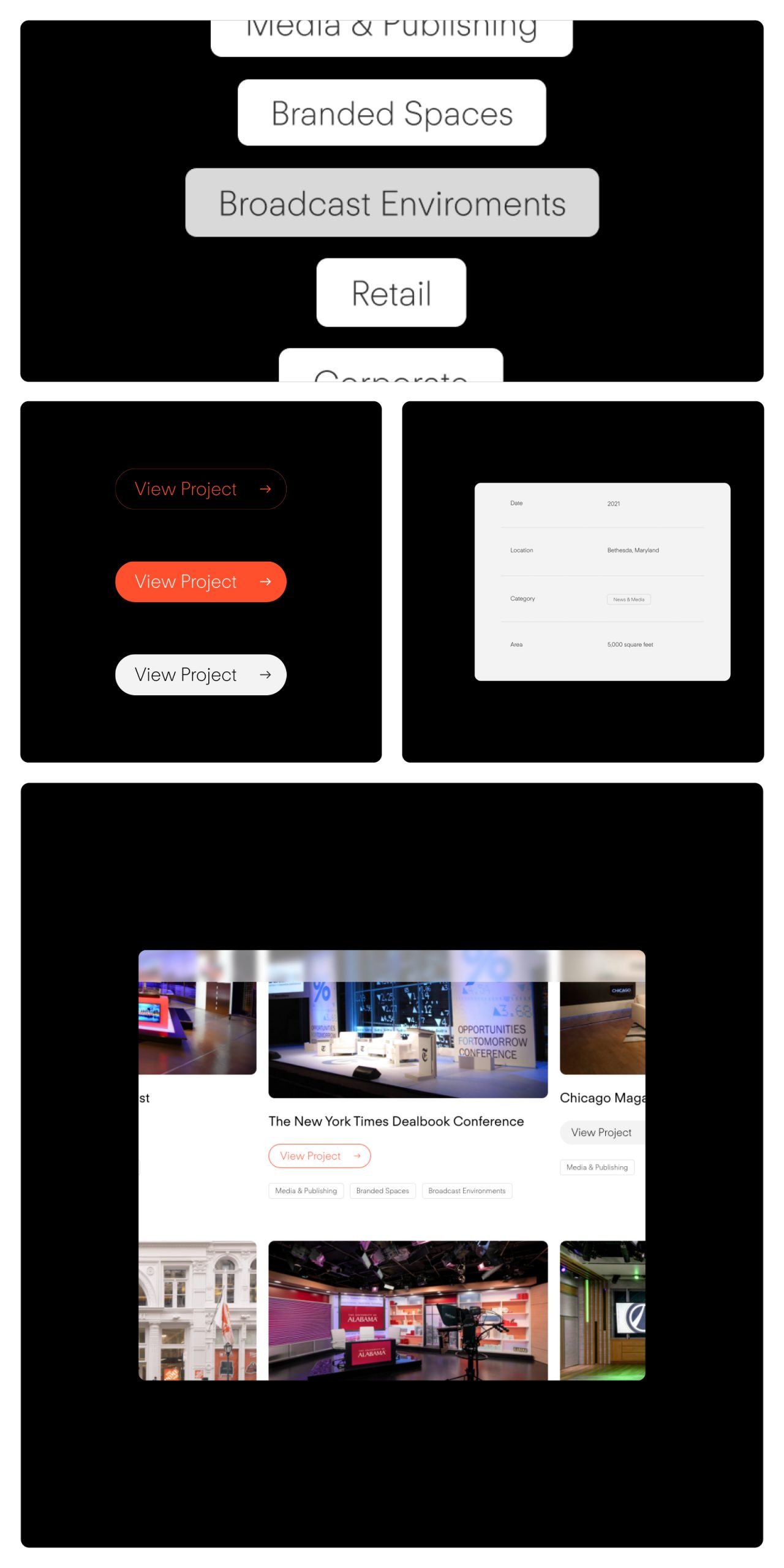
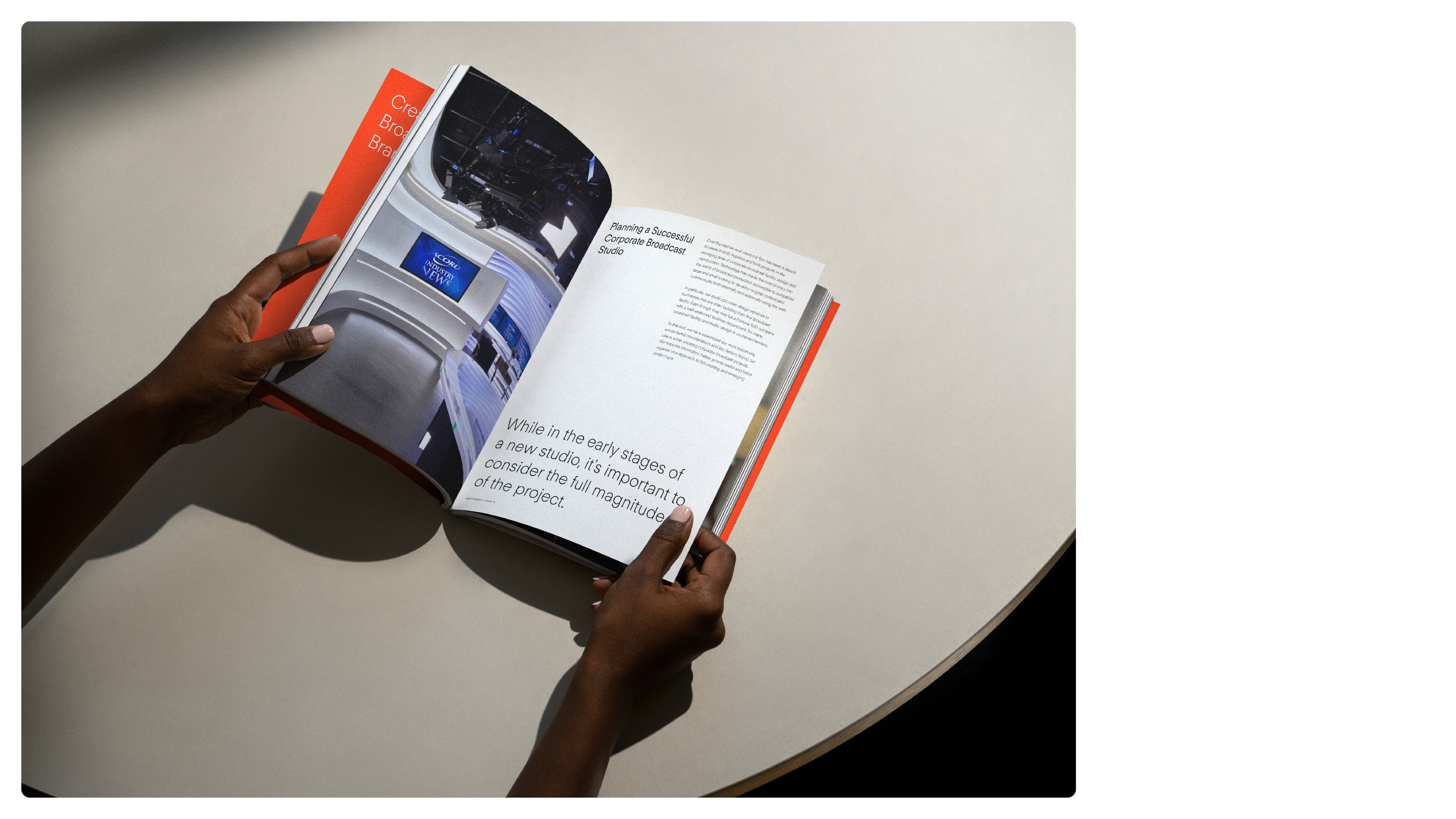
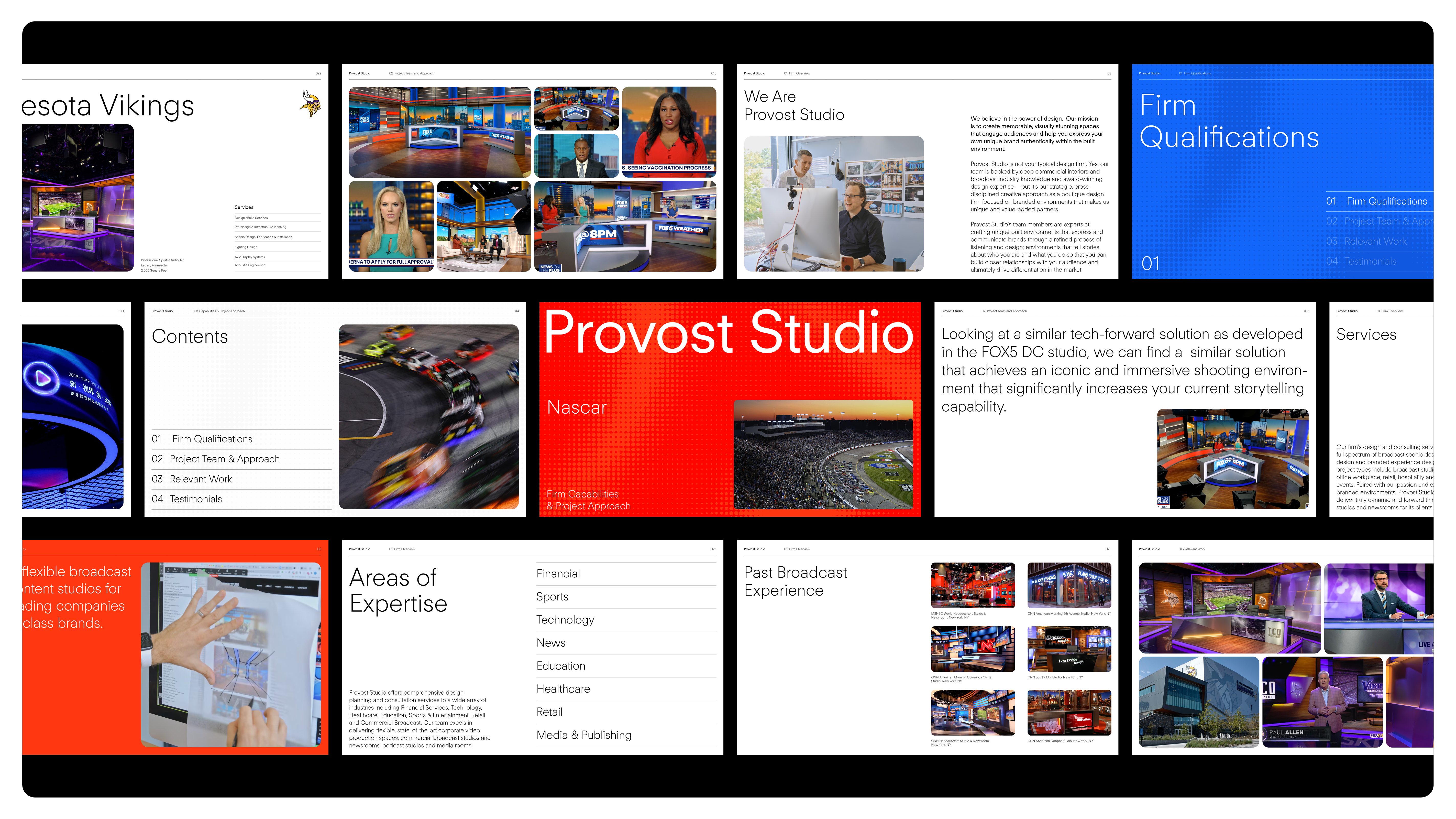
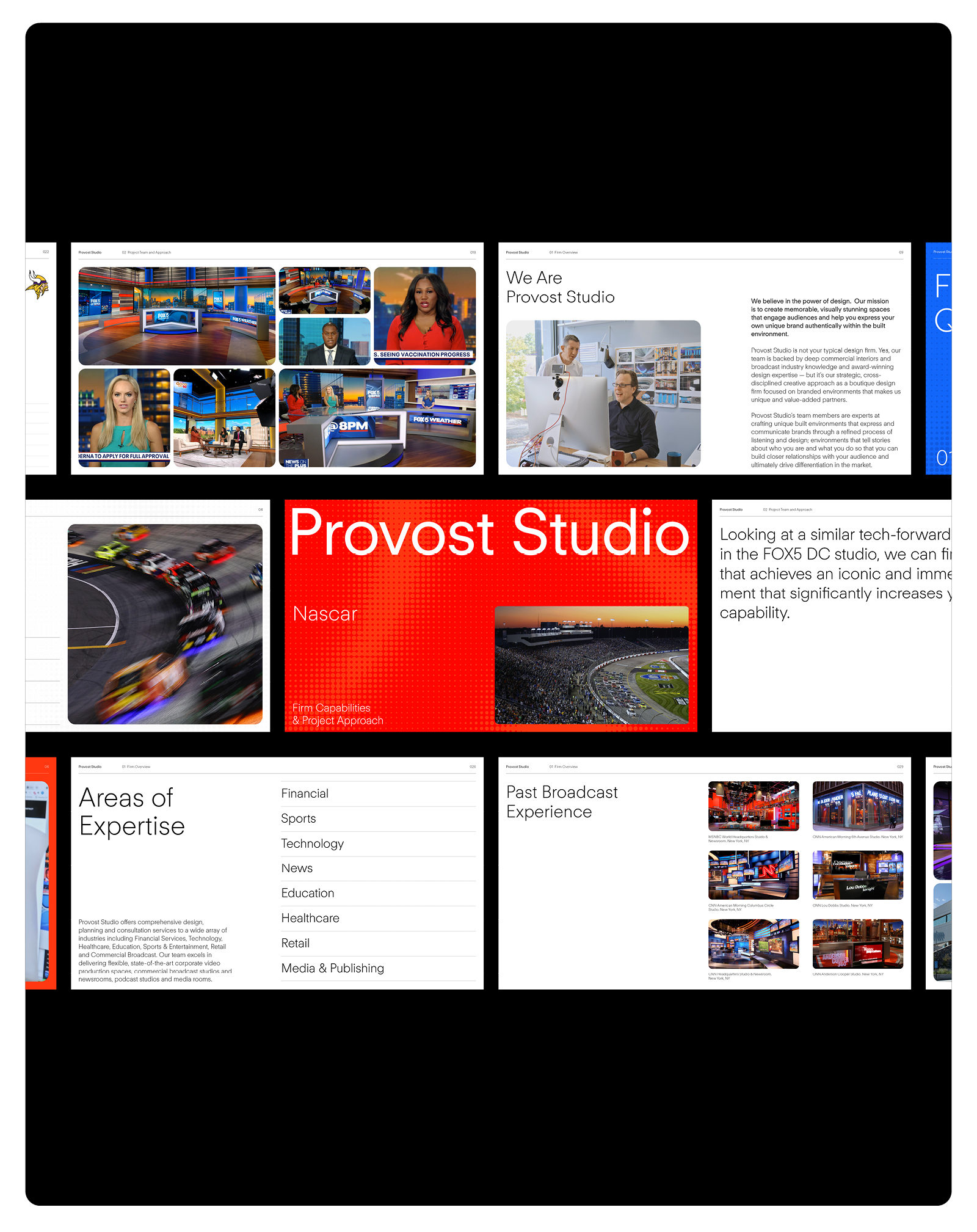
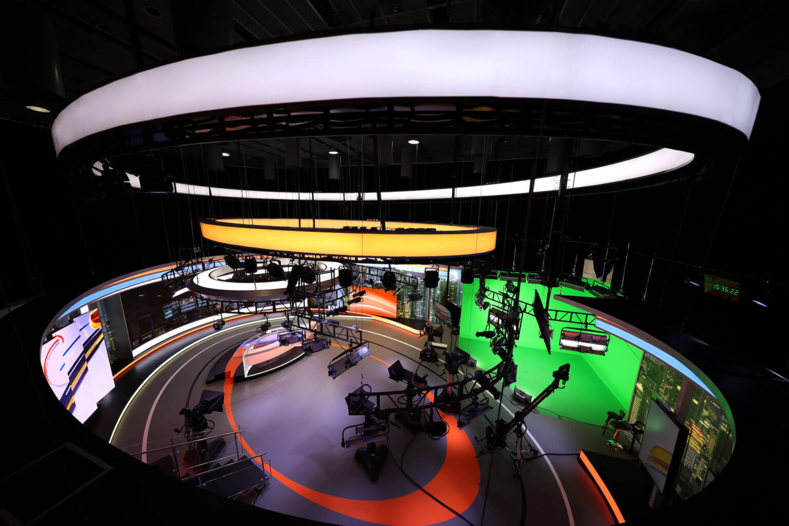
Gallery View
Provost Studio