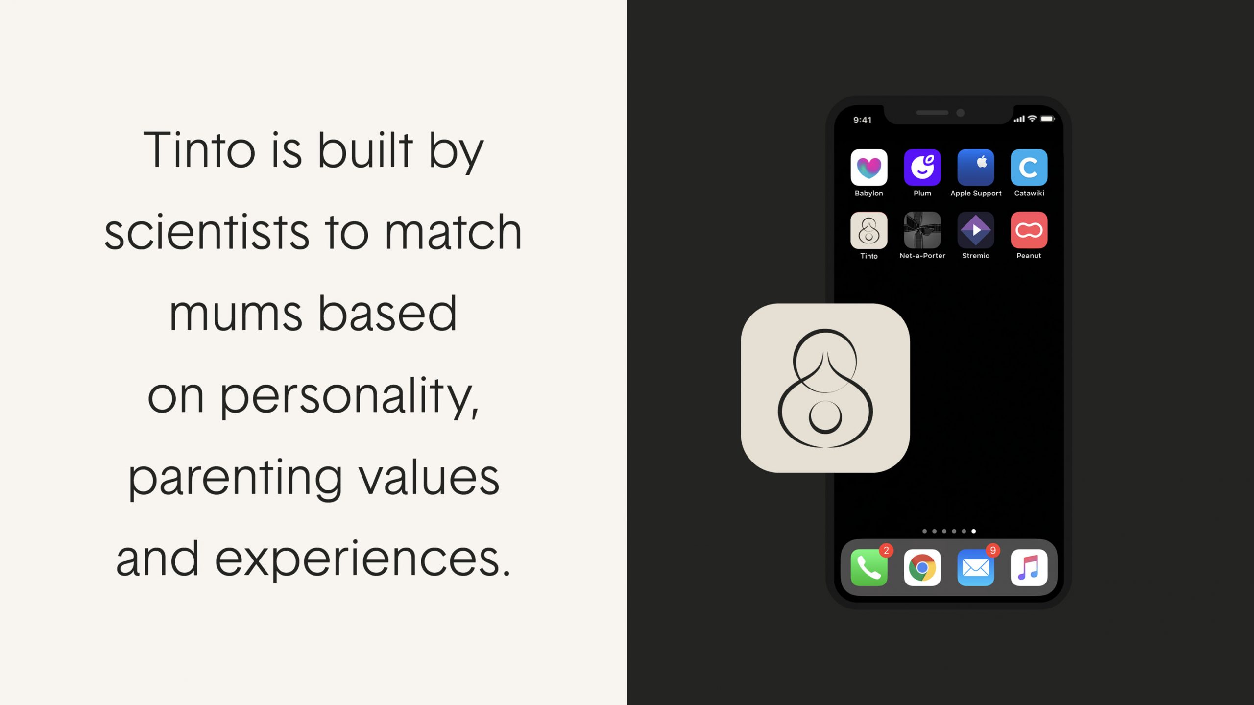
Tinto
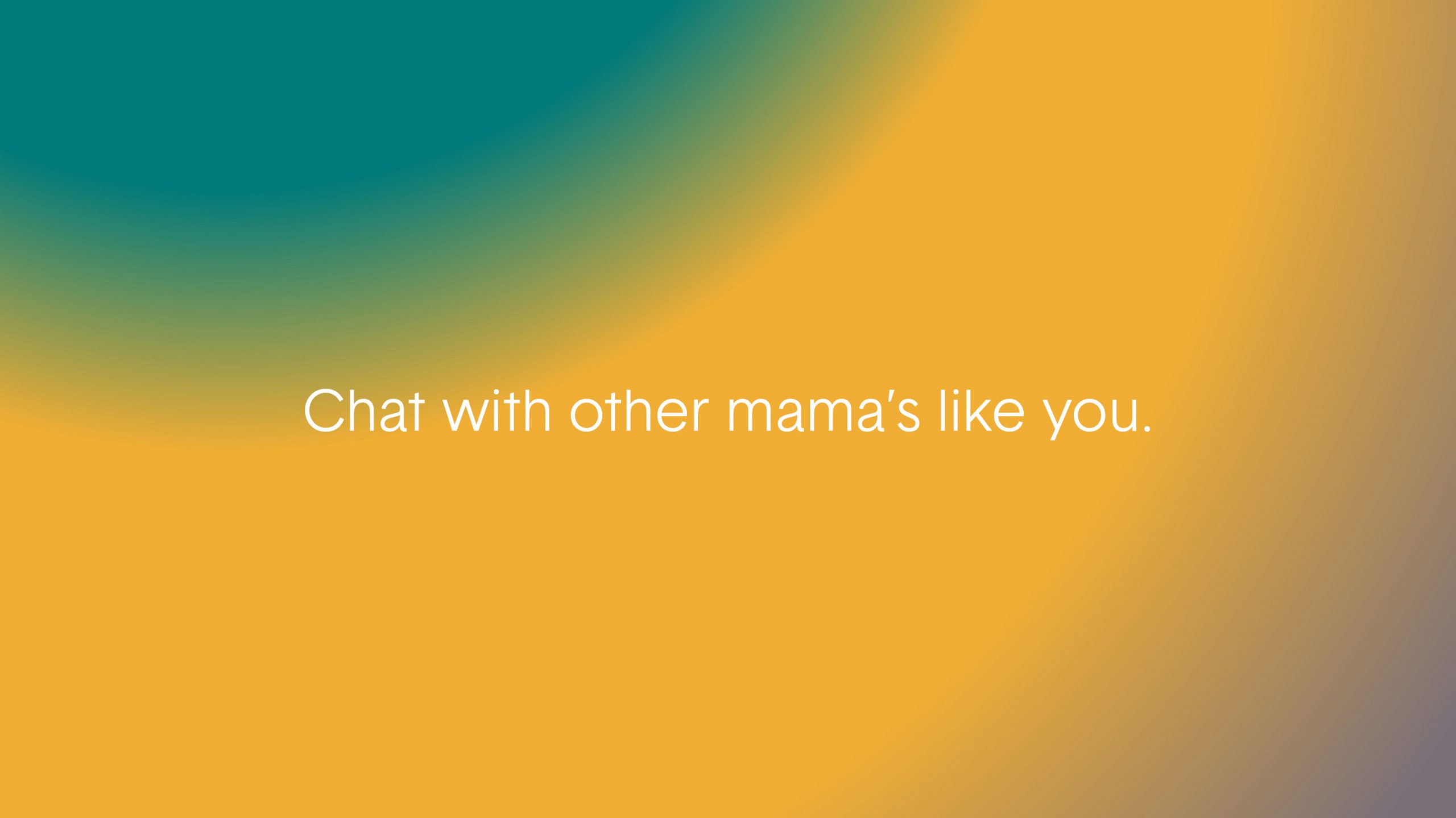
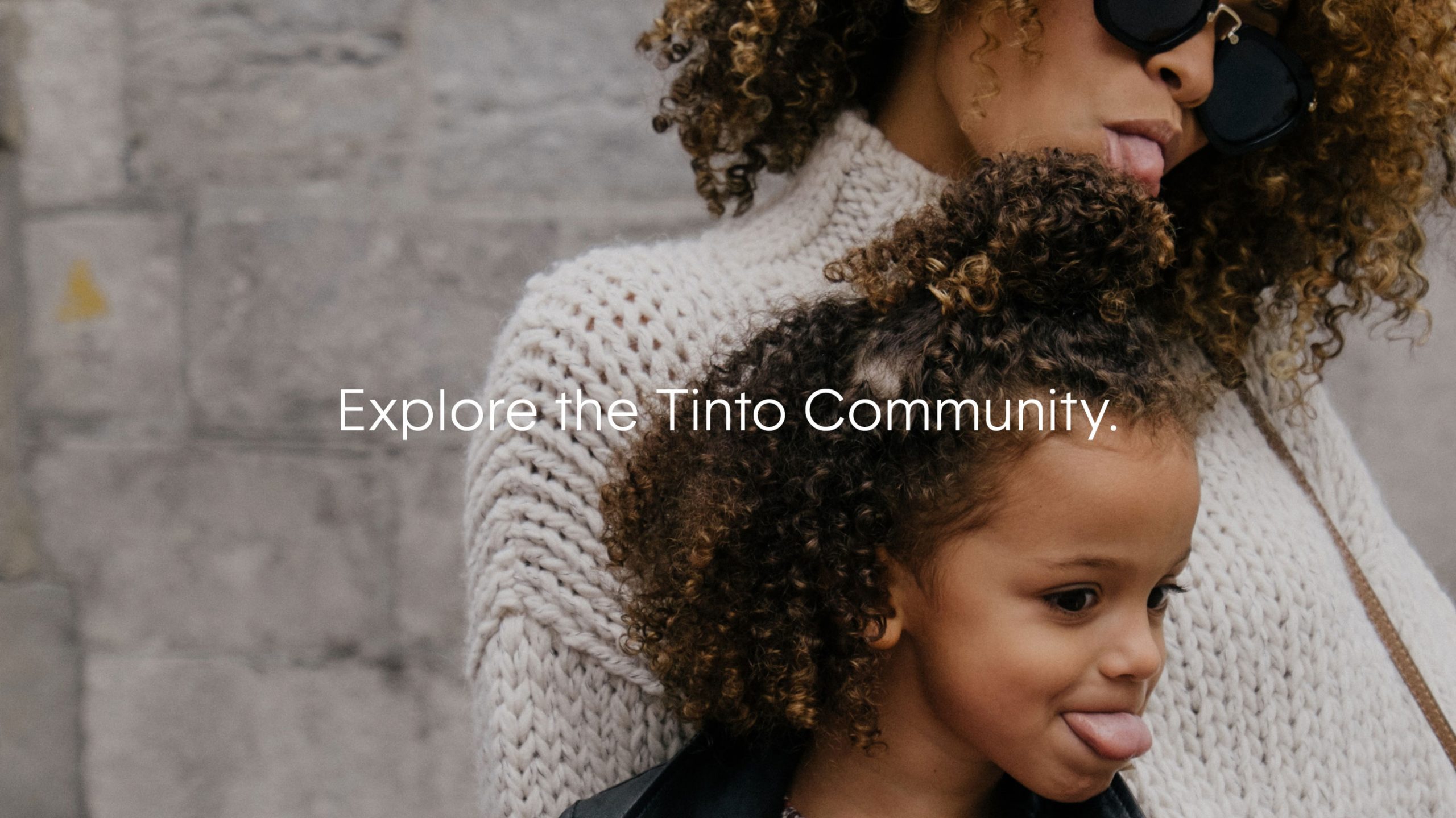
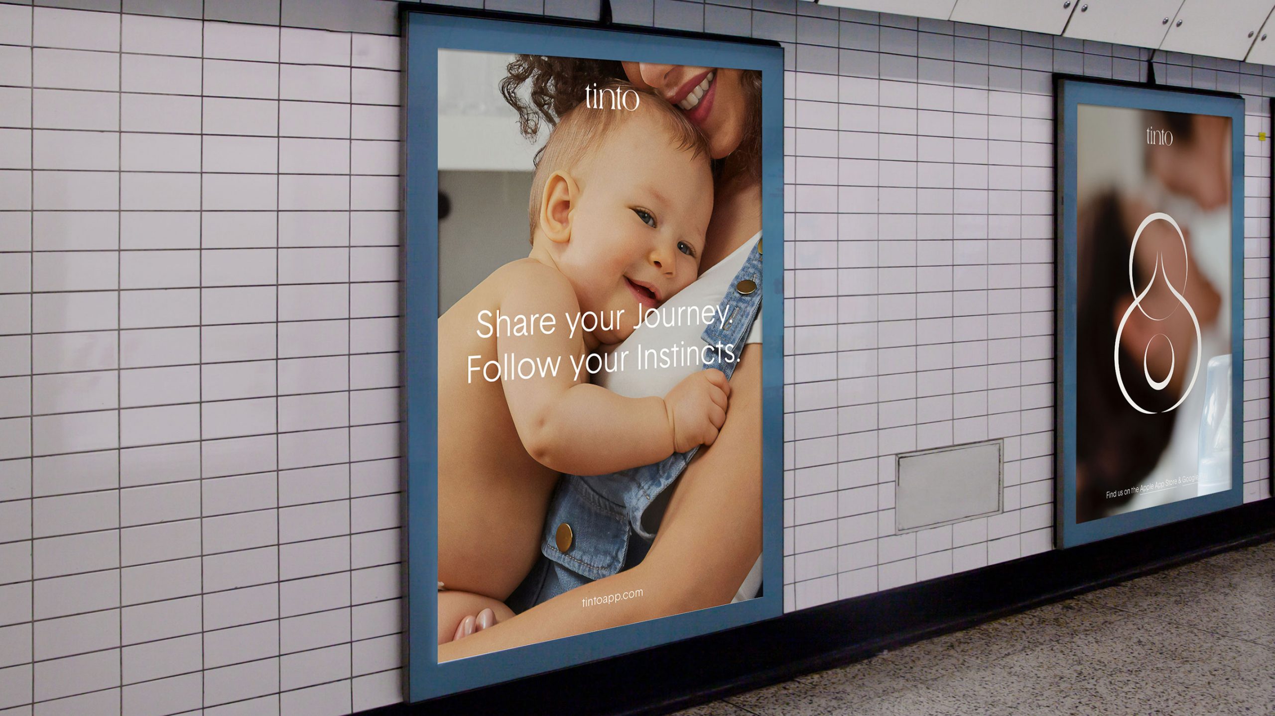
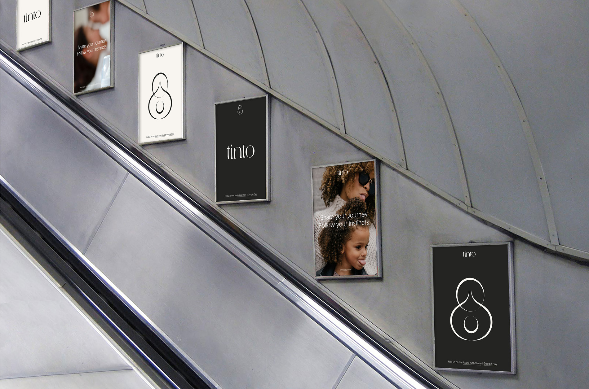
“We’re on a mission to help mothers thrive in every stage of life. Connect with mums on your wavelength. There’s a science in making meaningful connections. We want to show you how…”
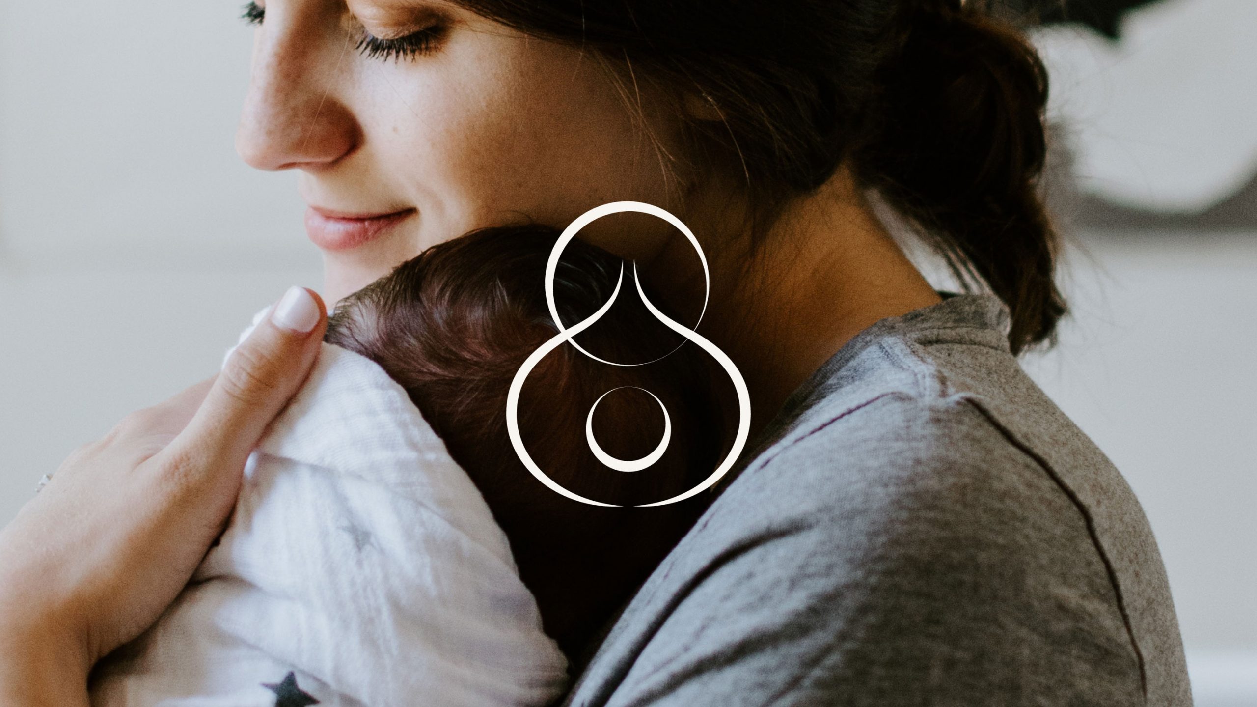
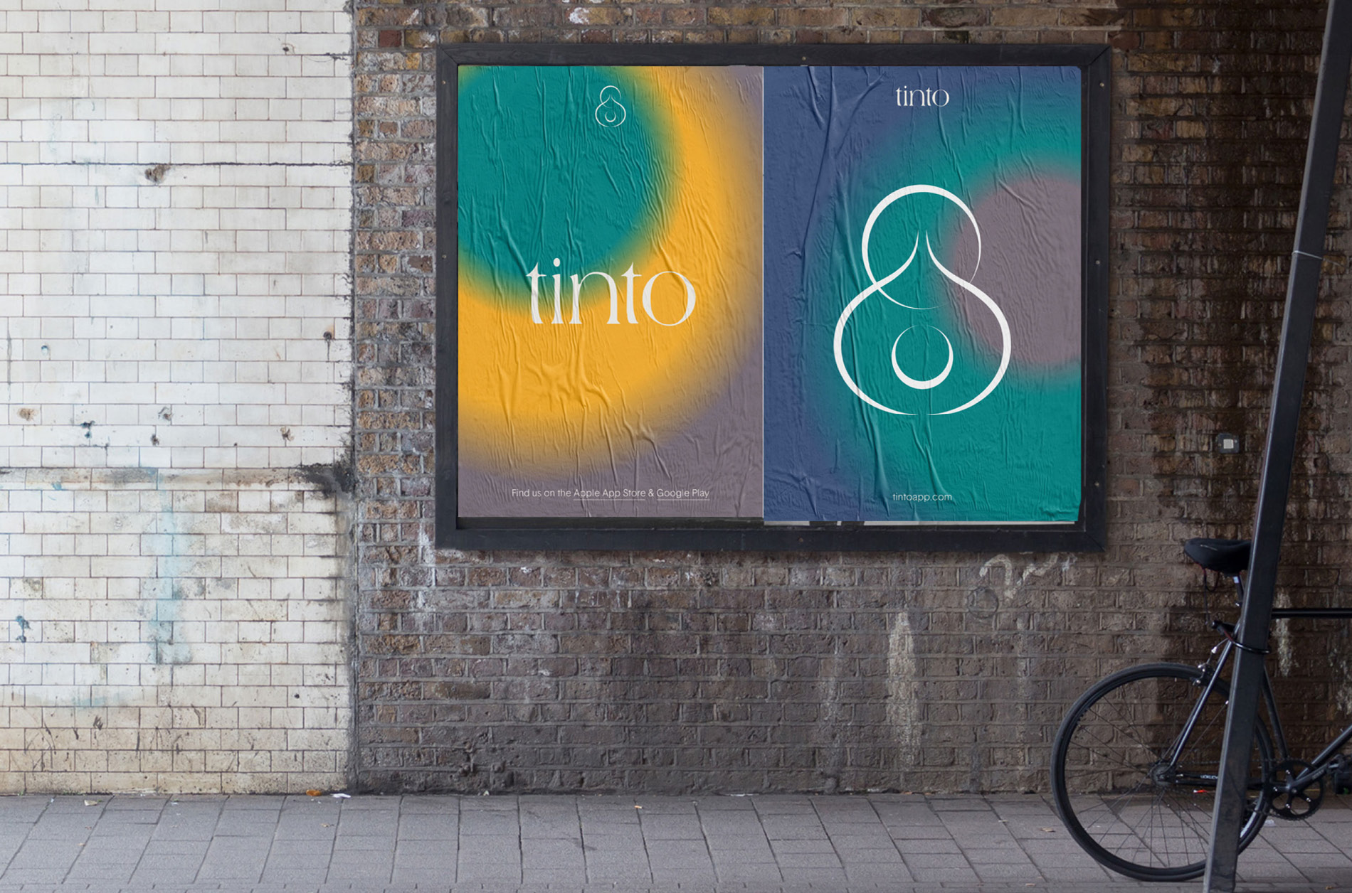
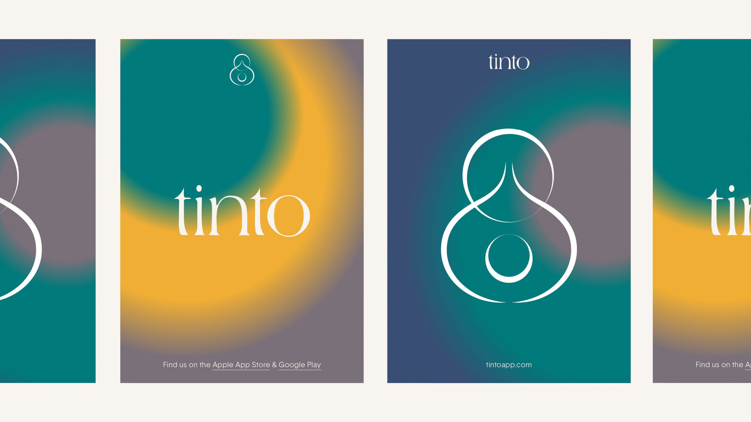
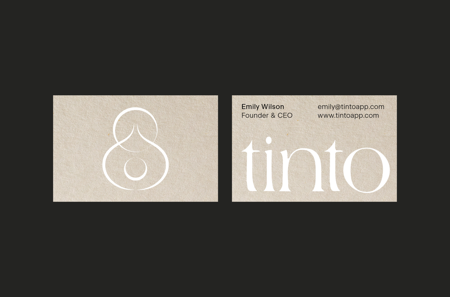
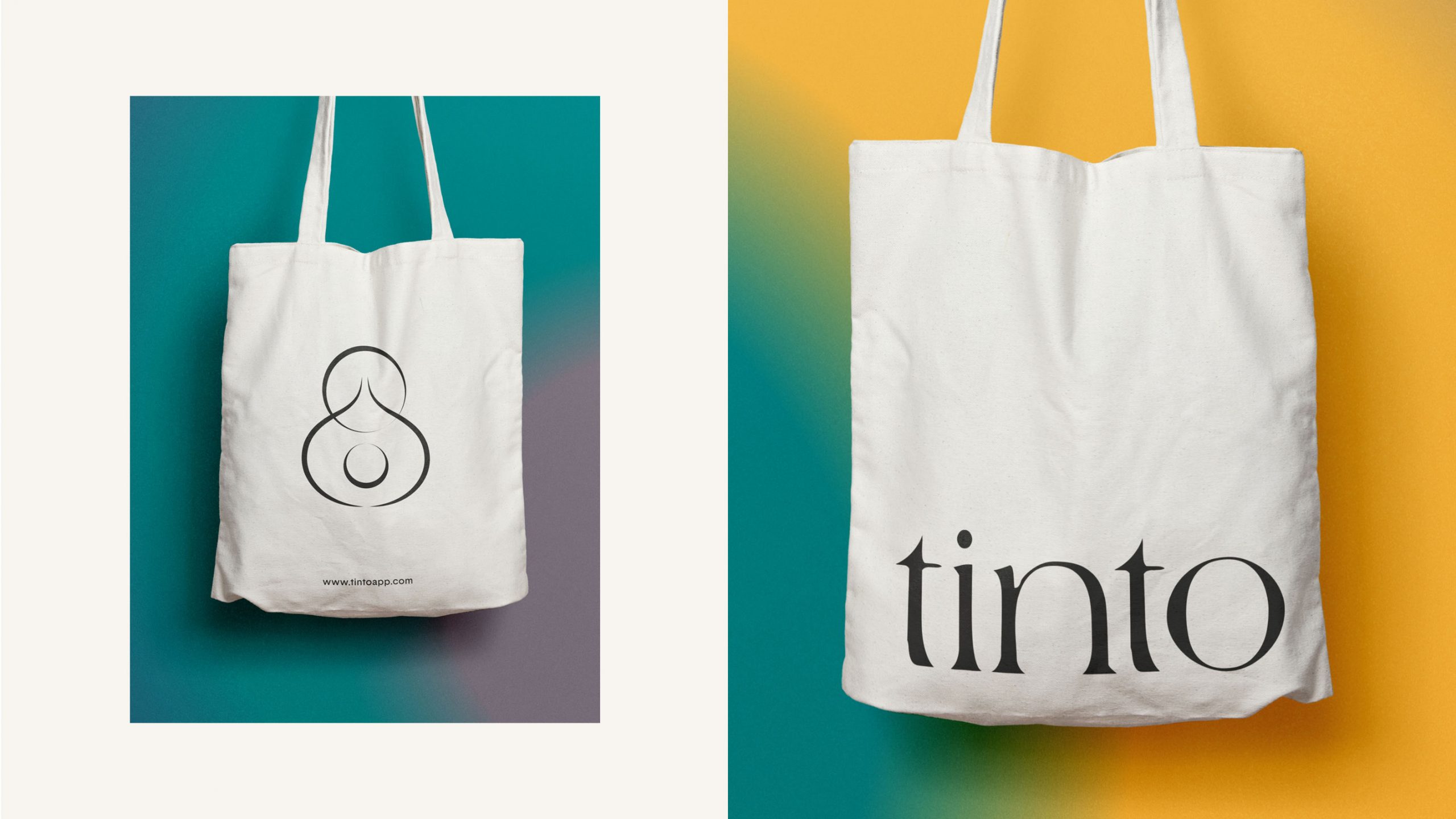
The most important factor when creating this identity was for the logo and symbol to represent organic forms without loosing a sense of sophistication and trust. The logotype itself has intentional imperfections due to it being hand rendered. We wanted the symbol to hold aspects of the human form in an abstracted way which resulted in an almost tribalist mark that encompasses the process of parenthood.
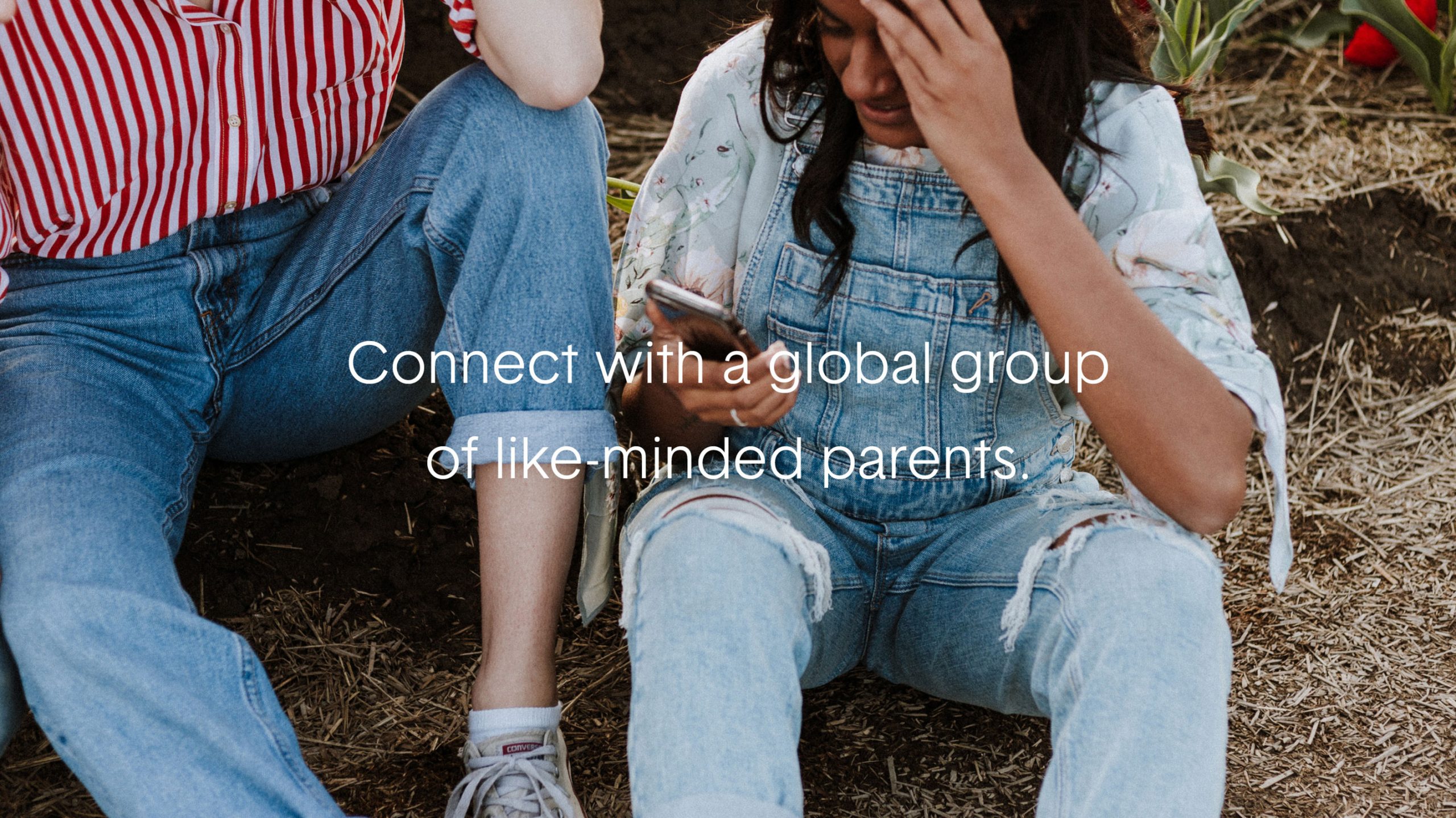
“This disconnected era is making mums feel increasingly isolated. It really does take a village to raise a child, so we built Tinto – that modern day village. We believe no one should face parenthood alone. That’s why we created Tinto, so we can thrive together.”
Tinto
The tone of UI and UX needed to be inviting and peaceful. We wanted to make the user feel as if they had arrived in a place of comfort and were dealing with a company they could trust whilst sharing highly personal aspects of their life.
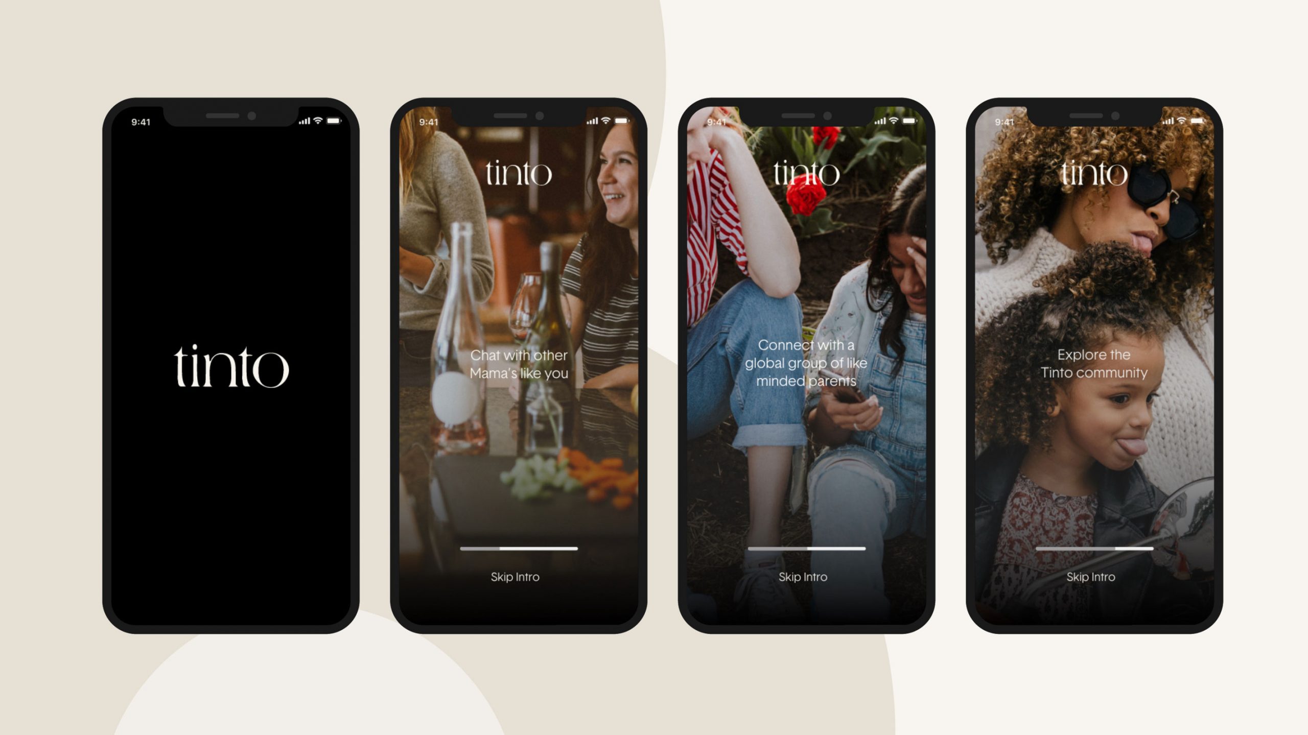
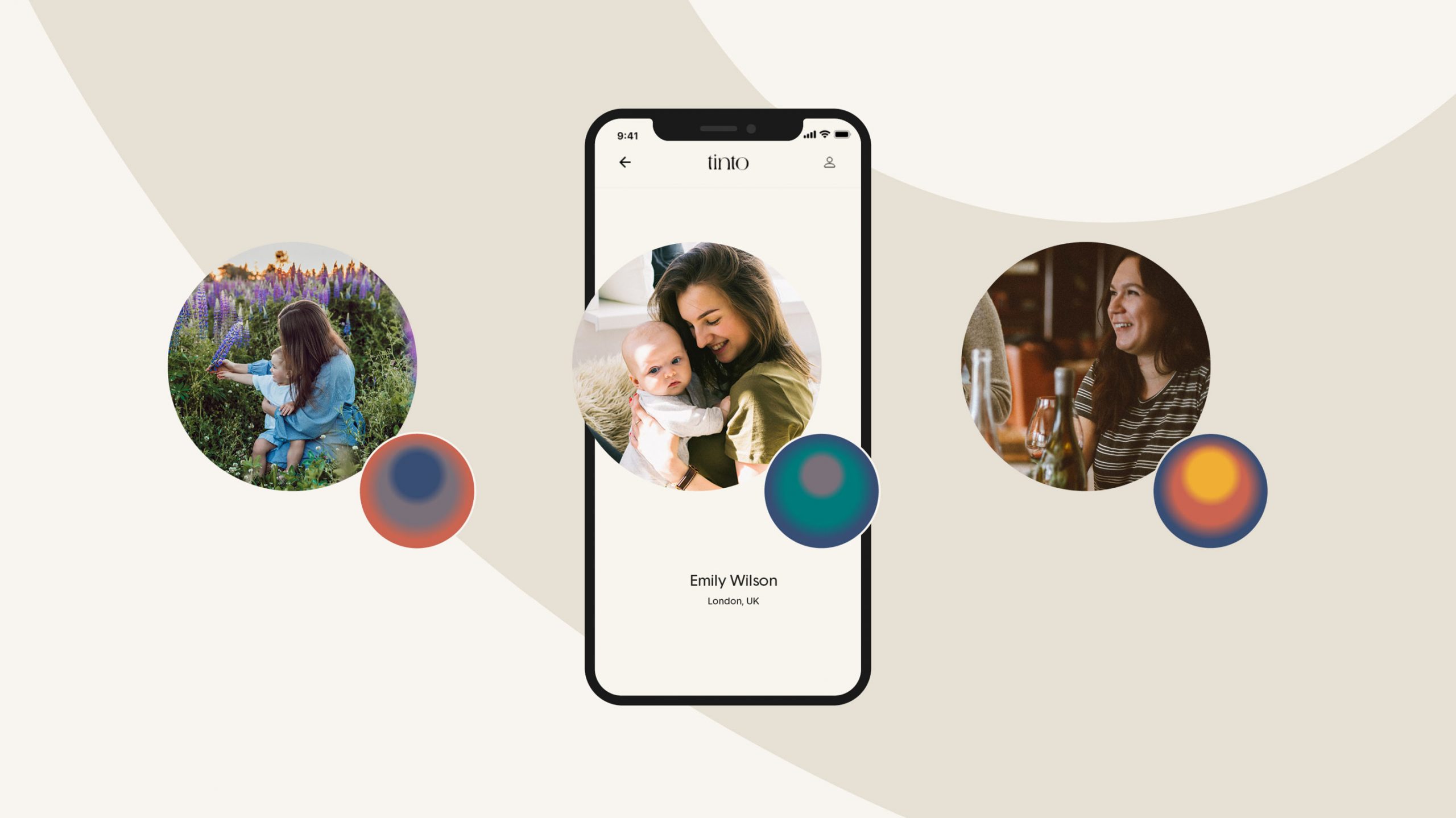
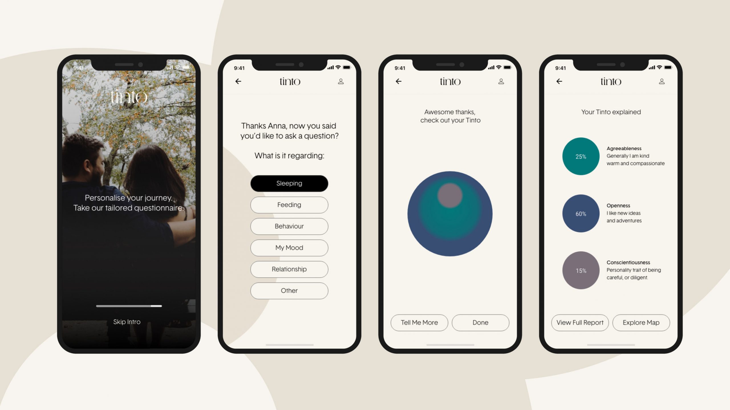
To further personalise the journey we developed a system of generating unique ‘personality spheres’ that were constructed by combining the users three most prominent personality traits gathered after a short questionnaire. This would not only give the user their very own one-of-kind sphere but it also meant it could be used as a visual tool to recognise other mothers with similar personality traits to themselves.
Developing these colourful gradients presented us with an additional graphic tool to use throughout the extended visual language and eye catching marketing.
Gallery View
Tinto
The tone of UI and UX needed to be inviting and peaceful. We wanted to make the user feel as if they had arrived in a place of comfort and were dealing with a company they could trust whilst sharing highly personal aspects of their life.
To further personalise the journey we developed a system of generating unique ‘personality spheres’ that were constructed by combining the users three most prominent personality traits gathered after a short questionnaire. This would not only give the user their very own one-of-kind sphere but it also meant it could be used as a visual tool to recognise other mothers with similar personality traits to themselves.
Developing these colourful gradients presented us with an additional graphic tool to use throughout the extended visual language and eye catching marketing.